Julian’s Packaging Insight — 2026.06.04
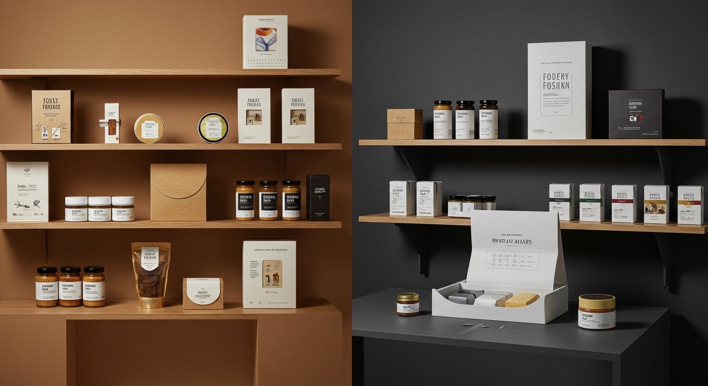
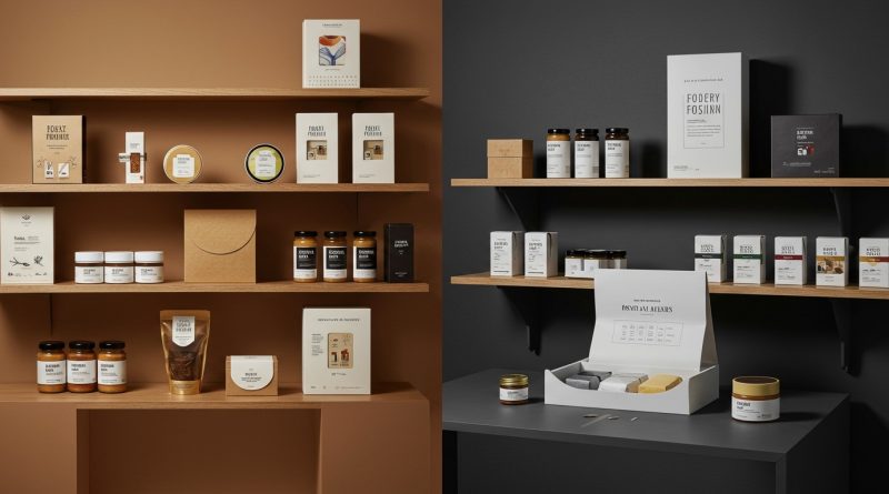
Packaging is no longer a passive container but an active participant in brand storytelling and sensory engagement.
The current landscape of packaging design is a vibrant testament to its evolving role. It’s no longer solely about containment; it’s a crucial touchpoint that dictates the entire consumer journey, from the fleeting moment of shelf discovery to the deeply personal act of unboxing. In an era saturated with digital experiences, the tactile reality of packaging provides a vital counterpoint, offering tangible proof of a brand’s promise. Sustainable materials are transitioning from a niche concern to a baseline expectation, demanding innovation that doesn’t compromise aesthetic appeal or functional integrity. Shelf impact, that split-second visual shouting match for attention, is being won through strategic use of color, form, and emergent visual language. Crucially, tactile branding – the subtle, yet profound, interplay of texture, weight, and material that engages the sense of touch – is emerging as a powerful differentiator, imbuing products with an emotional resonance that digital interfaces can only aspire to replicate. These recent developments highlight a collective understanding that packaging, when executed with intent, can be a potent engine for brand building and consumer connection.
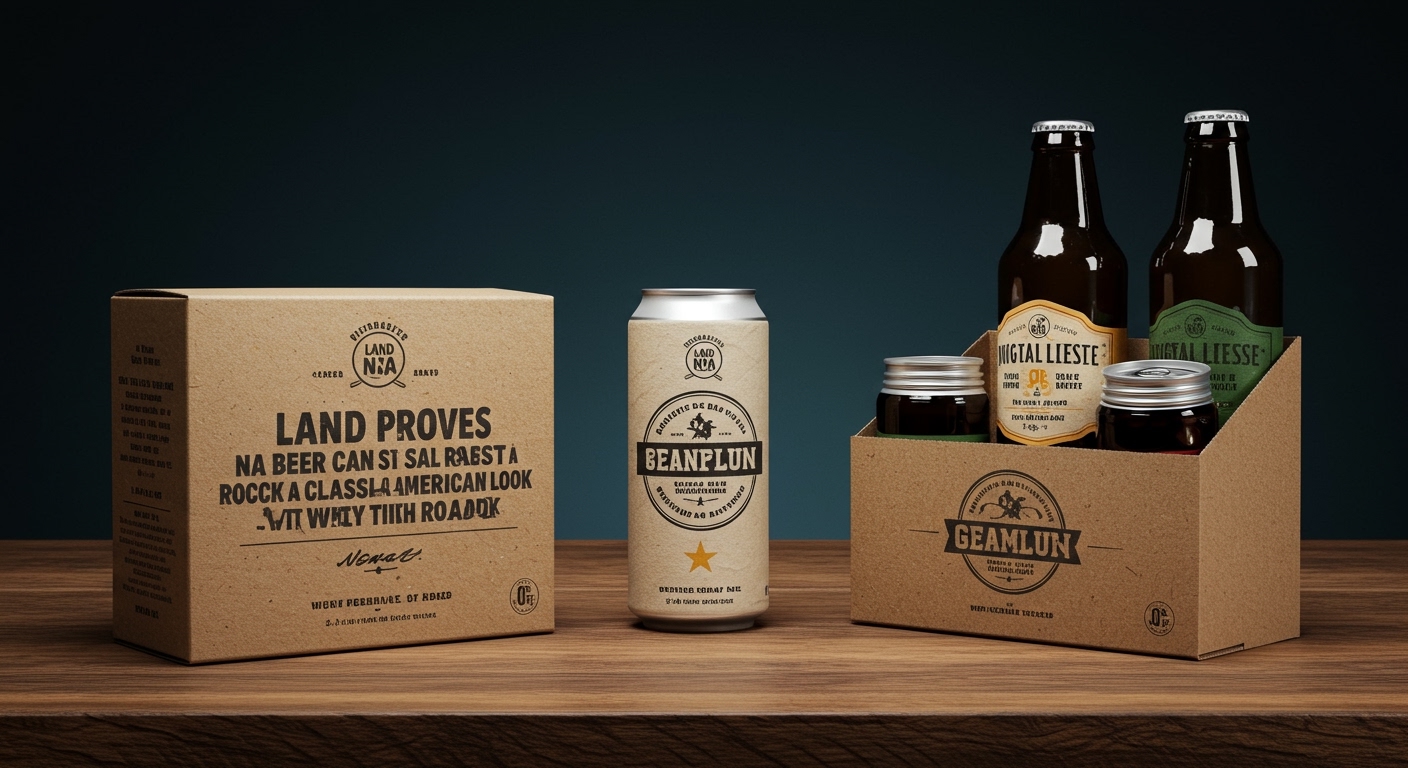
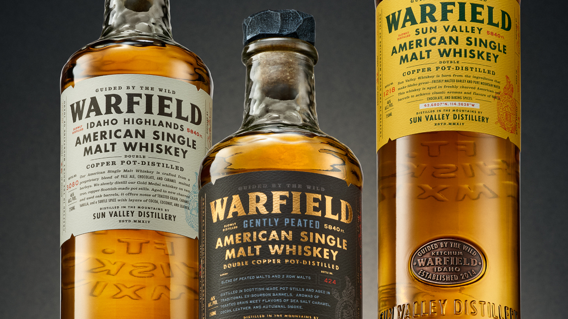
The news items collectively paint a picture of sophisticated brand repositioning, leveraging packaging to redefine product categories and re-engage consumers. Land’s work for NA beer brand Roadie demonstrates a masterful resurrection of classic Americana, proving that non-alcoholic beverages can embody heritage and cool, eschewing the often bland or overly medicinal aesthetic. This is a deliberate act of building desire through nostalgic visual cues, challenging the perception of a functional category. Similarly, Two Creatives’ Pura Vida Cacao identity moves away from the predictable, ceremonial signifiers of specialty cacao, opting for an accessible, everyday vibrancy. The saturated yellow and architectural typography signal a deliberate shift, making a premium ingredient feel like a democratized pleasure, a morning ritual rather than a distant indulgence. Chad Michael Studio’s Warfield Spirits offers a masterclass in place-based branding, meticulously crafting an identity rooted in its Sun Valley origins. The bespoke bottles, slate closures, and detailed engravings communicate a deep sense of craftsmanship and authenticity, transforming a spirits collection into a tangible representation of its mountainous landscape. Mischief’s Parm Bars initiative is perhaps the most audacious, reframing a familiar dairy product into a performance-oriented snack. This bold rebranding requires packaging that communicates utility and aspirational fitness, fundamentally altering consumer perception through visual association. Finally, Wedge’s refresh for Stone & Skillet elevates a humble English muffin brand. By placing the cast-iron skillet at the fore, the design imbues the product with a sense of artisanal quality and enduring tradition, preparing it for wider retail success through sophisticated, approachable visual cues. Each case study underscores the power of strategic design to imbue products with new meaning and aspiration, whether by reviving heritage, democratizing luxury, anchoring in place, or reinventing function.
The tension lies between the aspiration for authenticity and the imperative of mass appeal. Brands are increasingly seeking to convey genuine heritage, artisanal craft, or a deep connection to place, as seen with Warfield Spirits and Stone & Skillet. This pursuit often involves bespoke materials, intricate detailing, and a focus on sensory experience, aiming for a premium, discerning consumer. Simultaneously, there’s a powerful drive to make products accessible and relatable, as exemplified by Pura Vida Cacao’s move away from exclusive codes and Roadie’s use of universally recognized Americana. Parm Bars, in its own way, bridges this by taking a familiar, almost utilitarian concept (cheese) and framing it within an aspirational lifestyle. The challenge for designers and brands is to navigate this delicate balance: how to imbue packaging with the depth and resonance of a niche, handcrafted product while ensuring it communicates broad desirability and everyday relevance. The risk is creating something so authentic it alienates, or so accessible it feels generic.
Looking ahead, the true revolution in packaging will not be solely in the materials used, but in the intelligent integration of embedded, unobtrusive sensory technology that elevates tactile branding. By 2028, expect to see a significant increase in packaging that subtly shifts in texture, temperature, or even emits faint, specific scents upon interaction, triggered by proximity or touch, moving beyond static design to create dynamic, memorable, and deeply personal unboxing experiences that directly communicate product provenance and quality without overt labeling.
TL;DR
Packaging is transforming from mute container to active storyteller, driven by tactile engagement and sustainable innovation.