Julian’s Typography Insight — 2026.06.04
The pixel has officially shed its skin, revealing a visceral, analogue yearning.
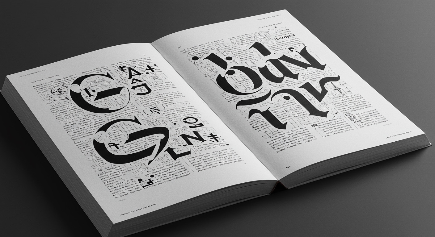
In an era saturated with fleeting digital pronouncements and aggressively legible interfaces, typography is re-engaging with its foundational principles, not as a retreat, but as a radical reimagining. Legibility, once the bedrock of functional design, is now being interrogated through a lens of conceptual depth. This isn’t about simply making text readable; it’s about exploring how form itself can embody meaning. Consider Alexandra Grant’s exploration of the Antigone myth, where the very structure and presence of text become conduits for profound narratives, pushing beyond mere communication to evoke existential resonance. Simultaneously, the resurgence of intricate grid systems, far from being sterile architectural frameworks, are being employed as sophisticated editorial tools, guiding the eye through complex information architectures with newfound nuance. Micro-typography, the subtle interplay of kerning, leading, and weight, is no longer an afterthought but a deliberate instrument for shaping reader experience, imbuing even the most utilitarian text with a distinct editorial voice.
The disparate threads of contemporary typographic discourse are weaving a fascinating tapestry. We’re witnessing a compelling dialectic between the ephemeral and the enduring, the digital and the tactile. On one hand, typefaces like Cheezy Snack emerge, a bold, almost audacious declaration of personality, directly mining the cultural zeitgeist for nostalgic, personality-driven branding. This isn’t accidental; it reflects a broader appetite for the tangible, the imperfect, and the undeniably memorable in a world often perceived as sterile. This embrace of the loud and the expressive stands in stark contrast to the meticulous, almost monastic, dedication to refined grid systems and subtle micro-typographic adjustments that underpin so much of contemporary editorial design. The news also hints at a fertile ground for typographic exploration in unexpected territories, referencing the enduring power of established systems like Monopoly, suggesting that even seemingly utilitarian frameworks can inspire new approaches to visual language and narrative. The coming together of Italian design in New York, for instance, signals a continued cross-pollination of ideas, where heritage and innovation engage in a dynamic conversation.
The inherent tension lies in the simultaneous pursuit of radical expressiveness and profound, almost philosophical, structural rigor. How can a typeface designed to evoke the visceral, immediate pleasure of junk food coexist with a typographic approach that interrogates ancient myths through the careful dissection of letterforms and their spatial relationships? This isn’t a contradiction to be resolved, but a productive friction that defines the current landscape. It highlights a discipline grappling with its own ubiquity, seeking to reclaim a sense of gravitas and meaning amidst the cacophony of digital communication. The playful, the bold, and the conceptually driven are not mutually exclusive; they are facets of a discipline that is actively defining its own future by looking both inward at its fundamental principles and outward at the cultural currents that shape our visual experience.
The next five years will see the emergence of hybrid typographic systems that dynamically adapt their conceptual and functional qualities based on the narrative context and the reader’s emotional state.
TL;DR
Typography is currently navigating a fertile tension between bold expressive forms and rigorous conceptual structures, redefining meaning in the digital age.