JHDD Typography Report — 2026.07.01
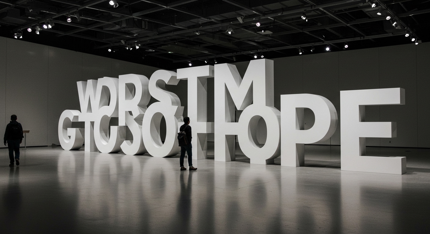
The Obama Presidential Center’s Words of Hope installation features 458 oversized Gotham Bold letters.
This singular detail highlights a pervasive trend: typography is increasingly employed not merely for content transmission. These disparate accounts reveal a collective push towards typography as a primary narrative agent, increasingly serving as both an architectural and an experiential element. Whether honoring historical figures like Dorothy Shaver through brand identity or transforming a speech into a physical landmark, type’s expressive and structural capacities are being re-evaluated for tangible, often public, applications.
The installation at the Obama Presidential Center exemplifies this shift. By rendering a speech in monumental Gotham Bold, the design prioritizes conceptual legibility and emotional resonance over rapid reading comprehension. Mainstream typographic practice often asserts that clarity and speed of reading are paramount, particularly for informational texts. However, this project suggests a different value proposition: the experience of type as a monument. The individual letters, while recognizably Gotham Bold, function less as components of a readable sentence and more as architectural forms, prompting engagement through their scale and material presence. This contradicts the conventional wisdom that optimal legibility solely hinges on micro-typographic precision for the eye’s effortless traversal of text.
The success of such installations forces a re-evaluation of legibility itself. When letters are meant to be felt and absorbed rather than scanned, the metrics shift. Designers are compelled to consider how letterforms interact with light, space, and human movement, not just optical readability on a flat plane. It is predicted that by mid-2028, generative design tools, informed by environmental and human interaction data, will produce parametric type systems specifically optimized for large-scale architectural integration, moving beyond static font files to responsive letterform ecosystems.
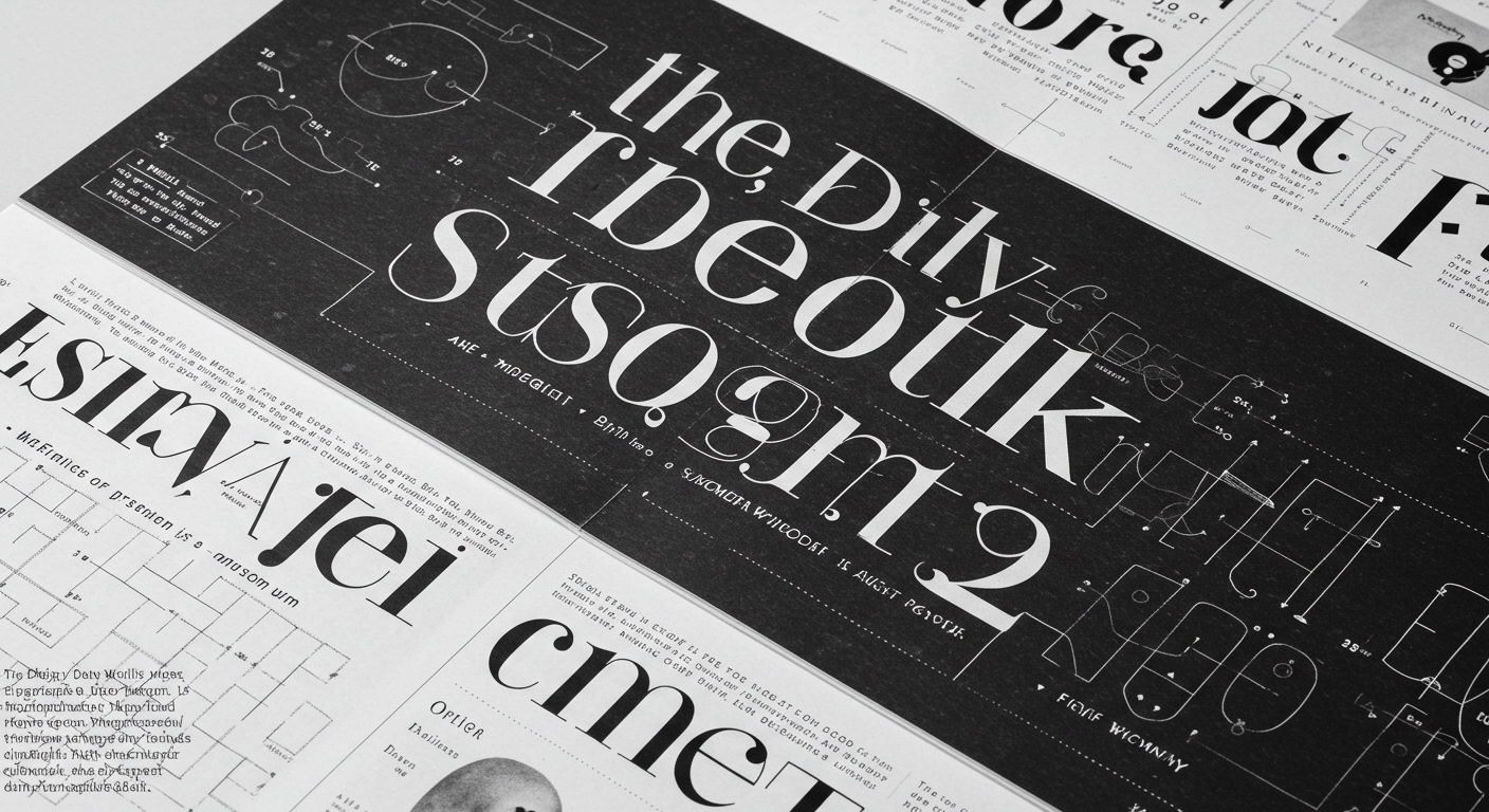
This trajectory faces resistance from the persistent demand for immediate, functional information delivery, especially in commercial applications where micro-typography directly impacts user conversion. The meticulous grid systems underpinning user interfaces and editorial layouts, designed for efficient content consumption, represent a counter-current. These systems prioritize clarity and hierarchy above all else, often seeing conceptual letterforms or monumental type as distractions rather than enhancements to legibility. The emphasis on practical legibility, driven by data on reading speed and comprehension, remains a dominant force.
Typography professionals should consciously integrate principles of spatial and conceptual legibility into their early design thinking. Rather than adding type as a final layer, consider how letterforms themselves can define or alter space, even on a screen. Experiment with grid systems that adapt not just to content, but to the intended experience of reading, allowing for moments of typographic monumentality or spatial interaction, even within a traditional editorial layout. This involves stepping away from purely two-dimensional considerations and exploring the implicit three-dimensionality of type.
TL;DR
Typography’s role is evolving from content delivery to spatial and conceptual experience, challenging traditional legibility metrics.
Curated References
About this editorial — This piece was developed using AI-assisted research and curation across multiple industry sources. All analysis, opinions, and predictions represent the editorial perspective of JHDD. Sources are linked in the references section above.