JHDD Packaging Report — 2026.06.22
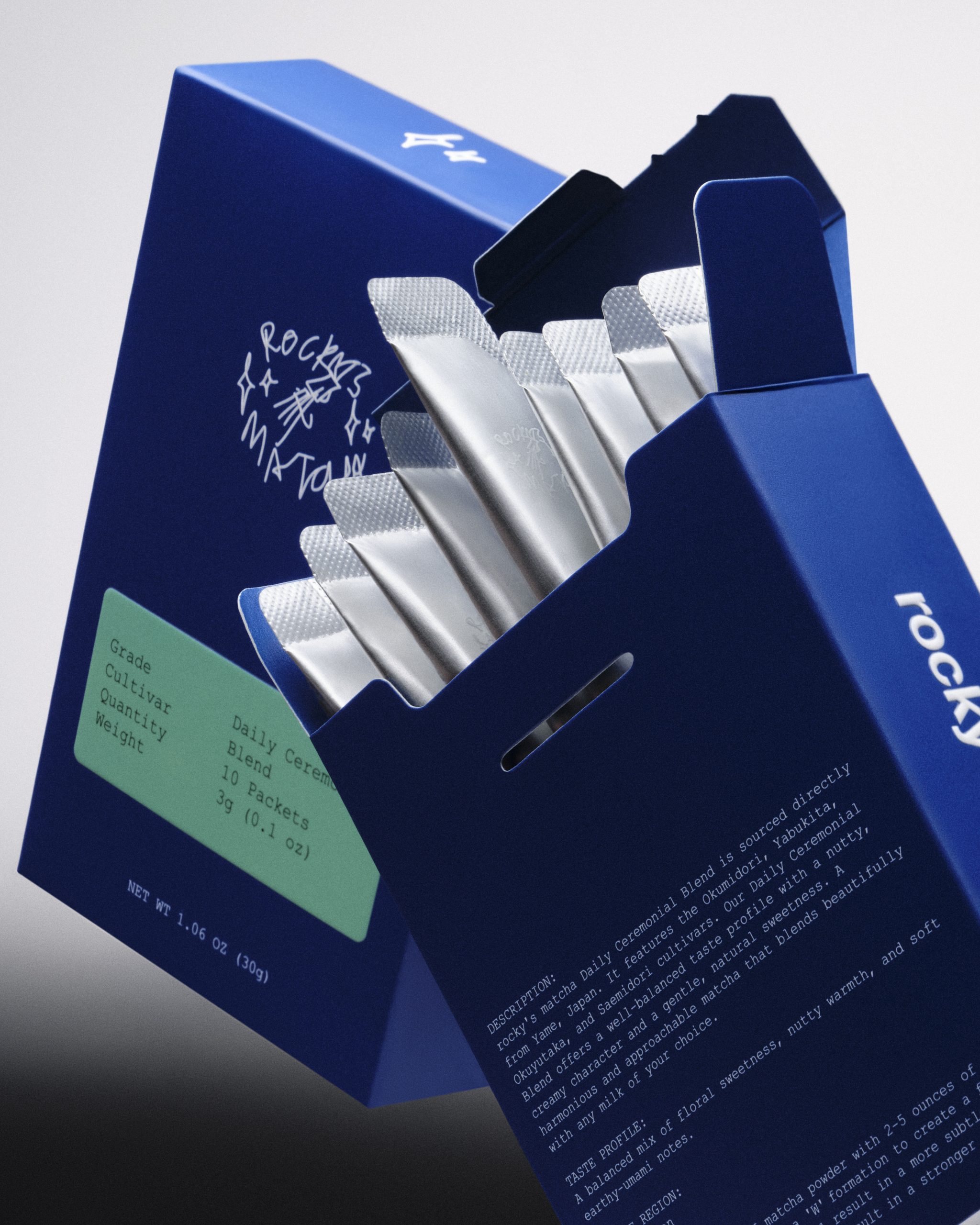
Rocky’s Matcha Sticks signals a deeper shift in consumer engagement, arriving in a matte silver mylar packet within a cobalt blue cigarette-style flip-top box.
This choice exemplifies a consistent pattern across recent launches: brands are leveraging packaging to embody an aspirational identity or lifestyle, often subverting established category aesthetics. The packaging no longer merely contains a product; it performs a cultural function, driving desire through distinct visual and tactile signals that frequently challenge traditional product communication. This strategy prioritizes the experience of the brand over a literal depiction of the product, fostering an emotional connection and immediate recognition that cuts through conventional shelf clutter.
The design for Rocky’s Matcha Sticks, with its matte silver mylar and cobalt blue flip-top box, directly challenges conventional wisdom in wellness packaging. Mainstream industry thought often dictates that health-focused products must visually communicate purity, naturalness, or clinical efficacy through clear design language, often employing muted tones, organic shapes, or explicit health claims. Rocky’s Matcha eschews this, instead adopting a “streetwear drop” aesthetic and a cigarette-style presentation, aligning the brand with a specific cultural moment and lifestyle rather than simply its functional benefits as ceremonial grade matcha. This deliberate choice reframes the unboxing experience from a health ritual to a fashion statement, enhancing shelf impact by standing out dramatically against competitors.
This approach demonstrates that tactile branding and an unexpected unboxing sequence can drive significant perceived value and desire, even for products in highly functional categories. The choice of matte mylar and a rigid, unconventional box creates a distinct haptic signature that enhances the perception of exclusivity and intentionality. Packaging professionals typically focus on communicating product attributes; however, this trend shows that communicating a desired identity can be more powerful, leading to packaging that is valued beyond its initial contents. This inherent perceived value contributes to sustainability by increasing the likelihood of reuse for the rigid box, extending its lifecycle past its primary function—a less discussed but critical aspect beyond simply material composition. Within two years, more brands will adopt packaging that radically departs from category norms, using tactile and visual cues to signify cultural aspiration rather than literal product function, with particular emphasis on materials and forms that encourage post-consumer retention and repurposing, like unexpectedly durable or aesthetically pleasing boxes.
Resistance to this identity-driven packaging often comes from supply chain logistics and established retail channels. Traditional retailers, accustomed to category-conforming visual cues, may find such disruptive designs challenging to integrate into existing merchandising strategies. Furthermore, regulatory bodies focused on clear product information and safety could scrutinize packaging that prioritizes abstract cultural messaging over explicit functional details, creating friction for designers pushing these boundaries.
A working packaging professional should conduct an immediate “sensory audit” of their brand’s primary and secondary packaging, not against direct competitors, but against products in entirely unrelated categories that command similar aspirational value. Focus on how tactile elements, perceived material weight, and unboxing rituals are employed by brands outside their immediate market, then explore how these sensory cues could be adapted to elevate their own product’s emotional resonance and create a distinct, identity-driven experience.
TL;DR
Packaging is evolving from product communication to cultural identity projection through tactile and visual design.
Curated References



About this editorial — This piece was developed using AI-assisted research and curation across multiple industry sources. All analysis, opinions, and predictions represent the editorial perspective of JHDD. Sources are linked in the references section above.