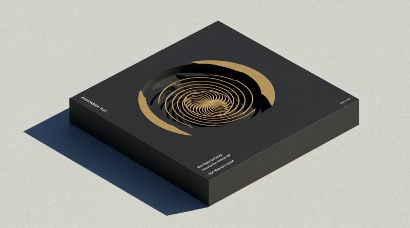
JHDD Branding Report — 2026.06.22
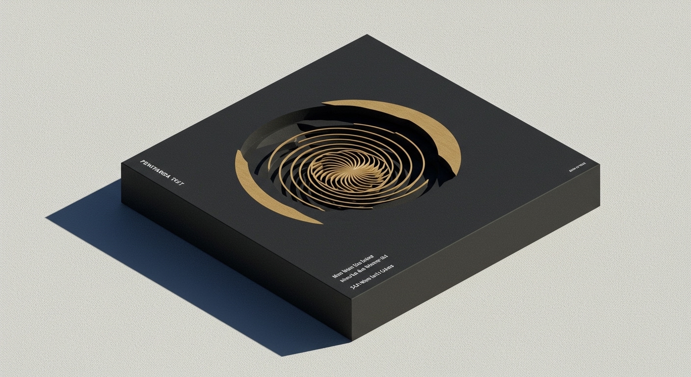
Pentagram’s visual identity for the Museum of Narratives (MoN Takanawa) in Tokyo utilizes a simple spiral to bridge traditional Japanese culture with hyper-modern exhibition themes.
This specific approach mirrors a wider pattern emerging across diverse brand engagements: a strategic pivot towards deep, hyper-local, or even nostalgic cultural specificity as a primary driver of brand equity. Global agencies like Base Design are applying exhaustive care to small, beloved institutions such as the ’80s seafood spot Ray’s, demonstrating an “earnestness done well” that prioritizes authentic local resonance over broad, generic polish. Concurrently, Studio Gruhl incorporates a “Global Hypercolour-esque” visual identity for the robotics data platform Rerun, a brand focused on “physical data” and “smarter robots.” These seemingly disparate projects share a common thread: they deliberately eschew generic modernism or universal appeal in favor of potent, culturally anchored signals that resonate with specific, often niche, audiences, thereby crafting distinct market positioning.

The prevailing industry wisdom frequently advocates for brand identities that are universally scalable and future-proof, especially for technology platforms or global consumer brands. This perspective often suggests that clear, unencumbered visual systems are key to widespread adoption and market leadership. However, this overlooks a critical shift. The brand equity generated by Studio Gruhl’s identity for Rerun, for instance, comes not from its abstract efficiency or sleek futurism, but from its deliberate, almost anachronistic, “Hypercolour-esque” aesthetic. This choice, evoking a specific past cultural moment, signals a more human-centric understanding of interaction with complex data and robots, fundamentally differentiating Rerun from competitors that lean into sterile, purely functional visual systems. This specific cultural reference, rather than hindering global adoption, builds a more distinct and memorable brand persona by layering unexpected emotional depth onto high-tech functionality.
This counter-intuitive strategy suggests that true brand longevity and distinctiveness will increasingly derive from leveraging specific, even niche, cultural signals rather than striving for broad, diluted relevance. The meticulous attention Base Design gave to Ray’s, a small-town ’80s seafood spot, exemplifies how deep immersion in a brand’s unique history and community yields a powerful, authentic visual identity that outlasts passing trends. By mid-2028, brand platforms that have successfully integrated hyper-local or retro-cultural visual systems will demonstrate significantly stronger community engagement, brand loyalty, and cut-through in crowded markets than those opting for conventional ‘modern’ aesthetics, particularly within the B2B tech and specialized consumer goods sectors.
This movement towards cultural specificity is met with resistance from established corporate structures and legacy brand strategists who continue to prioritize generalized “clean” aesthetics and focus group-validated lowest common denominators. These entities often fear alienating broad audiences by embracing a distinct point of view, clinging to blandness as a misguided form of safety in market positioning. They resist the perceived “messiness” or limited appeal of culturally rich, specific visual identities, preferring templates designed for maximum, yet ultimately shallow, reach, thereby diluting potential brand equity.
Branding professionals should dedicate a significant portion of their discovery phase to uncovering micro-cultural touchstones, historical idiosyncrasies, and sub-aesthetic cues relevant to a brand’s most passionate user base, however small. Instead of solely benchmarking against direct competitors or current trends, explore the forgotten visual language of local archives, niche communities, specific historical periods, or even the nuanced vernacular of specialized industries. Strategically integrate these findings into visual identity systems to cultivate deep resonance and enduring cultural signals, rather than merely superficial appeal.
TL;DR
Brand equity is increasingly built on deeply specific cultural signals and aesthetics, not universal appeal.
Curated References
About this editorial — This piece was developed using AI-assisted research and curation across multiple industry sources. All analysis, opinions, and predictions represent the editorial perspective of JHDD. Sources are linked in the references section above.