JHDD Typography Report — 2026.08.07
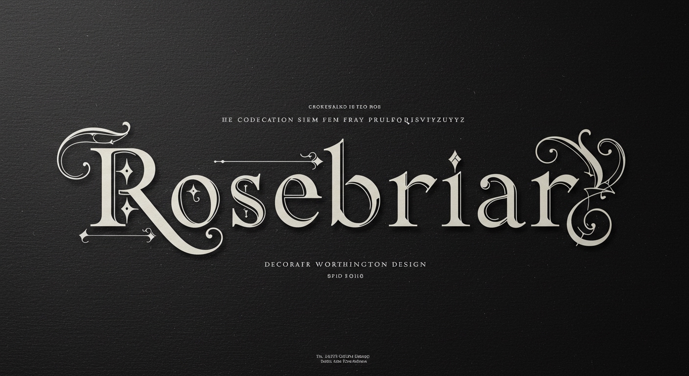
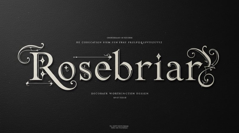
Rosebriar, a decorative display typeface from Laura Worthington Design, incorporates subtle gothic ornamentation alongside modern OpenType features, signaling a deeper shift in typographic practice.
Across observations of “rare and one-of-a-kind letterforms” in “Book the Trip” and the conceptual endeavor of “revivifying a dead language through cartoons,” a pattern emerges: contemporary design is increasingly engaging with letterforms that possess inherent narrative and historical weight. This is not a simple revivalism or fetishization of the past, but rather a sophisticated attempt to integrate the evocative power of historical and vernacular forms with the precise control offered by current digital typographic tools, pushing beyond mere functional legibility towards conceptual resonance within structured grid systems.
Mainstream industry opinion often positions legibility as a primary, unwavering metric, equating it directly with speed and ease of reading through visual transparency. This perspective frequently dismisses typefaces like Rosebriar, with its “storybook charm” and “gothic ornamentation,” as purely aesthetic, potentially sacrificing utility for flourish. However, such a view overlooks how advanced micro-typography, particularly through OpenType features, reframes the relationship between ornament and understanding. Rosebriar’s integration of these modern capabilities means its decorative elements are not arbitrary additions but are contextually responsive, allowing for an expressive headline to maintain clarity not by simplification, but by intelligent variation.
The true challenge of legibility now extends beyond stroke contrast or character width into how a typeface communicates beyond the literal word. Laura Worthington Design’s approach with Rosebriar suggests that conceptual letterforms, when finely tuned by micro-typographic control, can contribute to a richer user experience, especially in editorial design where engagement and atmosphere are paramount. The “hand-crafted elegance” delivered via precise digital features represents a form of deep legibility, where the letterforms themselves carry a layer of meaning. By mid-2027, the design community will increasingly recognize that the most effective display typography balances immediate readability with the embedded narrative of its forms, rather than strictly adhering to a stripped-down efficiency model.
This evolution faces resistance from the prevailing pragmatic demands of digital content delivery platforms and the ubiquity of template-driven web design. These systems frequently enforce rigid grid structures and limited font choices, prioritizing universal accessibility and loading speed over the nuanced, expressive qualities that specialized typefaces offer. The impulse towards minimalist, unadorned typography, often driven by a perceived need for frictionless user experience across diverse devices, can inadvertently stifle the conceptual richness that typefaces like Rosebriar cultivate, viewing any deviation from pure functionalism as an impediment.
A working Typography professional should, this week, experiment with the OpenType features of at least one decorative or historically-inspired typeface within a complex grid system, paying close attention to how stylistic alternates, ligatures, and contextual variations affect micro-typography and perceived legibility. Instead of defaulting to purely functional sans-serifs, investigate how a typeface’s inherent character can be leveraged through its programmed intelligence to enhance the editorial narrative, particularly in display settings or specific call-out boxes, without disrupting overall readability.
TL;DR
The integration of historical letterform aesthetics with modern OpenType features redefines legibility as a contextual, conceptual experience.
Curated References
About this editorial — This piece was developed using AI-assisted research and curation across multiple industry sources. All analysis, opinions, and predictions represent the editorial perspective of JHDD. Sources are linked in the references section above.