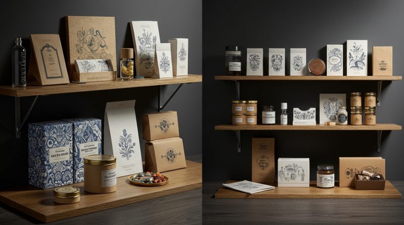
JHDD Packaging Report — 2026.08.07
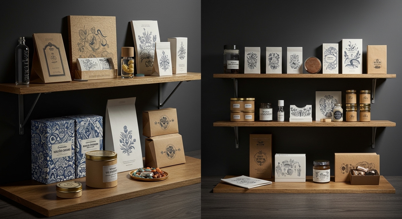
Violaine et Jérémy’s work, characterized by hyper-detailed illustration and artisanal materiality, challenges the industry’s digital-first design assumptions.
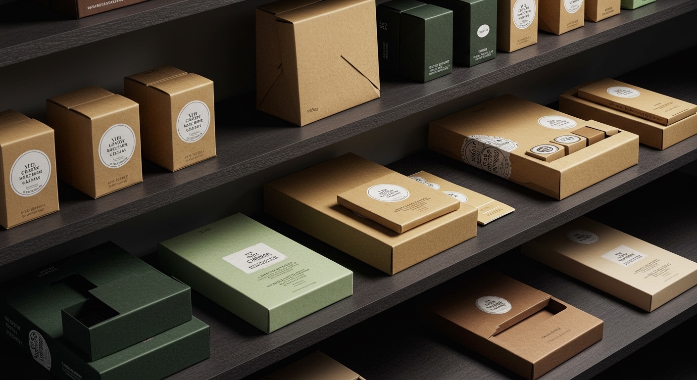
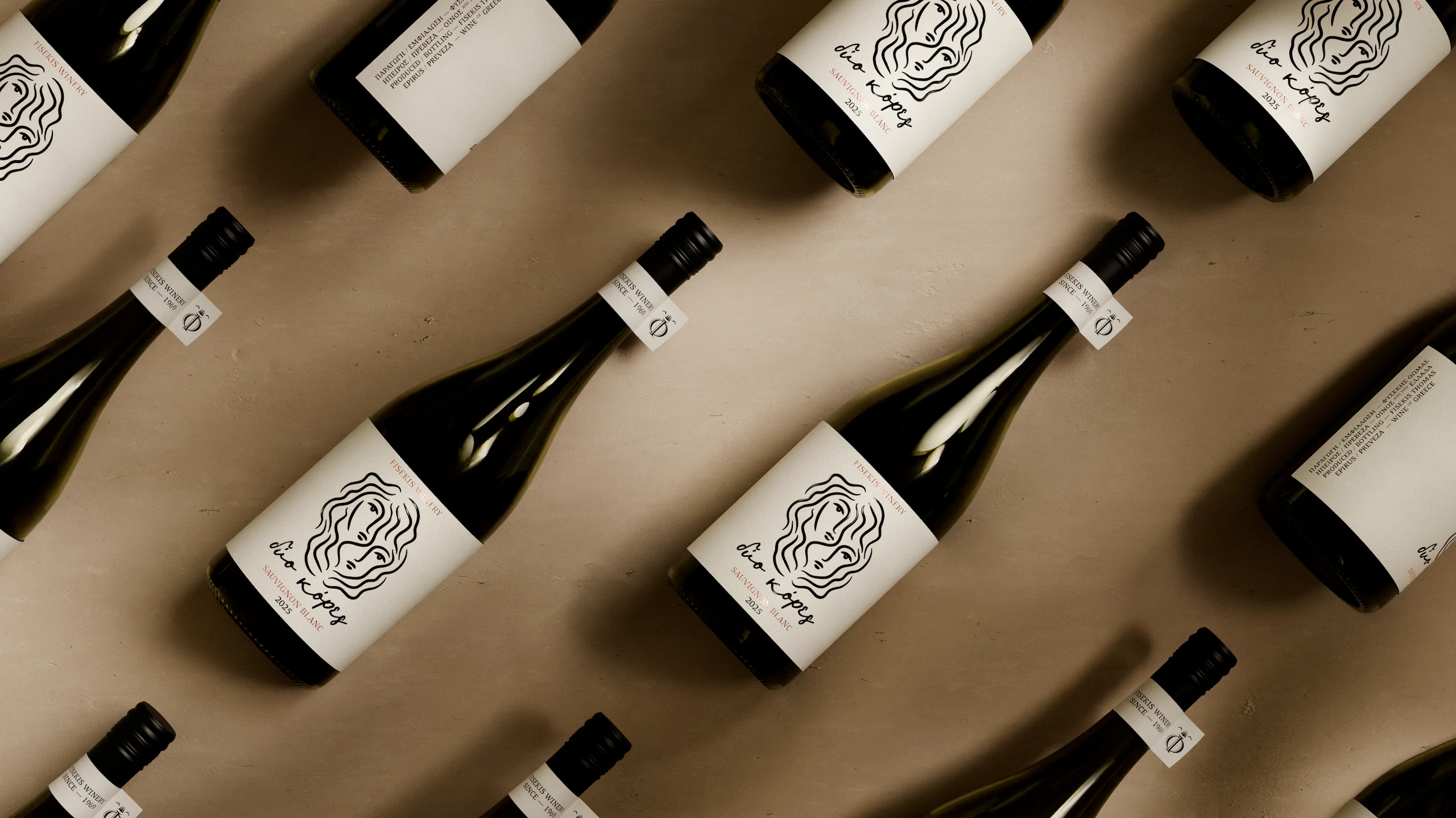
These diverse projects reveal a quiet but consistent pivot: brands are seeking deeper, more resonant physical identities for their packaging. The emphasis shifts from mere product information or fleeting digital engagement to a tangible, sensory experience. This includes Erika Luisetta’s use of pure color and pattern for Numa cold brew, bypassing typical illustrative clichés, and iFrame Design Studio’s integration of foil stamping with stone toned paper for Dio Kores wine, directly tying the product to its origin through texture and finish. A shared thread is the strategic employment of materials and finishes to create immediate, memorable tactile and visual signatures that speak volumes without relying on overt narrative illustrations.
The conventional wisdom often posits that efficiency and digital scalability should drive packaging design, sometimes leading to a perceived homogenization or an over-reliance on stock imagery and predictable visual codes. Violaine et Jérémy actively contradicts this by centering their practice on what they term “anti-digital” design. Their approach, focusing on custom typography and rich materiality, demonstrates that investing in distinct physical craftsmanship can generate significant shelf impact and foster deeper brand connection. This view counters the idea that complex, tactile finishes are merely costly embellishments. Instead, they are becoming foundational elements for brands aiming to distinguish themselves in crowded categories, particularly for products like premium beverages where the physical interaction is a key part of the perceived value.
This focus on tangible distinction is not a niche trend; it represents an evolving consumer expectation for authenticity and a more meaningful interaction with physical products. Forchewn’s commitment to sustainable packaging for instant, single-serve coffee further illustrates how material choice can serve both ethical and branding objectives. The tactile quality of a compostable pouch or a recycled carton, even for a convenience product, now communicates value beyond its environmental credentials. Predictions suggest that by early 2028, brand investment in unique, sustainably sourced tactile finishes will increase by 20% across the premium food and beverage sectors, driven by consumer demand for packaging that feels as considered as the product inside. This shift will make generic, glossy finishes appear dated and less trustworthy.
This move towards enhanced materiality and tactile branding faces concrete resistance from cost-cutting pressures and established manufacturing paradigms. Global supply chains, often optimized for scale and low unit cost, prioritize readily available, standardized materials. Introducing bespoke paper stocks, specific foil applications, or custom-embossed textures across millions of units can significantly increase production complexity and lead times. Furthermore, the perceived risk of deviating from category norms, even when aiming for differentiation, can be a hurdle for large corporations accustomed to iterative rather than disruptive design changes.
This week, a working Packaging professional should identify one current project and challenge the default material specification. Instead of simply meeting sustainability quotas with standard options, explore suppliers for innovative recycled content papers or bio-based polymers that offer a distinct, unexpected tactile experience. For example, research stone-toned paper options similar to those used by iFrame Design Studio for Dio Kores, even if the application is for a different product category, and present a costed sample to stakeholders, highlighting the sensory impact alongside the environmental benefit.
TL;DR
Strategic investment in distinctive tactile branding and sustainable materials is becoming a core differentiator, not a luxury.
Curated References


About this editorial — This piece was developed using AI-assisted research and curation across multiple industry sources. All analysis, opinions, and predictions represent the editorial perspective of JHDD. Sources are linked in the references section above.