JHDD Typography Report — 2026.07.30
The Merrill C. Berman Collection highlights a historical moment “When Berlin Was Too Depressing for Words.”
The collected news items reveal a recurring design tension: the struggle between overt textual declaration and the implicit narrative power of visual form. This tension dictates how effectively messages are absorbed, whether through explicit words, intentional absence, or illustrative storytelling. It underscores a persistent challenge in design practice, navigating the threshold where verbal clarity intersects with visual suggestion, and how this interaction shapes comprehension from early printed images to contemporary digital displays.
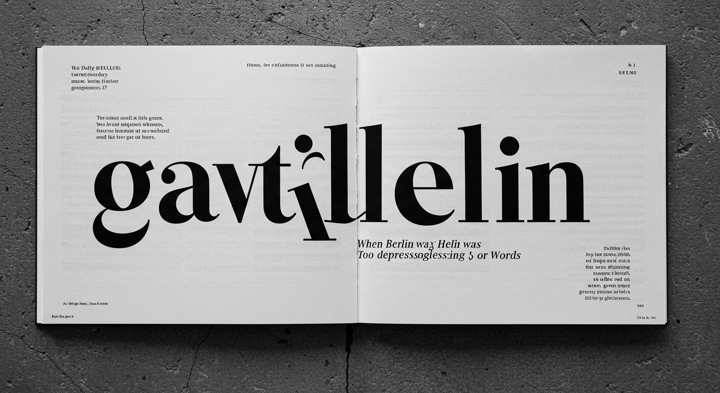
The Merrill C. Berman Collection features materials where words were deemed insufficient or undesirable for conveying the mood of Berlin, indicating an early recognition of non-verbal communication’s potency. D.B. Dowd’s Reading Pictures further explicates how illustrations have constructed meaning throughout history, often preempting or complementing textual explanations. Mainstream design, however, often prioritizes “expressive” typography, pushing conceptual letterforms for brand distinction or perceived innovation. This approach frequently sacrifices foundational legibility under the guise of artistic intent. A complex, ‘expressive’ typeface, while visually arresting, can impede immediate comprehension, forcing the reader to decode the letterform’s unique shape before absorbing the word’s meaning. This directly opposes the clarity sought by historical approaches where typographic restraint often served to amplify a powerful image or concise message. The assumption that visual novelty equates to effective communication overlooks the primary function of type: conveying information with maximum efficiency and minimal cognitive load for the reader.
The widespread adoption of AI tools for content generation, as hinted by D.B. Dowd’s work on modern culture, will necessitate a counter-movement in typographic practice. The sheer volume of automatically generated text will demand type systems engineered for maximum processing speed and unambiguous comprehension. By mid-2028, leading design agencies will pivot from developing bespoke, highly conceptual typefaces for every project. Instead, there will be a resurgence of interest in highly optimized, transparent type systems designed for maximum legibility across varied digital and print media, driven by the increasing volume of information demanding rapid, unambiguous consumption. This shift will not be a mere return to austere aesthetics. Instead, it will leverage advanced computational tools to dynamically optimize micro-typography within robust grid systems, ensuring ideal character spacing, line height, and word breaks for diverse content and output platforms. Designers will increasingly focus on defining flexible typographic hierarchies that automatically adapt, maintaining legibility and conceptual clarity regardless of viewing context.
The primary opposing force to this essential shift toward legibility and clarity is the pervasive influence of “design for engagement” metrics. This current prioritizes novelty and transient visual stimulation over enduring clarity, often justifying difficult-to-read type or overly complex layouts based on initial user “clicks” or “scroll time.” These metrics do not always correlate with true comprehension or effective communication. The continuous push for “unique” visual language, even if functionally inferior, is frequently an economic rather than a user-centric driver, rooted in the perceived value of immediate, superficial distinctiveness.
A typography professional should, this week, select a complex, “conceptual” typeface they admire and analyze its fundamental legibility using objective metrics. Assess its x-height consistency, character distinction, counter-shape clarity, and stroke contrast, paying close attention to micro-typographic details like kerning and word spacing under various conditions. Then, compare its performance against a transparent, highly legible text face. The exercise should move beyond subjective aesthetic judgment to a practical assessment of typographic utility for its intended message, informing future decisions about when and how conceptual letterforms serve actual communication goals.
TL;DR
Typographic innovation must prioritize objective legibility and conceptual clarity over subjective visual expression to meet future communication demands.
Curated References
About this editorial — This piece was developed using AI-assisted research and curation across multiple industry sources. All analysis, opinions, and predictions represent the editorial perspective of JHDD. Sources are linked in the references section above.