JHDD Typography Report — 2026.07.29
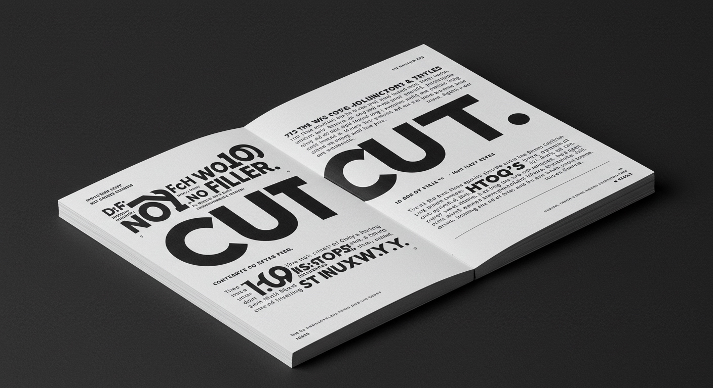
Dr. Dori’s Cut No. 6 advocates for content presented with “100 Words. No Filler.”
This directive for concise communication resonates across several contemporary discussions. What connects a costume designer’s disciplined creativity, an artist’s versatility across styles, an analysis of historical illustration, and the metaphor of carving a magazine into stone, is an underlying, unarticulated emphasis on the physical and conceptual integrity of content delivery. These varied perspectives collectively point towards a renewed valuation of permanence and focused intent in communication, moving away from purely transient or superficially dynamic forms. The articles suggest a gravitation towards the essential, where design choices are deliberate and meaningful, rather than merely reactive to digital trends.
D.B. Dowd’s Reading Pictures details how illustration has shaped culture from “earliest printed images to the age of AI.” This historical arc, spanning from fixed forms to generative content, highlights a critical tension for contemporary typography. The industry mainstream often extols the virtues of variable fonts and infinitely scalable layouts, prioritizing adaptability above all else. However, this perspective overlooks a fundamental truth: true legibility and conceptual clarity are often diminished when grid systems and micro-typographic details are sacrificed at the altar of boundless flexibility. An overemphasis on dynamic scaling, without rigorous attention to the underlying baseline grid and optical spacing, can ironically lead to visual noise and reduced comprehension, particularly in extended reading environments.
The true challenge for typography in the age of AI, as foreshadowed by Dowd’s analysis, lies in re-establishing human authorship over fundamental visual hierarchy. It is not enough for type to be technically responsive; it must also be conceptually robust and optically refined. Predictions suggest that by mid-2027, the design community will see a significant movement away from purely algorithm-driven typesetting, particularly for high-value editorial content. This shift will manifest in software and workflow developments that empower designers with more granular control over micro-typography and bespoke grid systems, allowing them to imbue generated layouts with a deliberate, human-centric legibility that current AI often struggles to replicate consistently.
The primary force resisting this re-assertion of human control over typographic nuance is the relentless push for automation and speed inherent in much of the current technological development. The “age of AI” presents both powerful tools and a significant risk: the temptation to offload all decision-making to algorithms. This pursuit of efficiency, often driven by the demands of “consumer culture” for rapid content cycles, risks deprioritizing the meticulous craft required for optimal legibility and sophisticated conceptual letterforms. The ease of generating numerous variations often overshadows the discipline required to perfect a single, thoughtfully constructed typographic solution.
A working Typography professional should this week commit to a focused micro-typographic audit of a current project. Specifically, one should examine the baseline grid’s consistency across all text blocks and breakpoints, rather than relying on default settings. Adjust the leading and tracking of both headline and body text to harmonize with this established grid, prioritizing optical balance and the natural rhythm of the text over strict numerical adherence, especially in passages intended for sustained reading.
TL;DR
Intentional typographic design, grounded in materiality and specific grid systems, is becoming critical against automation.
Curated References
About this editorial — This piece was developed using AI-assisted research and curation across multiple industry sources. All analysis, opinions, and predictions represent the editorial perspective of JHDD. Sources are linked in the references section above.