JHDD Typography Report — 2026.07.04
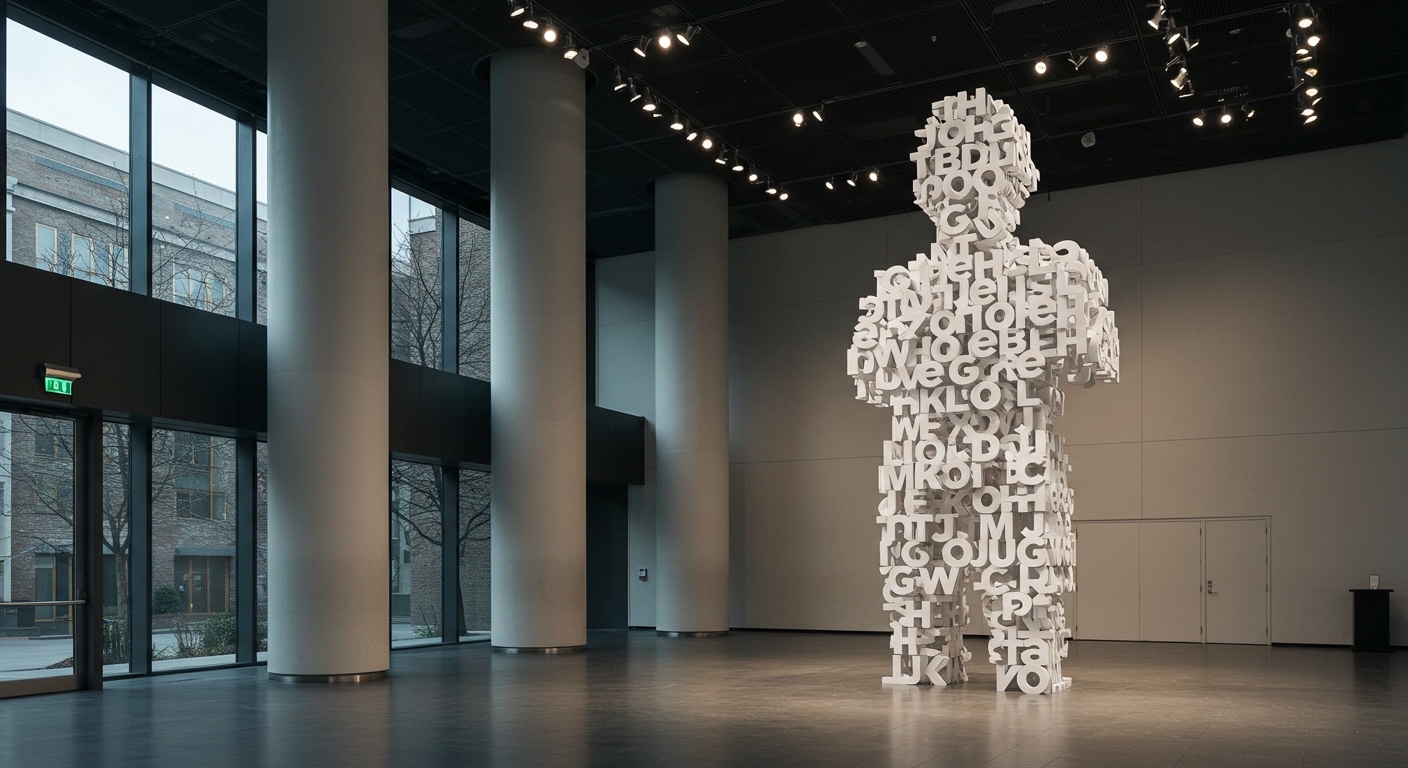
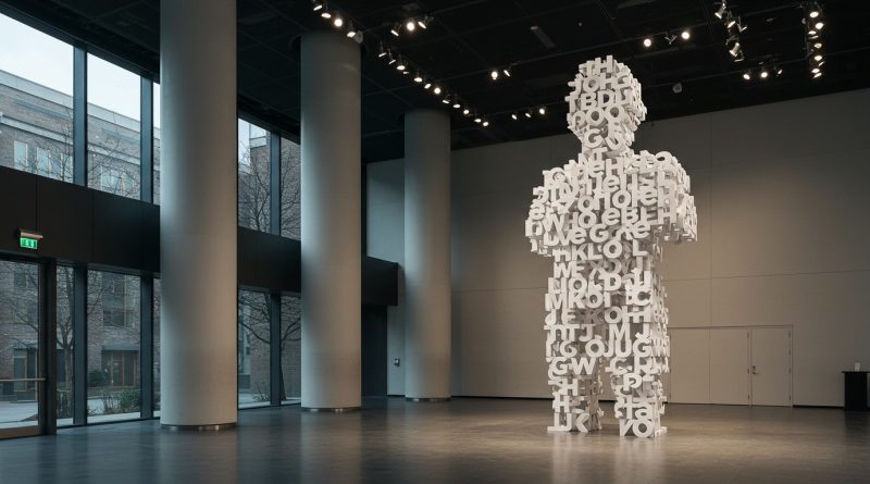
The Obama Presidential Center’s Words of Hope installation uses 458 oversized Gotham Bold letters to create an architectural experience.
A recurring pattern across recent design discussions is the active re-physicalization of collective memory and cultural identity, moving from abstract ideas into tangible, public forms. This is evident in projects that monumentalize historical narratives or re-contextualize cultural ephemera, using design to solidify or reinterpret shared experiences, often with a nostalgic undertone. These initiatives frequently involve a public display, whether through stamps, exhibitions, or architectural installations.
The Obama Presidential Center’s Words of Hope installation represents a significant public commissioning of typography. Its use of 458 oversized Gotham Bold letters transforms a speech into a permanent architectural experience. Conventional wisdom celebrates such projects as an elevation of typography to monumental status. However, this perspective overlooks a critical tension. While grand scale delivers immediate impact, it can simultaneously dilute the subtle legibility and micro-typographic considerations that define sophisticated textual communication. The emphasis on individual letterform recognition, often with highly legible sans-serifs, overrides the grid systems and typographic rhythm essential for reading comprehension at smaller scales. This approach leverages familiarity for iconic recognition rather than inviting a deeper interaction with the conceptual depth of the letterforms themselves.
The perceived “monumental moment” risks reducing typography to an ornamental rather than a functional or conceptual art within public spaces. When letters become architectural elements, their primary role shifts from encoding meaning through sequence and spacing to asserting presence through sheer mass. This prioritizes brand recognition and immediate visual impact over the intricacies of how type communicates nuanced thought. This editorial observes that this trend, while visually striking, can lead to a homogenization of public typographic expression, where a few robust typefaces are chosen for their unyielding forms, rather than for their specific narrative capabilities. By mid-2027, the industry will begin to see a counter-movement in public design commissions, focusing on responsive, context-aware typographic interventions that leverage environmental data to dynamically adapt conceptual letterforms, rather than relying solely on static, monumental display.
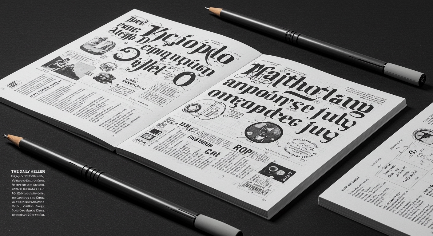
This current drive for large-scale, iconic typographic statements faces resistance from projects that prioritize intricate, human-scale narratives. The exhibition “Celebrating the Lost Tribe of Alphabet City,” for instance, blends humor, nostalgia, spirituality, and pop culture. Its focus on the particularity of “Maimonides meets the Grateful Dead as they both drink Dr. Brown’s soda” highlights a nuanced, human-scale conceptual letterform, which communicates complex, interlayered meaning rather than a simplified public statement. This embodies a resistance against the flattening effect of sheer scale.
Typography professionals should, this week, experiment with grid systems that permit dynamic micro-typographic adjustments based on user interaction or environmental conditions, particularly for digital displays that bridge into physical experiences. Rather than scaling a static design, explore responsive kerning, leading, and letterform variations that adapt to perceived distance or context, moving beyond fixed conceptual letterforms to fluid ones.
TL;DR
The trend towards monumental typography risks flattening conceptual depth for immediate visual impact, necessitating a professional re-evaluation of dynamic legibility and micro-typographic adaptability.
Curated References
About this editorial — This piece was developed using AI-assisted research and curation across multiple industry sources. All analysis, opinions, and predictions represent the editorial perspective of JHDD. Sources are linked in the references section above.