JHDD Packaging Report — 2026.07.04
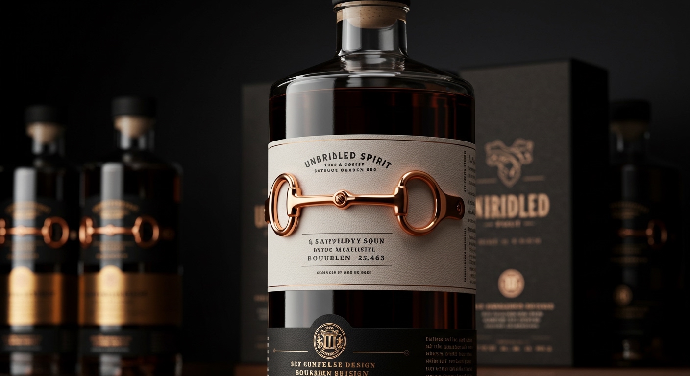
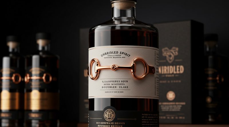
Unbridled Spirit’s bourbon employs a rose gold snaffle bit hardware piece as a core component of its packaging design.
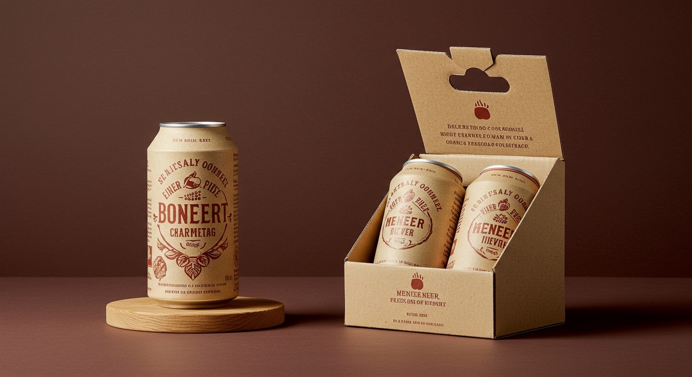
The examples in recent industry news illustrate a growing preference for packaging that actively subverts established category norms. This can be seen through the comic-strip aesthetics of Meneer Bommel or the high-fashion minimalism of Unbridled Spirit. This pattern signifies a strategic move beyond mere differentiation; it is about deliberately challenging consumer expectations at the point of purchase and initial interaction. This approach often leverages unique tactile elements and structural forms to redefine brand perception, fostering a deeper, more memorable engagement.
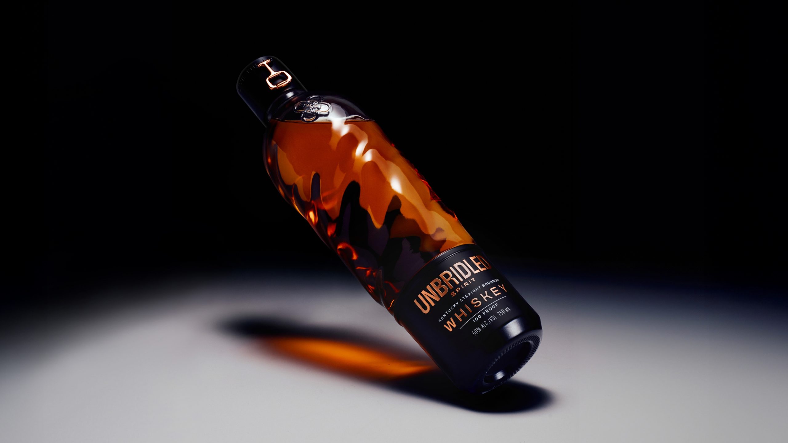
The design for Unbridled Spirit, by Holy Studio, showcases a deliberate rejection of traditional bourbon aesthetics, opting instead for a sculptural glass bottle and a matte black label that evokes luxury fashion. This approach, while visually striking, also heavily relies on tactile branding. The rose gold snaffle bit is designed to invite touch, signifying a departure from expected cues through its material interaction. This contradicts the mainstream industry opinion that radical departures from established category codes risk alienating consumers or confusing them on the shelf. Instead, when executed with precision and high material quality, such deliberate subversion can elevate perceived value and establish a unique, resonant brand identity that consumers actively seek out for its distinctive experience. The tactile quality of a custom bottle or a unique label finish communicates craftsmanship beyond what visuals alone can convey.
This strategic unorthodoxy extends beyond premium spirits. The recent refresh for Dukes Coffee by SODAA studio, for instance, chose restraint and a subtle, blind debossed wordmark in an otherwise visually cluttered coffee aisle. This tactile detail, a subtle impression instead of an overt statement, offers a sophisticated unboxing experience that builds anticipation and signals premium quality without relying on overt opulence. By mid-2028, this trend of deliberate anti-category design, particularly through innovative material finishes and unique structural forms that emphasize tactile engagement, will become a standard benchmark for brands aiming for authenticity and deeper consumer connection, not just in luxury sectors but also in everyday premium goods.
The primary resistance to this design philosophy comes from established supply chain inertia and cost-optimization imperatives prevalent in large-scale consumer packaged goods. Companies operating with standardized manufacturing processes and high-volume production often find custom tooling, specialized finishes, and atypical structural forms prohibitively expensive or logistically complex. The pressure to maintain competitive pricing and maximize shelf space efficiency often steers brands towards conventional packaging solutions that are readily available and scalable, even if they result in visual and tactile conformity.
A working packaging professional should conduct a detailed audit of their current product lines to identify one core visual or tactile convention specific to their category that could be intentionally inverted or subverted. This involves examining materials, finishes, structural forms, and opening rituals. The goal is to pinpoint an element that, when redesigned with an unexpected tactile or structural quality, could redefine the unboxing experience or shelf impact without compromising product integrity or brand clarity.
TL;DR
Strategic packaging design now actively redefines category norms through tactile innovation and structural novelty to forge deeper consumer connections.
Curated References


About this editorial — This piece was developed using AI-assisted research and curation across multiple industry sources. All analysis, opinions, and predictions represent the editorial perspective of JHDD. Sources are linked in the references section above.