JHDD Typography Report — 2026.06.22
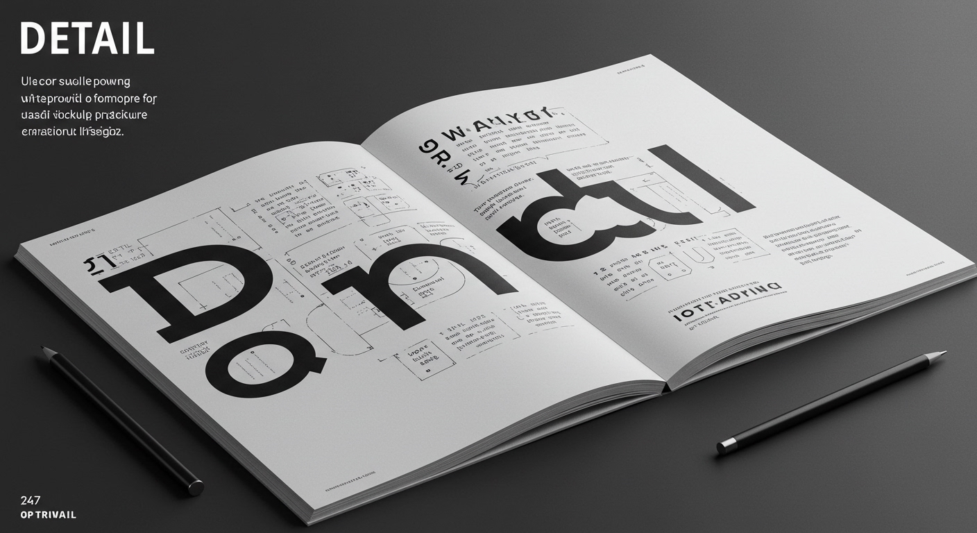
Detail, the new rounded typeface from PSTL, foregrounds subtle curves and clever deviations in its letterforms.
Recent observations, from Alex Wright’s exploration of American newspaper history to the Brooklyn Botanical Garden’s “Summer of Love” celebration, alongside the specific nuances of PSTL’s new typeface, indicate a shared focus. This pattern reveals an increasing interest in re-evaluating historical design practices and their inherent micro-typographical considerations, not merely as nostalgic revisitations but as functional precedents for contemporary digital typography. The shared thread is a deliberate, granular attention to form and historical context, rather than a sole pursuit of aesthetic novelty.
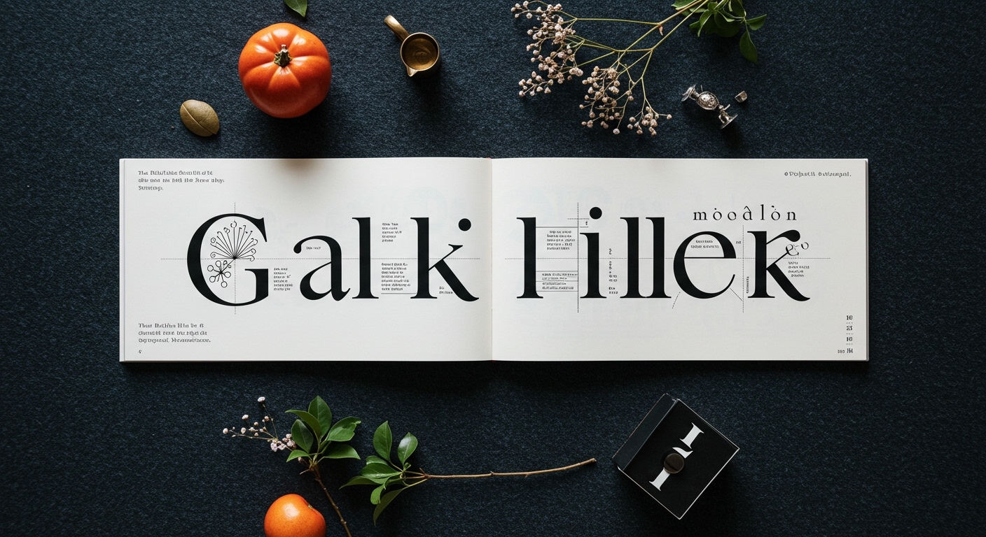
PSTL’s approach with “Detail” exemplifies a movement away from overtly expressive conceptual letterforms towards a more nuanced micro-typographical presence. Mainstream industry opinion frequently champions typefaces that declare their personality with immediate, bold gestures, often prioritizing a strong visual identity for branding and impact. However, the true legibility and conceptual depth of a typeface like Detail reside in its understated qualities. Its subtle curves and quiet mischief are not secondary features; they are the primary mechanisms through which its personality is conveyed, enhancing rather than hindering legibility in extended text. This challenges the conventional belief that a distinct type personality inherently demands overt visual cues or compromises readability.
This focus on minute details suggests a re-evaluation of how digital type interacts with grid systems and user perception. Instead of relying on a dominant visual theme, designers are exploring how slight alterations in counter-forms, stroke endings, or baseline shifts influence reading flow and semantic interpretation. Such granular attention refines the overall visual economy of text. By mid-2027, the industry will see a measurable shift in how type families are marketed and adopted, with greater emphasis placed on their capacity for adaptable micro-typographical adjustments across diverse digital platforms, rather than on their initial stylistic shock value.
This deeper engagement with micro-typography is resisted by current pressures in digital product design, which often prioritize immediate visual impact and scalability. The rapid iteration cycles in user interface development and corporate branding frequently overlook the long-term benefits of finely tuned character details. The broad deployment of readily available typefaces, selected for quick visual recognition, contrasts with the meticulous, iterative work required to optimize subtle letterform nuances for consistent legibility and conceptual alignment across diverse digital interfaces. The fleeting nature of content, similar to the description of “graphic ephemera” postage stamps, also encourages a casual treatment of grid systems and character-level precision.
A working typography professional should dedicate time this week to examining a recently published digital typeface, not for its macro-level stylistic features, but specifically for its micro-typographical details. Focus on the subtle variations in counter shapes, the terminals of strokes, and the consistency of optical adjustments across different weights and sizes. Then, intentionally apply it within a strict grid system, observing how these micro-details influence text flow and visual hierarchy, rather than merely using it as a decorative element. This practice trains the eye to recognize and utilize the full potential of type beyond its immediate visual appeal.
TL;DR
The typographic landscape prioritizes subtle, historically informed micro-details over loud design gestures for enhanced legibility and conceptual depth.
Curated References
About this editorial — This piece was developed using AI-assisted research and curation across multiple industry sources. All analysis, opinions, and predictions represent the editorial perspective of JHDD. Sources are linked in the references section above.