JHDD Typography Report — 2026.06.21
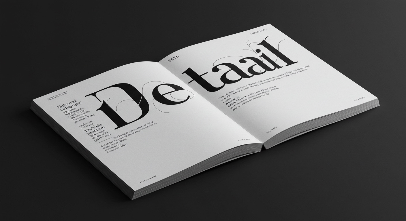
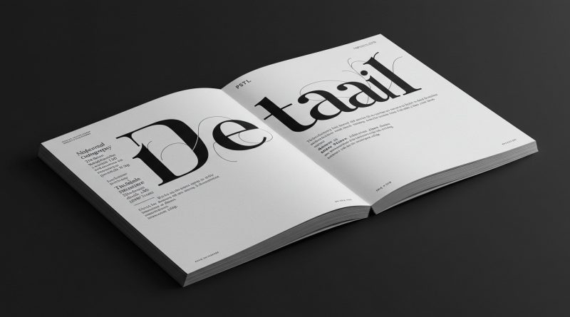
PSTL’s new typeface, Detail, showcases personality through subtle curves rather than overt design gestures. This specific emphasis on nuanced form echoes a broader, less discussed shift in how typographic communication gains resonance in contemporary media. The “Summer of Love” celebration at the Brooklyn Botanical Garden, Alex Wright’s examination of the American newspaper’s history, and the continued fascination with postage stamps all reflect an increasing valuation of specific, historically grounded, and detail-rich graphic communication. This emergent pattern favors concentrated meaning derived from limited canvases or established forms, emphasizing unique character over generic accessibility.
Analysis of this pattern reveals a quiet refutation of widely held industry assumptions regarding legibility and user engagement. Mainstream typographic discourse frequently prioritizes universal legibility, often equated with maximum immediate scan-ability achieved through highly neutral, minimalist sans-serif forms. The prevailing belief suggests that stripping away distinctive traits accelerates comprehension across diverse platforms and user abilities. However, typefaces like PSTL’s Detail challenge this by proving that minor conceptual letterform deviations, such as a “quiet sense of mischief” in its curves, can significantly deepen engagement and memorability. This approach suggests that true legibility extends beyond mere recognition; it encompasses a connection built through distinctiveness. A typeface that gently asserts its character can embed itself more firmly in a reader’s memory, fostering a unique reading experience rather than simply facilitating information transfer.
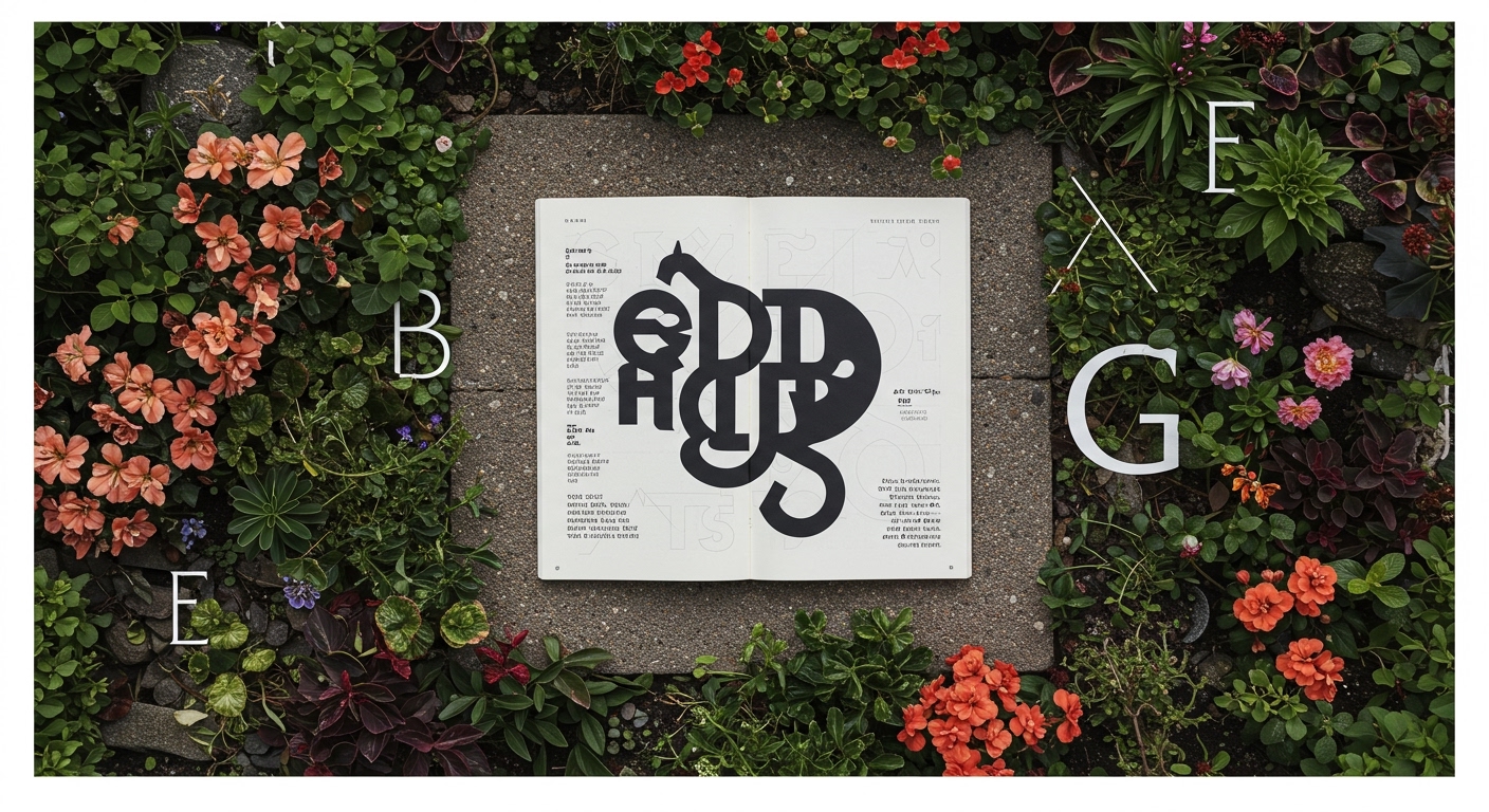
This subtle expressiveness, rooted in meticulous micro-typography, points to an evolution in design priorities. Where once “invisible” typography was celebrated as the ultimate goal for seamless reading, there is now a growing appreciation for type that subtly makes itself known. It acknowledges the cognitive reality that distinction aids recall, and a memorable form can be more effective than a perfectly neutral one in a saturated visual environment. By mid-2027, this trend will lead to a notable increase in corporate branding systems integrating bespoke micro-typographic details and custom character sets into their digital guidelines, moving beyond the current reliance on generic geometric sans-serifs to differentiate themselves.
The primary opposing force to this development remains the infrastructure of scalable digital content delivery. Default operating system fonts, automated content management systems, and the imperative for cross-platform, multi-language compatibility often mandate the use of highly generalized, lowest-common-denominator typefaces. This prioritization of technical efficiency and global uniformity frequently overrides the nuanced, detail-oriented design choices that contribute to a typeface’s specific character. Corporations prioritizing rapid deployment and minimal overhead often resist the perceived complexities of integrating highly customized typographic expressions into their vast digital ecosystems.
Typography professionals should immediately begin advocating for dedicated kerning tables and stylistic alternates as standard requirements within their grid systems and brand style guides, particularly for web and application interfaces. Rather than accepting system defaults, designers must actively demonstrate how precise micro-typographic adjustments enhance both brand identity and long-term user recognition, directly linking these details to business objectives like engagement metrics and brand recall. This involves presenting the conceptual value of subtle letterform personality, not just its aesthetic appeal, to clients and developers.
TL;DR
Typographic specificity, even in micro-details, drives engagement beyond basic legibility.
Curated References
About this editorial — This piece was developed using AI-assisted research and curation across multiple industry sources. All analysis, opinions, and predictions represent the editorial perspective of JHDD. Sources are linked in the references section above.