JHDD Typography Report — 2026.06.17
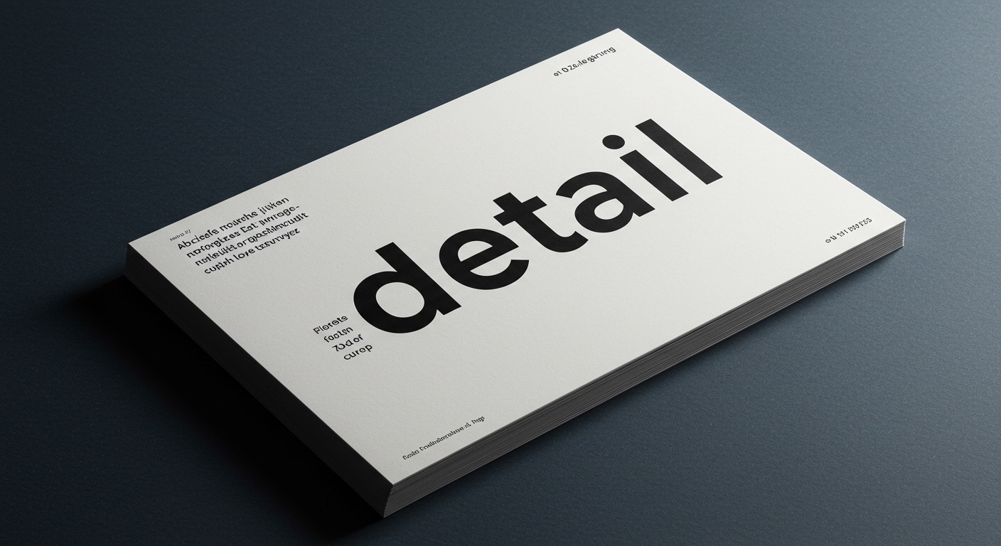
Detail, a new rounded typeface from PSTL, achieves its personality through subtle curves.
The recent industry dialogue, as seen across PRINT Magazine’s coverage, points to a reappraisal of what constitutes impactful typographic design, echoing the enduring principles of designers like Paul Rand. It is not always the grand visual statement but often the precise, almost imperceptible adjustments that define a brand’s voice or a typeface’s character. This trend highlights a renewed focus on micro-typography and the nuanced interplay of form and function over overtly conceptual gestures, suggesting a return to foundational principles of legibility and systemic coherence.
The refresh for KFC by JKR exemplifies this shift, emphasizing “bold typography” alongside the brand’s iconic bucket. While mainstream branding discussions often laud dramatic visual overhauls, the KFC project suggests a different pathway: leveraging foundational typographic principles with a refined hand. Boldness here does not imply shouting, but rather a confident application of form that reasserts brand identity through clarity and recognition. This approach prioritizes immediate comprehension and subconscious familiarity, ensuring that the brand’s typographic elements maintain optimal legibility across diverse applications, from large-format signage to digital interfaces. It represents a considered integration within a wider visual grid, rather than a standalone expressive element, avoiding the need for viewers to decode an overly conceptual letterform.
This aligns with the ethos suggested by PSTL’s Detail typeface, where personality emerges from “clever deviations” rather than aggressive stylistic choices. A common industry misconception dictates that conceptual letterforms must push boundaries visibly, often at the expense of pure legibility or strict grid adherence. However, Detail demonstrates that sophisticated micro-typography can imbue character while maintaining readability, a critical factor for ubiquitous brand applications. The “quiet sense of mischief” described by PRINT Magazine highlights how subtle adjustments to stroke terminals, counter shapes, and character widths can communicate distinctiveness without sacrificing clarity or disrupting the underlying grid system. These micro-typographic decisions ensure optical balance and consistent gray value, making the typeface feel cohesive and effortless to read. This suggests that by mid-2027, clients will increasingly demand type solutions that offer both unique personality and unimpeded legibility, shifting emphasis from purely expressive typefaces to those that master the subtle art of functional distinction.
This careful, detail-oriented approach directly counters the relentless demand for instant virality and disruptive aesthetics driven by social media feeds and quick content consumption models. Platforms that prioritize immediate visual impact often reward superficial novelty, pushing designers toward hyper-expressive conceptual letterforms or grid-defying layouts that prioritize shock value over sustained legibility and systemic integrity. This pressure encourages a “louder design gestures” mentality, creating a visual noise that ultimately fatigues the audience and erodes effective communication, forcing designers to chase fleeting trends rather than build enduring typographic systems.
A working typography professional should dedicate time this week to meticulously analyze the micro-typography of a familiar client project, specifically scrutinizing character spacing, optical adjustments for common kerning pairs, and the subtle interplay of ascenders and descenders in headline and body text. Focus on identifying three specific points where minor adjustments to tracking, leading, or individual letterforms could enhance overall legibility or refine the visual voice without altering the core typeface or overriding the established grid structure. Implement these adjustments on a small test sample and observe the perceptible improvement.
TL;DR
Effective typography prioritizes refined micro-detail and subtle character over loud conceptual gestures for enduring legibility and brand distinction.
Curated References
About this editorial — This piece was developed using AI-assisted research and curation across multiple industry sources. All analysis, opinions, and predictions represent the editorial perspective of JHDD. Sources are linked in the references section above.