JHDD Branding Report — 2026.06.18
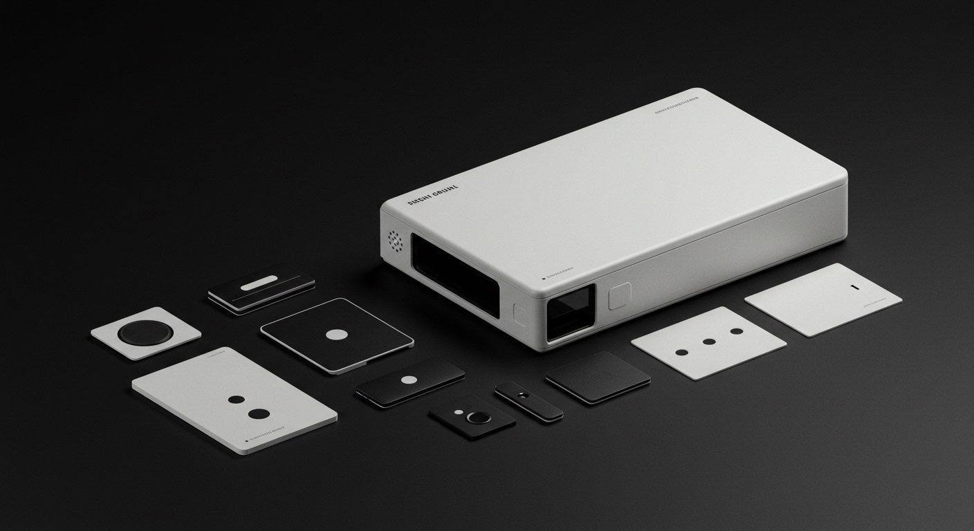
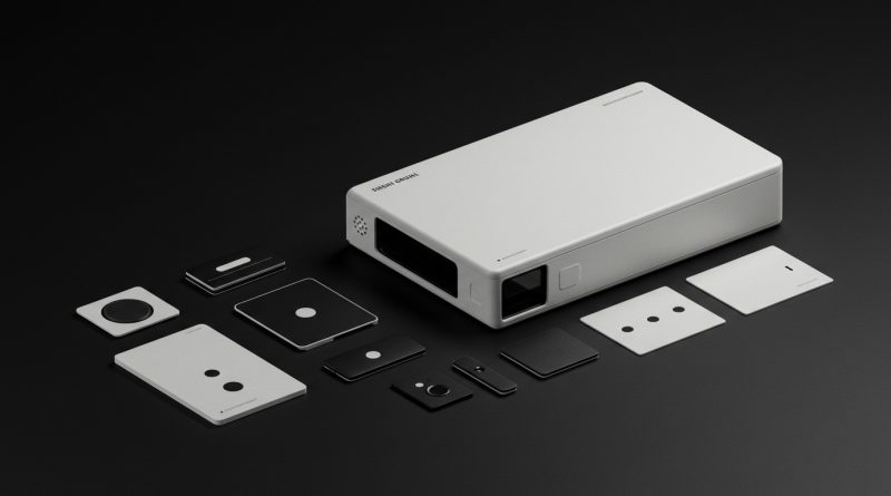
Studio Gruhl’s brand identity for Rerun aims to help users “see what robots see.”
This approach reflects a broader shift where brand identities are no longer solely about recognition or differentiation. They are becoming complex interpretive systems, designed to make abstract concepts, multi-modal data, or even sensitive human experiences culturally legible and emotionally resonant. Whether it is translating robotic data streams into relatable visual cues, as seen with Rerun, or reframing a challenging personal journey like hair loss, as with Leo, these identities function as active translators, making the intangible tangible and offering new modes of understanding.
Consider Studio Gruhl’s work for Rerun, a unified data layer for physical data used in robotics. The brand identity is described as “Global Hypercolour-esque,” intending to convey the platform’s ability to offer a novel perspective on complex data. Mainstream industry opinion often dictates that B2B tech branding should prioritize a sense of stability, authority, and functional clarity, frequently leading to conservative, modular visual systems. However, Studio Gruhl’s approach for Rerun contradicts this by embracing a dynamic, almost sensorial aesthetic that positions the brand not just as a tool, but as a new lens through which to perceive reality. This moves beyond merely communicating features to actively simulating an experience of understanding.
The Rerun identity system is not simply decorating a product; it is embodying the product’s core promise of perception. This signals a strategic pivot in brand equity building. Instead of building trust primarily through established visual tropes, these identities build equity through their inherent capacity to explain or reframe complex propositions. This suggests that within the next two years, we will observe a significant increase in B2B tech and service brands investing in visual identity systems that are designed to be explicitly experiential and interpretive, rather than just declarative. These systems will function as demonstrable interfaces for the very value proposition they represent.
The primary resistance to this evolution comes from entrenched corporate design guidelines and the risk aversion prevalent in large organizations. Many established brands and their legal teams often prioritize static, easily codified visual systems that focus on trademark defensibility and uniform application across all touchpoints, often at the expense of interpretive dynamism.
A working branding professional should immediately shift their strategic intake process. Rather than asking “What do you want to communicate?” or “What emotion should this evoke?”, they should probe, “What fundamental perception or understanding problem does your offering solve, and how can the visual system itself embody that solution?” This involves moving beyond surface aesthetics to deeply integrate the brand’s core function into its visual language.
TL;DR
Brand identities are evolving from mere identifiers to sophisticated interpretive frameworks that make complex ideas accessible.
Curated References
About this editorial — This piece was developed using AI-assisted research and curation across multiple industry sources. All analysis, opinions, and predictions represent the editorial perspective of JHDD. Sources are linked in the references section above.