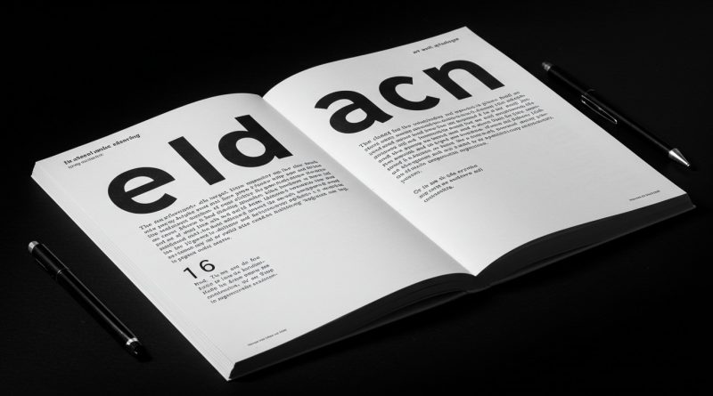
JHDD Typography Report — 2026.06.13
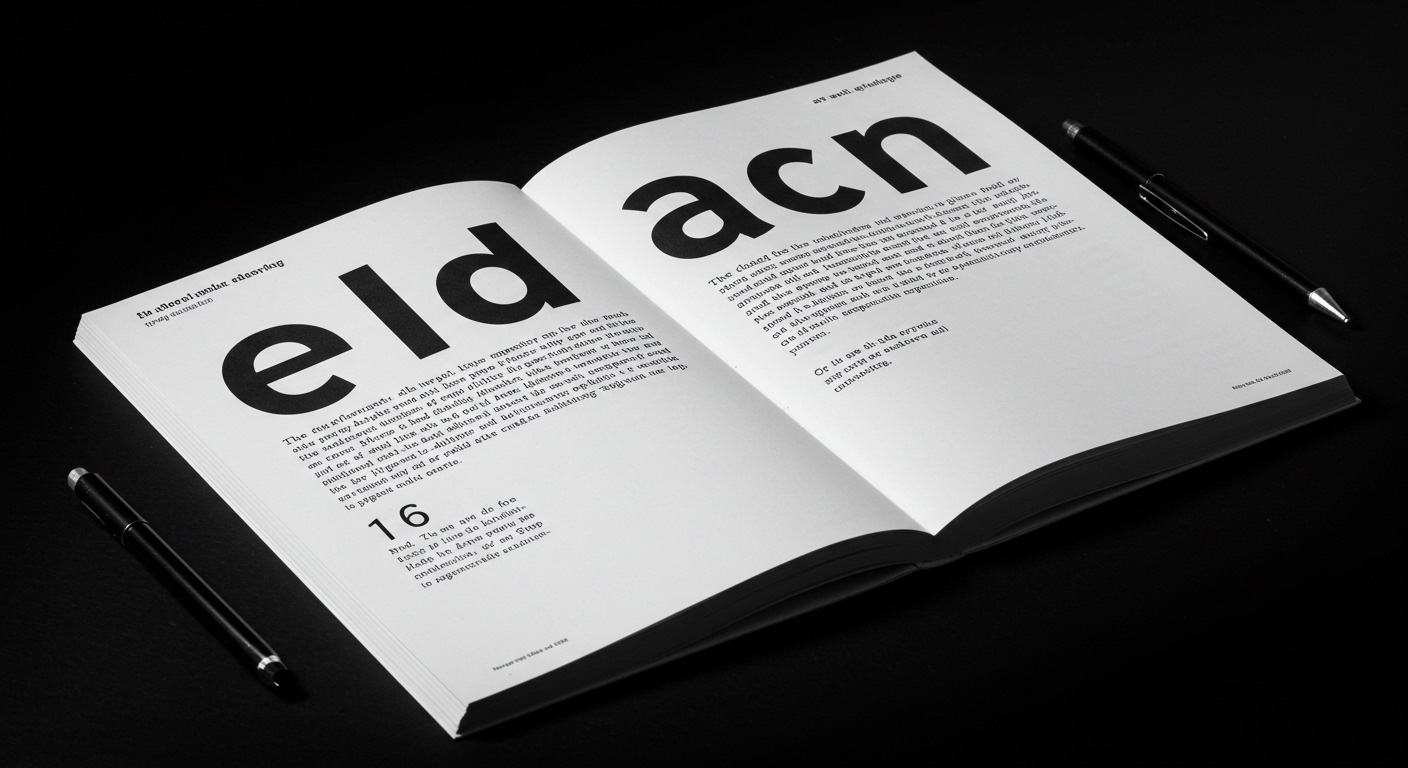
The resurgence of the monospaced typeface is not merely a stylistic whim but a coded signal of design’s impending return to rigorous craft.
Across these disparate discussions—the enduring appeal of focused, compact publications, the nuanced identity work for artisanal brands, the legacy of influential design journals, and the tactile artifacts of industrial marking—a singular, underlying current emerges: a collective, almost subconscious, yearning for legible, conceptual rigor in an increasingly ephemeral digital landscape. This isn’t a movement towards retro aesthetics; it’s a deep-seated reaction against the commodified, trend-driven churn of contemporary design, a demand for substance over fleeting visual noise. The signal is the growing reverence for the object, the carefully considered artifact, and the enduring power of legible communication.
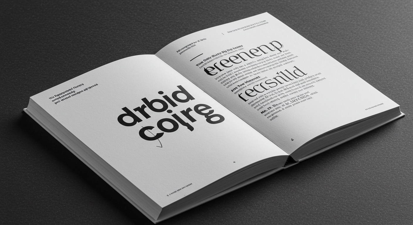
The gravitational pull back towards clarity and conceptual depth is undeniable. Brands like SSStudio, with their meticulous approach to the Adonna Wines identity, demonstrate an understanding that true prestige lies not in overt ostentation but in the subtle articulation of heritage and craft. Their work, eschewing the current deluge of flashy, animated logos, opts instead for a deliberate typographical language grounded in legible forms and a restrained grid. This is a direct refutation of the prevailing industry opinion that brands must constantly chase the latest digital-native trend to remain relevant. In truth, the most enduring brands are those that can distill complex narratives into universally understandable typographic expressions. The deeper the conceptual bedrock, the less susceptible the design is to the whims of fleeting aesthetics. We will see by late 2025 a significant portion of established digital-first brands re-evaluate their entire visual lexicon, prioritizing legibility and conceptual integrity over rapid iteration, spurred by a quiet but potent backlash against the visual fatigue induced by current trends.
This shift, however, is not without its friction. The established agencies, heavily invested in rapid-turnaround, template-driven design solutions for a broad, undifferentiated market, represent the primary counterforce. Their business models are predicated on volume and a superficial engagement with design trends, making the pivot towards deep conceptual work and meticulous typographic execution a significant operational and financial challenge. This tension highlights the widening chasm between design as a craft practiced with intention and design as a commodity produced at scale. The resistance comes from a system built on speed and breadth, not depth and precision.
For a working Typography professional, the actionable takeaway this week is to actively seek out and dissect the micro-typographic decisions within these “little books,” brand identities rooted in heritage, and historical ephemera. Examine how the chosen typeface interacts with its surrounding grid, the precise kerning that imbues letters with conceptual weight, and the subtle variations in leading that shape the reader’s experience. Move beyond the analysis of macro-form and embrace the granular details that define truly legible and conceptually rich communication.
TL;DR
The design industry’s embrace of monospaced typography signals a critical return to legibility and conceptual depth, pushing back against superficial digital trends.
Curated References
About this editorial — This piece was developed using AI-assisted research and curation across multiple industry sources. All analysis, opinions, and predictions represent the editorial perspective of JHDD. Sources are linked in the references section above.