JHDD Branding Report — 2026.08.07
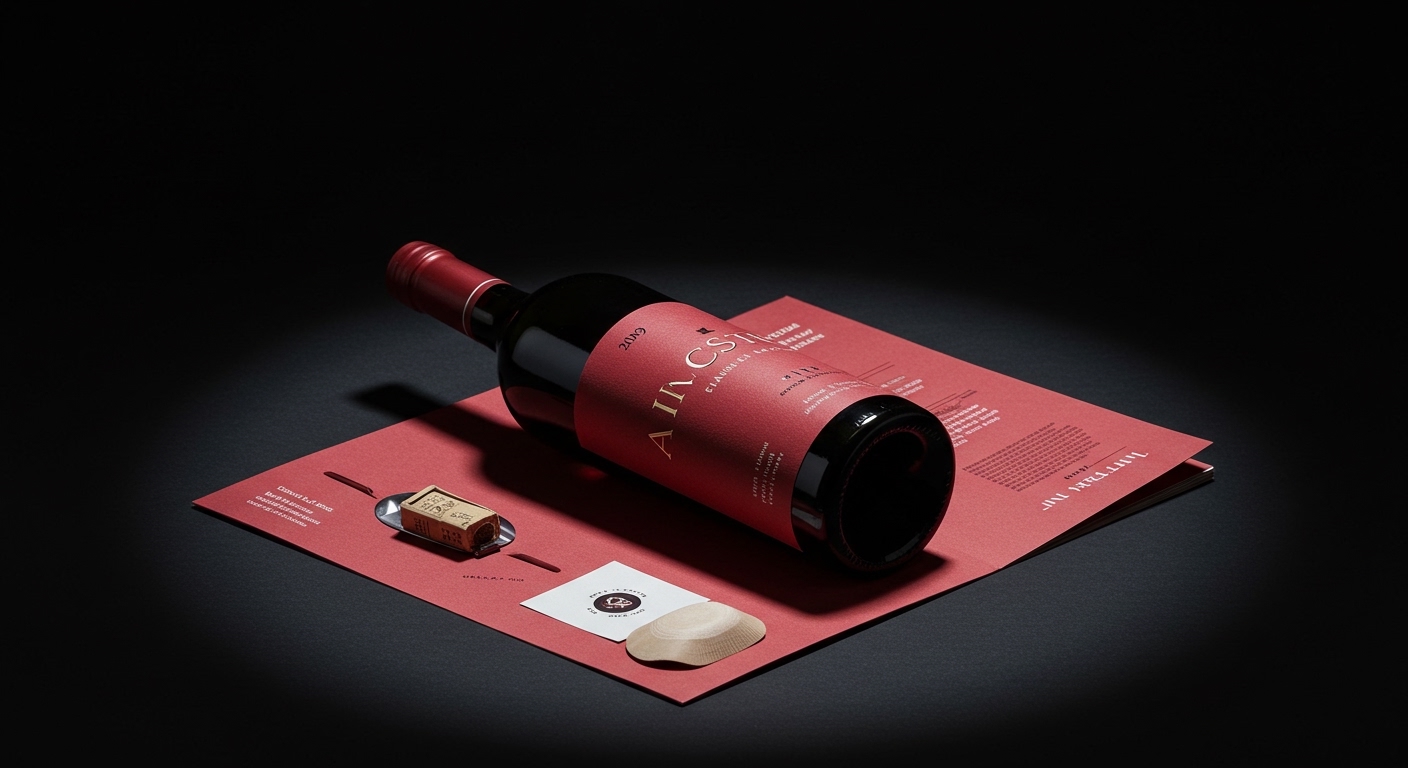
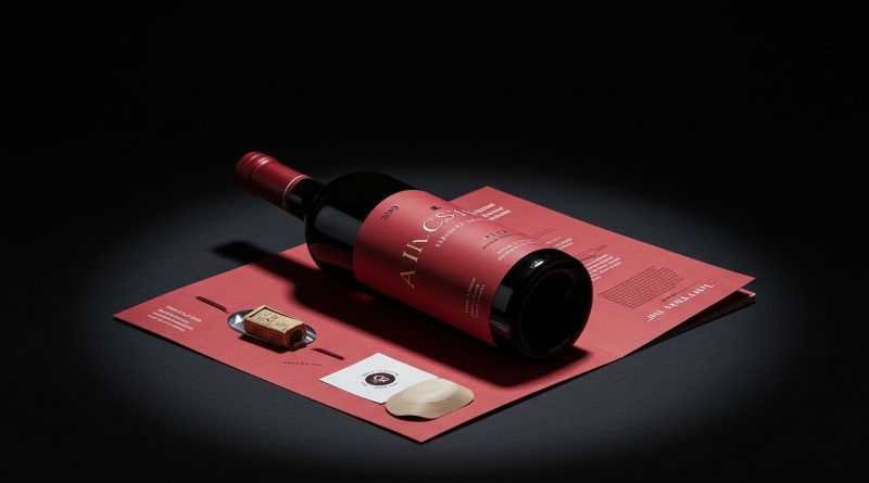
All Purpose ditched traditional wine clichés for Ancestrel’s lurid new identity, using a visual language far removed from typical vineyard imagery. This specific design choice for the natural wine importer, alongside other recent strategic shifts, illustrates a precise new challenge for brand equity: mastering the art of the highly calibrated signal.
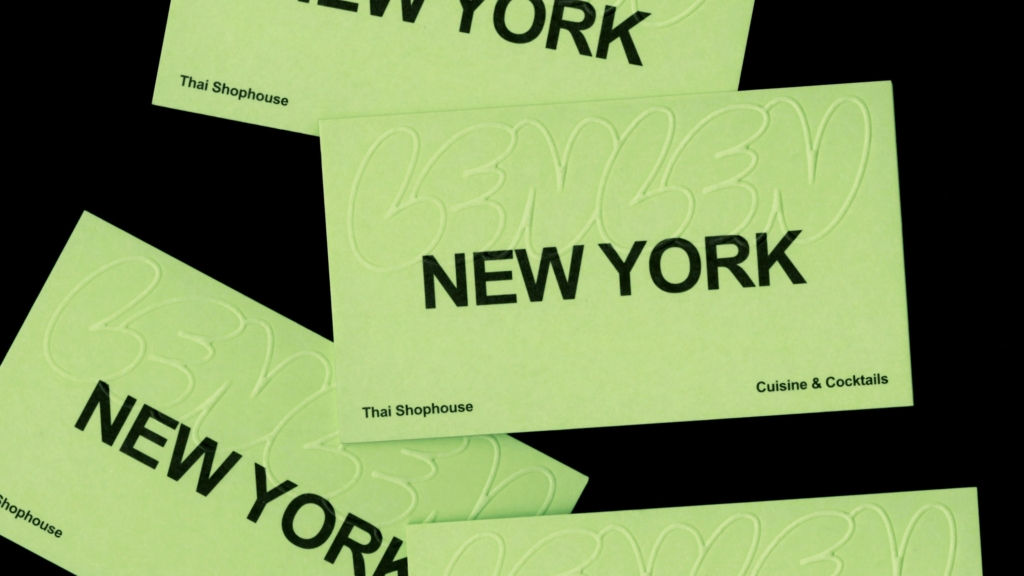
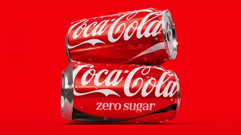
The common thread through these diverse brand strategies is a sophisticated calibration of visibility. Whether through Pentagram’s “controlled chaos” for LenLen or JKR’s near-invisible adjustments for Coca-Cola, brands are navigating a precise line between standing out and standing firm. This is not about being loudly disruptive or quietly consistent, but about understanding where to amplify a specific message and where to subtly reinforce core values. It represents a strategic move away from generic distinctiveness towards a targeted resonance within specific cultural pockets or existing brand equity.
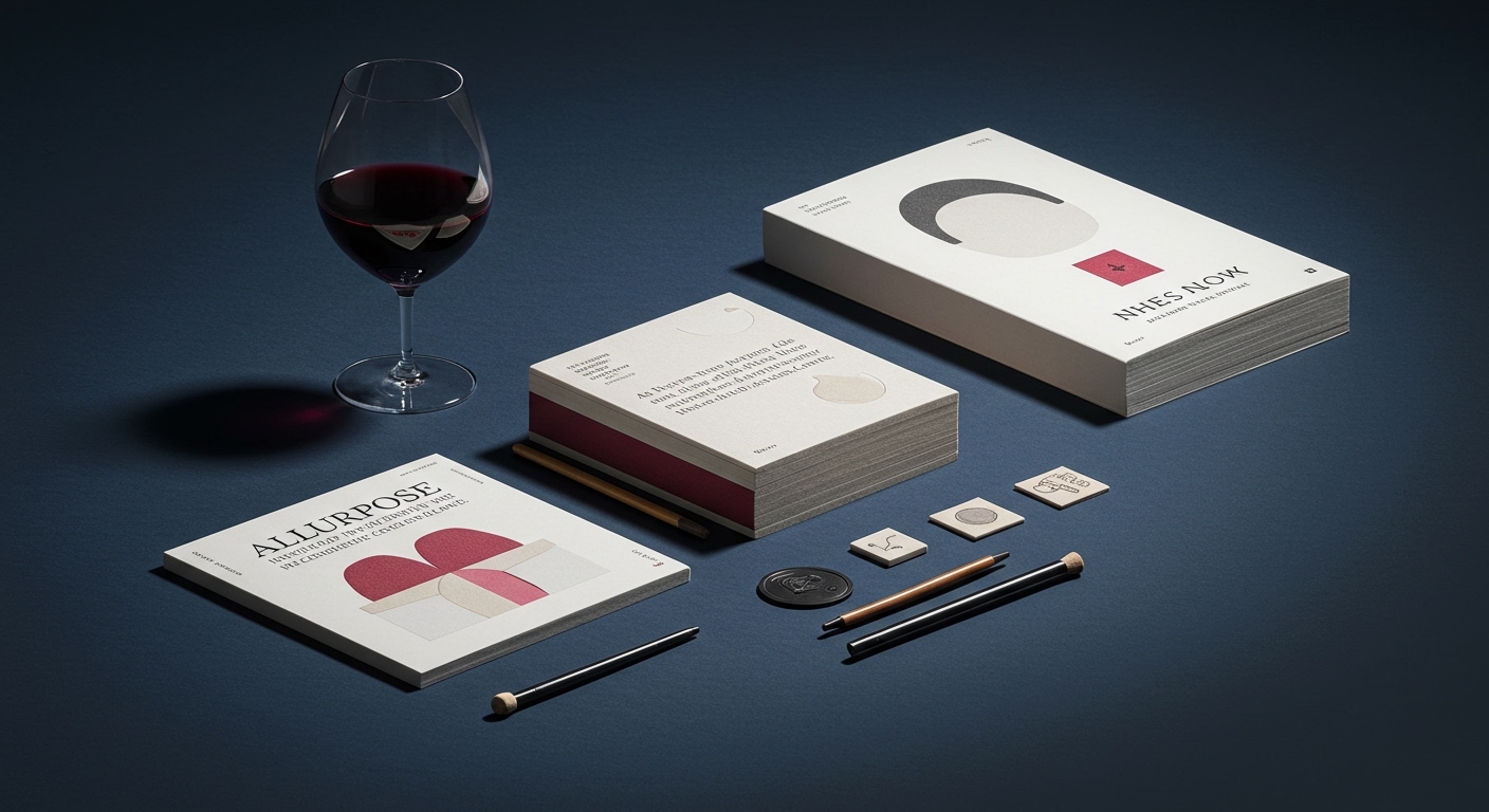
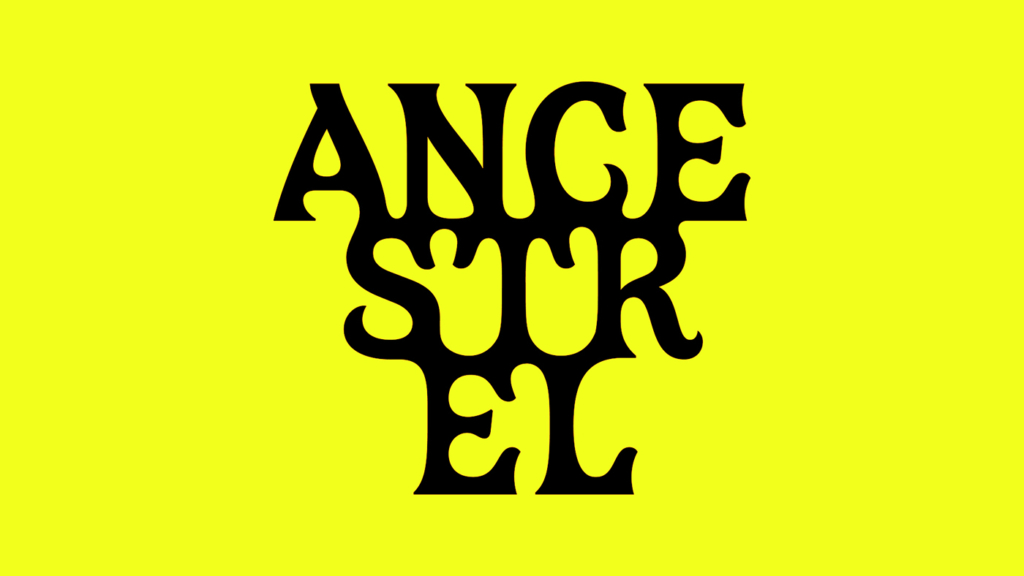
Ancestrel, the UK’s first natural wine importer, used a “lurid” identity designed by All Purpose to distinguish itself. This deliberately non-traditional approach rejects the expected visual codes of the wine industry, which often lean on heritage, terroir, and aspirational luxury. Its choice of an unconventional aesthetic signals an insider’s understanding of its target audience, who likely value authenticity and disruption over conventional prestige. The brand’s identity itself becomes a cultural signal, affirming its specific market position without needing to explain it broadly.
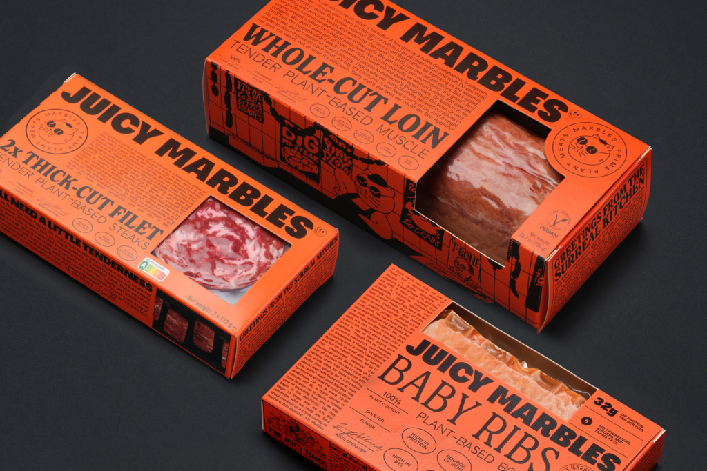
Mainstream industry opinion often prioritizes universal appeal or clear category signaling, advocating for designs that instantly communicate what a product is to the widest possible audience. However, the success of Ancestrel’s “lurid” identity, like Ljudje’s work for vegan meat brand Juicy Marbles in avoiding the “sad snack” trope, suggests the opposite: that strategic opacity or even deliberate friction in visual identity can build stronger brand equity with a specific, engaged audience. Rather than aiming for immediate decipherability, these brands cultivate a visual language that rewards cultural fluency, fostering a sense of belonging among consumers who “get it.” This creates a more robust, loyal base than broad, shallow appeal ever could. Brands that master this nuanced approach will see significantly higher engagement, leading to increased market share among their desired demographics by mid-2028.
This trend meets resistance from risk-averse marketing departments and clients fixated on immediate market comprehension and broad, quantifiable reach. Those who equate brand visibility with ubiquitous recognition often struggle to embrace identities that deliberately narrow appeal in favor of deep cultural resonance, fearing alienation of potential customers or misunderstanding from mainstream audiences. This opposition prioritizes safety and established visual tropes, often overlooking the diminishing returns of generic differentiation.
Branding professionals should spend less time on broad market surveys for visual identity decisions and more time performing ethnographic observation within niche cultural communities relevant to their client’s actual and desired audience. Understanding specific visual vernaculars, anti-trends, and in-group codes allows for the development of identities like Ancestrel’s or LenLen’s that feel authentic and deeply embedded, rather than merely applied. This means moving beyond demographic data to cultural anthropology.
TL;DR
Effective brand identities increasingly achieve distinctiveness by signaling cultural fluency rather than universal legibility.
Curated References
About this editorial — This piece was developed using AI-assisted research and curation across multiple industry sources. All analysis, opinions, and predictions represent the editorial perspective of JHDD. Sources are linked in the references section above.