JHDD Interior Report — 2026.06.08
The persistent desire for unapologetic chromatic dialogue within otherwise disciplined spatial frameworks signals a maturing understanding of sensory engagement.
Across seemingly disparate typologies – from office environments seeking unifying visual anchors to retail spaces emulating geological tactility, and residential renovations embracing playful functional accents – a discernible pattern emerges: the deliberate infusion of specific, saturated chromatic accents into otherwise neutral or historically-referenced palettes. This isn’t mere decoration; it’s a calculated deployment of colour as a sophisticated architectural element, a deliberate strategy to modulate human flow and create micro-atmospheres within larger volumes. The underlying force is a quest for “chromatic resonance,” where carefully chosen hues act as mnemonic devices, guiding perception and enhancing the tactile and emotional experience of a space.
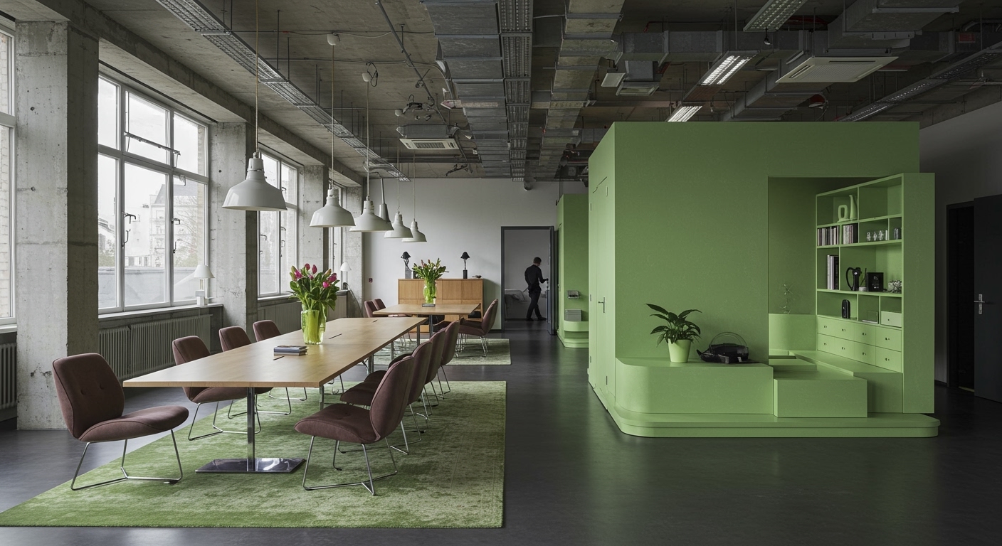
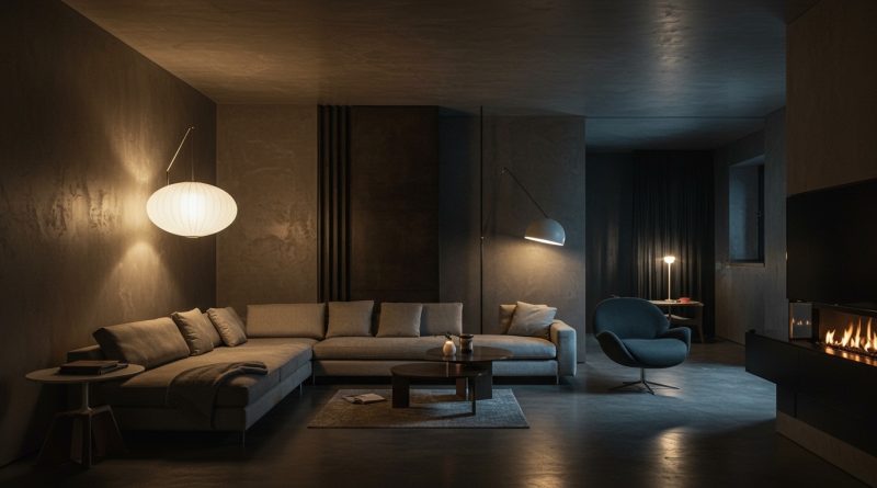
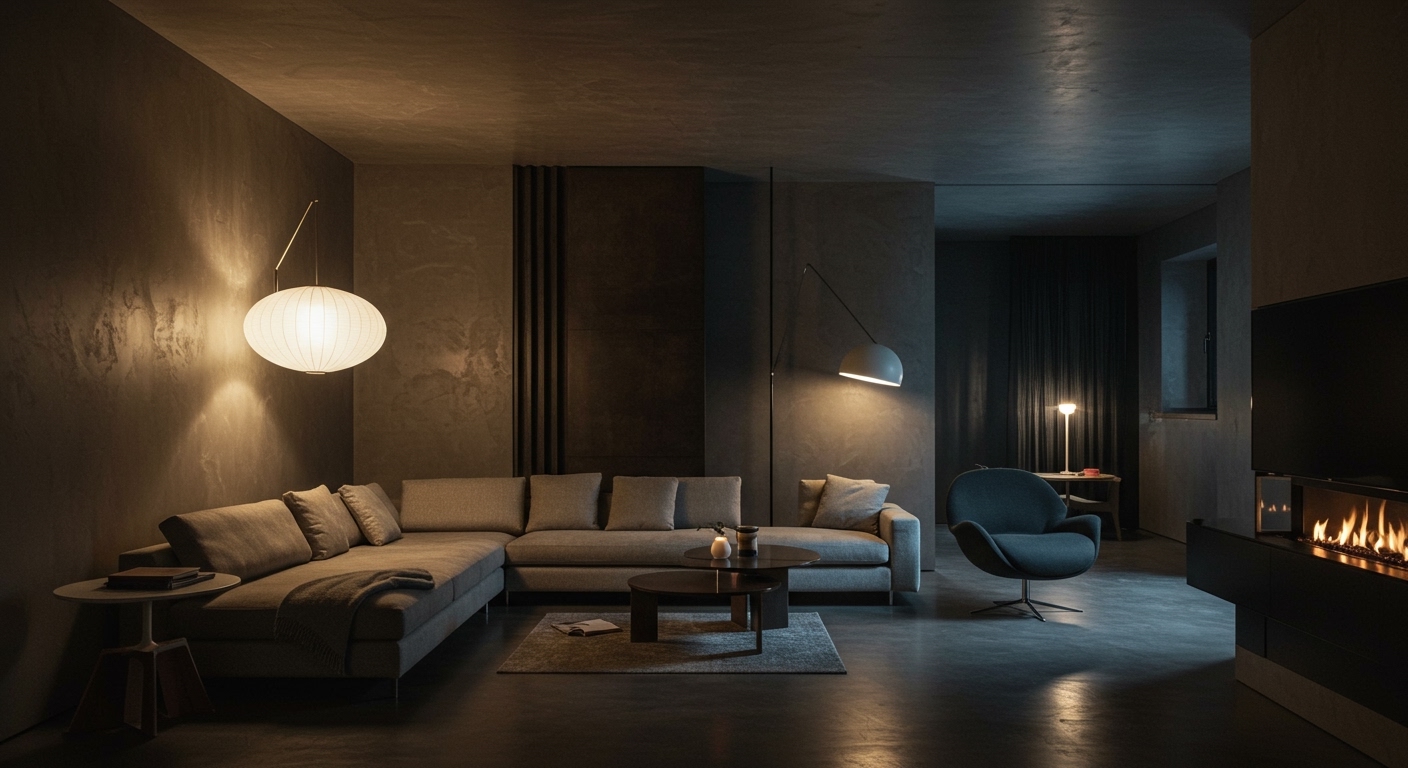
This phenomenon moves beyond the superficial trends of accent walls or pop-art furnishings. It’s a deep dive into how colour can engineer a spatial narrative. Consider the work of Esrawe + Cadena for Xinú Oaxaca showroom. Their use of basalt, a dark, matte volcanic rock, creates an immediate tactile impression, but the true genius lies in the potential for judiciously placed, perhaps a deep, earthy ochre or a vibrant, mineral-infused turquoise, to draw the eye along a curated path, emphasizing the transition from exterior courtyard to intimate fragrance discovery. This approach prioritizes the sensorial journey, a far cry from the sterile, colour-averse minimalism that dominated early 2010s commercial design. Conventional wisdom might suggest that such bold chromatic interventions risk alienating a broad audience or dating the design prematurely. However, a veteran designer understands that the power lies not in ubiquity, but in precision and context. The strategic application, like the pistachio green in ASKA’s office, acts as a subliminal conductor of attention and mood, unifying disparate zones and imbuing them with a distinct, memorable character. The prediction here is that by late 2026, this sophisticated use of chromatic resonance will become a standard expectation, moving from a “wow factor” to a fundamental design tool, particularly in hospitality and retail.
The friction arises from a lingering adherence to a more subdued, historically-bound materiality. The desire to emulate the “glamour and sophistication” of the 1920s, as seen in the Nice Projects cinema, can often lead to an over-reliance on predictable period motifs and a timidity in introducing contemporary chromatic vitality. This tension reveals a broader industry struggle: the comfort of established aesthetics versus the imperative of innovative sensory engagement. The former risks creating spaces that feel like curated museum pieces, devoid of contemporary life, while the latter, if executed poorly, can feel jarring and ephemeral. The true mastery lies in finding the dialogue between the past and the present, allowing colour to bridge that gap without compromising the integrity of either.
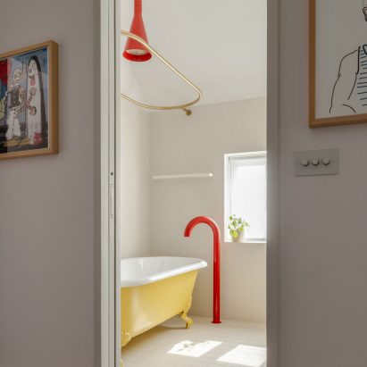
For the working interior professional, the takeaway this week is to re-evaluate the role of colour beyond its aesthetic contribution. Instead of viewing a colour swatch as a finishing touch, engage with it as a spatial director. Conduct a material and colour audit of upcoming projects, specifically identifying opportunities to imbue the space with a resonant hue that guides human flow, enhances tactile discovery, or creates a subtle emotional anchor. This means understanding that a saturated tap in a bathroom isn’t just fun; it’s a focal point that can dictate the entire spatial experience of that small, yet crucial, zone.
The deliberate use of saturated colour is now integral to engineering sophisticated spatial experiences.
Curated References




About this editorial — This piece was developed using AI-assisted research and curation across multiple industry sources. All analysis, opinions, and predictions represent the editorial perspective of JHDD. Sources are linked in the references section above.