JHDD Typography Report — 2026.06.28
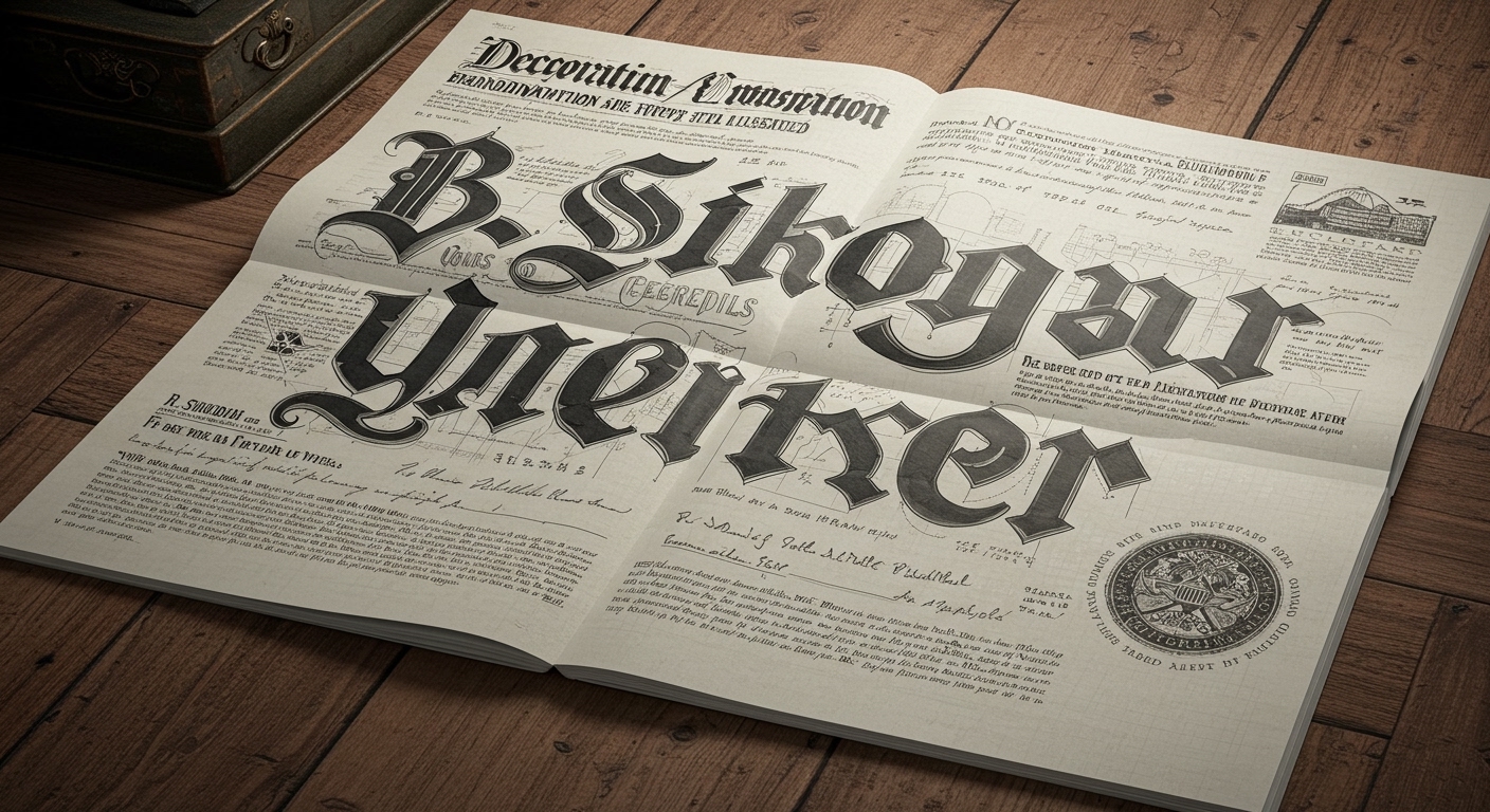
R. Sikoryak’s ‘Declaration / Emancipation Illustrated’ presents enduring American documents through a comics blend.
The disparate reports, from PRINT Magazine’s commitment to independent design journalism to the policy discussions at the Sustainable Brands Conference 2026, reveal a collective re-evaluation of how human authorship and historical context imbue contemporary design with meaning. This extends beyond mere visual style to structural integrity and perceived trustworthiness, challenging an industry often driven by sterile optimization. The threads connecting Gabi Campanario’s global Sketcher Fest and Love & War’s branding for Shaver Hall suggest a renewed appreciation for design elements that carry a visible trace of their origin and heritage, demanding a more nuanced approach to legibility and visual systems.
R. Sikoryak’s ‘Declaration / Emancipation Illustrated’ exemplifies a prevailing undercurrent where conceptual letterforms are no longer merely decorative or expressive, but fundamentally functional in conveying layers of meaning. His work demonstrates how the visual language of comics, with its inherent kineticism and character-driven typography, can recontextualize foundational texts without sacrificing their gravitas or clarity. This approach deliberately deviates from the widespread industry belief that optimal legibility is solely achieved through maximal simplicity, uniformity, and adherence to sterile typographic conventions. Instead, Sikoryak’s method suggests legibility gains depth when it is emotionally and historically resonant, even if it requires a more active engagement from the reader. The visual texture of hand-drawn or historically inflected letterforms, applied with a master typographer’s sensitivity, can foster a deeper connection and comprehension than purely optimized digital typefaces, which often trade character for universal blandness. This reinterpretation argues that true legibility encompasses not just quick recognition, but also the enduring retention and nuanced understanding of information.
This trend is not a nostalgic retreat, but a strategic re-engagement with the artisanal and the authentic as a counterpoint to algorithmic design. Typography professionals frequently prioritize grid systems built for efficiency, speed, and adaptability across infinite screens and device types, often overlooking how these rigid systems might flatten historical or emotional nuance. A contradictory view asserts that a meticulously crafted, even idiosyncratic, grid can serve as a powerful narrative device, making a direct appeal to human experience and memory. For instance, in branding efforts such as Love & War’s for Shaver Hall, transforming the historic Lord & Taylor building into a food and culture destination, the challenge is not just to modernize but to respectfully integrate the specific legacy of retail pioneer Dorothy Shaver. This demands micro-typographic decisions—such as the subtle interplay of historical letterform cues within a contemporary type family, or the deliberate placement of textual blocks within a grid that echoes archival layouts—to weave historical echoes into current layouts. This ensures the brand communicates both innovation and heritage through its letterforms and their arrangement, where legibility also means conveying authenticity. By mid-2027, the commercial viability of brands that strategically leverage this layered approach to typography, particularly those emphasizing human authorship and historical depth in their visual identity, will significantly outpace those relying solely on generic, efficiency-driven design systems.
The primary opposing force comes from the prevailing metrics of digital performance, where page load times, automated content generation, and universal accessibility through minimalist design often dictate typographic choices. This mindset, pervasive in large-scale digital publishing and platform development, frequently pushes for homogenized type systems that strip away individual character or conceptual depth in favor of technical efficiency and immediate scannability. This tension highlights a fundamental conflict between optimizing for speed and optimizing for meaning, cultural longevity, and perceived trustworthiness.
Typography professionals should, this week, experiment with integrating a single hand-drawn letterform or a carefully selected historically informed typographic ornament into a grid-based layout for a current project. They should critically assess how this choice affects the perceived authority and emotional resonance of the communication, rather than focusing exclusively on its immediate scannability. This involves exploring how conceptual letterforms and subtle micro-typographic details, even in small doses, can enhance a message, infuse personality, and build trust without compromising overall legibility. Consider how the grid can structure both present content and historical reference.
TL;DR
Contemporary typography is finding depth and trust in human authorship and historical nuance over pure functional minimalism.
Curated References
About this editorial — This piece was developed using AI-assisted research and curation across multiple industry sources. All analysis, opinions, and predictions represent the editorial perspective of JHDD. Sources are linked in the references section above.