JHDD Typography Report — 2026.06.26
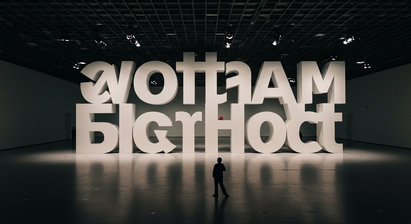
The Obama Presidential Center’s Words of Hope installation uses 458 oversized Gotham Bold letters to transform a speech into a permanent architectural experience. This project, alongside broader discussions around design history and material impact, reveals a quiet but profound shift: typography is being re-evaluated as a physical, tangible element, moving beyond its traditional role on screens or printed pages. This re-engagement with typography’s material reality demands a deeper consideration of how letterforms function within three-dimensional space, influencing perceived legibility, conceptual impact, and the underlying grid systems that govern their arrangement.
The widespread acclaim for the Obama Presidential Center’s installation often focuses on its conceptual power and monumental scale. However, a mainstream industry view often overlooks the nuanced micro-typographic challenges inherent in such applications. The prevailing assumption that simply enlarging type guarantees enhanced legibility at an architectural scale is incomplete. True legibility in monumental typography, where individual Gotham Bold letters stand several feet tall, depends less on the point size and more on the precise calibration of letter spacing, word spacing, and line breaks as experienced by a moving viewer. These elements, which are meticulously refined for desktop publishing, require significant re-engineering when type becomes a physical object integrated into a grid system designed for human navigation and interaction within an architectural volume. The conceptual letterforms gain their power not just from their visual presence but from their continued readability and spatial coherence from variable distances and angles.
The current approaches to environmental graphics often treat monumental text as a scaled-up version of two-dimensional design, neglecting the specific optical distortions and parallax effects introduced by viewing three-dimensional objects in a physical environment. By late 2027, advanced architectural design software will integrate real-time optical compensation for letterforms and spatial grid systems, allowing designers to simulate viewer movement and dynamically adjust micro-typographic properties to maintain optimal legibility and aesthetic balance. This will move beyond static kerning pairs towards algorithmic solutions that respond to environmental conditions and human perception.
The primary opposing force to this precise, perception-driven approach is the inertia of established fabrication processes and cost-efficiency models. Manufacturing and installation workflows for large-scale signage frequently prioritize standardized components and assembly methods over the intricate, custom adjustments required for optically refined micro-typography. Designers, pressed by budgets and timelines, often compromise on fine-tuning details that, while seemingly minor, significantly impact legibility and experiential quality at scale. The Sustainable Brands Conference 2026, for example, highlighted the imperative for efficiency, which can sometimes be at odds with bespoke typographic refinement.
A working typography professional engaged in large-scale environmental projects should prioritize physical or augmented reality prototyping for critical text passages. This means developing full-scale mock-ups or using AR tools to review type from various pedestrian viewpoints, rather than relying solely on rendered elevations. This direct observation will reveal necessary adjustments to letter spacing, word spacing, and the overall rhythm of text blocks within the intended grid system, ensuring that conceptual letterforms remain truly legible and impactful in their built context.
TL;DR
Typography in physical spaces requires dynamic micro-typographic adjustments for legibility, challenging static design conventions.
Curated References
About this editorial — This piece was developed using AI-assisted research and curation across multiple industry sources. All analysis, opinions, and predictions represent the editorial perspective of JHDD. Sources are linked in the references section above.