JHDD Packaging Report — 2026.06.26
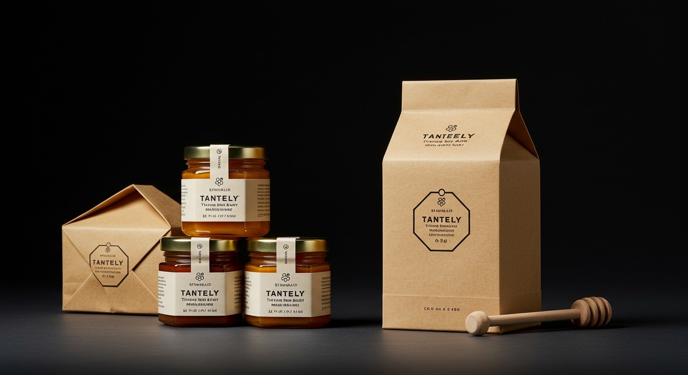
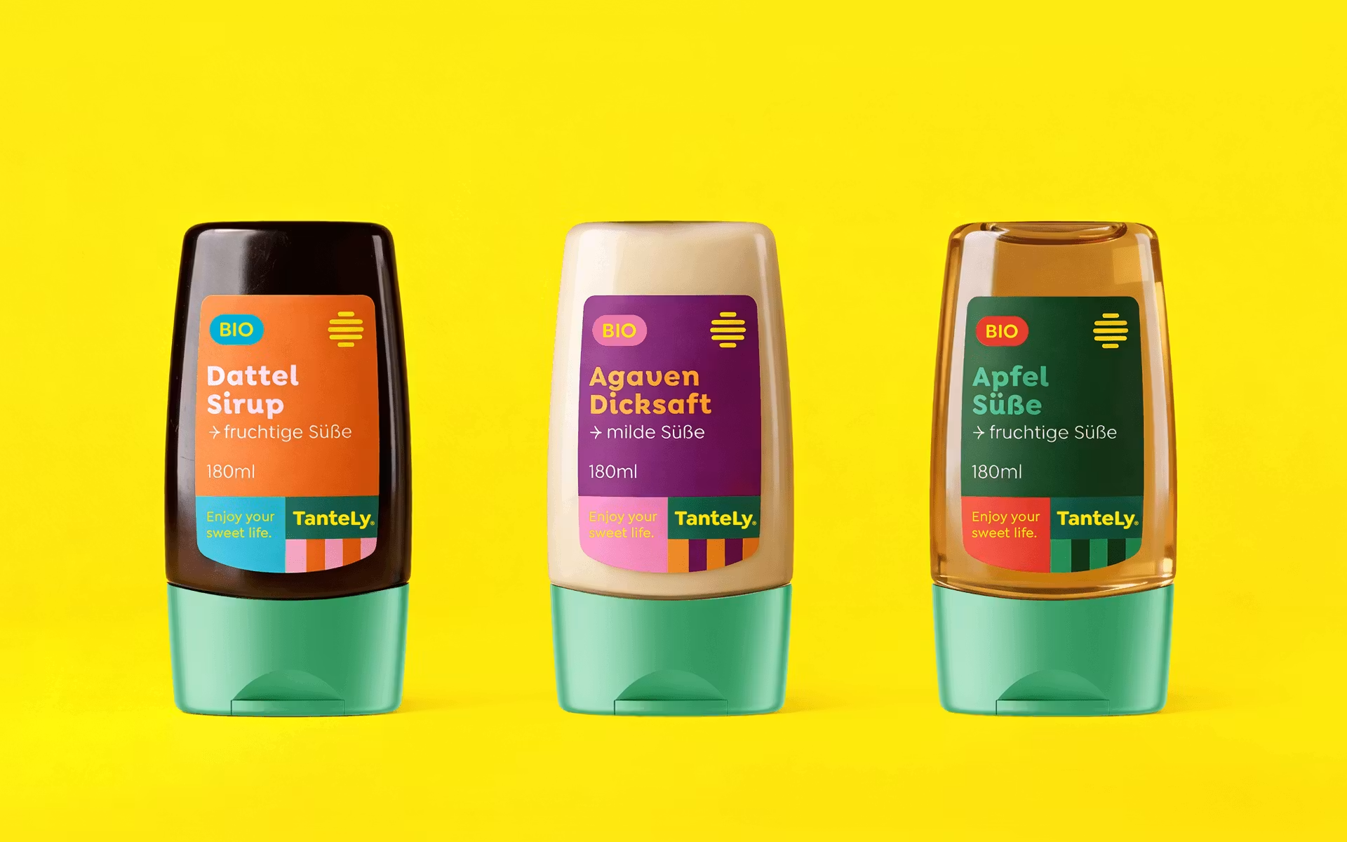
Studio Chapeaux treats every TanteLy honey variety like its own standalone product, wrapping each jar in a completely different color world pulled from its landscape.
This approach signifies a departure from conventional brand uniformity, reflecting a broader pattern among forward-thinking designers and brands. These stories collectively illustrate a strategic embrace of physical specificity, tactile richness, and narrative depth in packaging. The emphasis is on creating distinct, memorable interactions that defy the prevailing pressure for digital-first ubiquity, instead grounding brand experiences in tangible, sensory engagement and curated material choices.
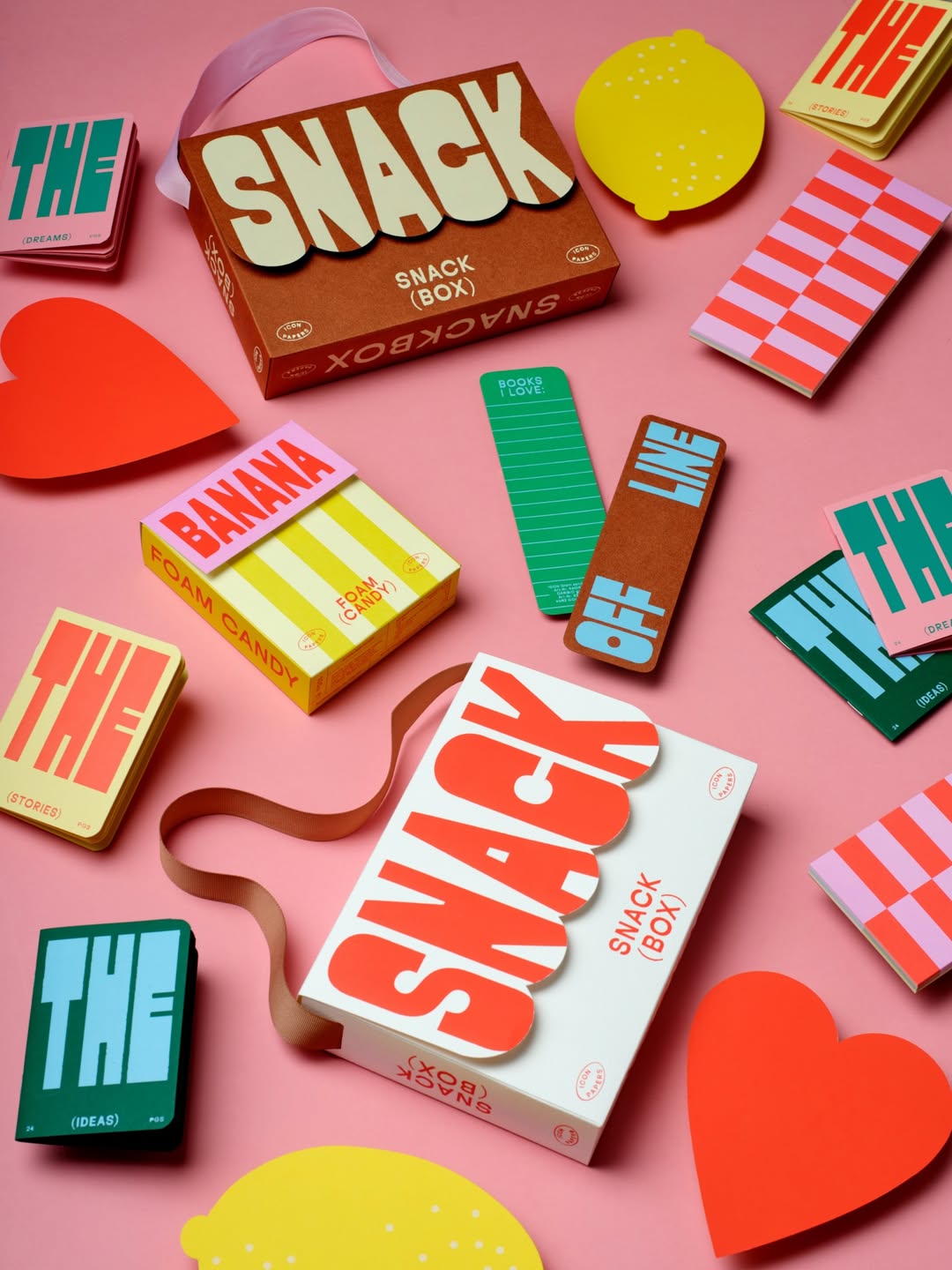
Designstudio Mathilda Mutant’s Icon Papers Snackbox 2.0 provides a prime example, where every piece in the box earns its place and the paper itself “does all the talking.” This emphasis on the intrinsic qualities of the material challenges a common industry belief that packaging must primarily serve as a billboard for complex graphics or a conduit for digital QR codes. In contrast, the Snackbox demonstrates that understated material expression can communicate premium value and brand intention more effectively than overt branding. The unboxing becomes an exercise in material discovery, elevating perception of the content and the brand itself. This direction suggests that by mid-2027, B2B sectors will significantly increase investment in bespoke physical presentation for items traditionally considered utilitarian, moving beyond basic branded collateral to create unboxing experiences with tangible depth.
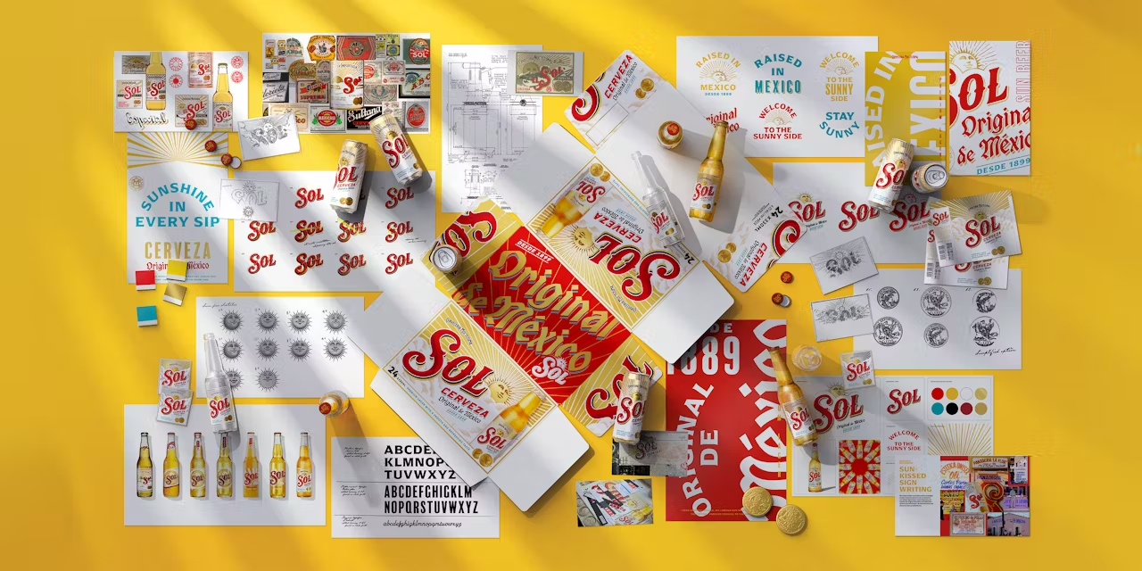
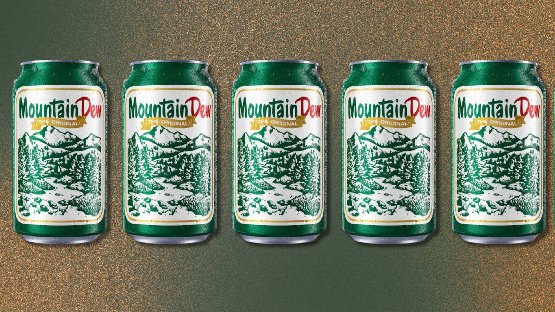
The work of Tobias Hall in revamping legacy brands with meticulous craftsmanship and vintage hand-lettering also supports this shift. Hall elevates heritage packaging, not by modernizing it with slick, generic aesthetics, but by reinforcing its physical history through artisanal detail. This contradicts the mainstream assumption that legacy brands must aggressively pursue contemporary visual trends to remain relevant. Instead, these brands find renewed resonance by deepening their material connection to their own history, allowing the packaging to evoke a sense of authenticity and enduring quality that resonates with consumers seeking genuine experiences.
The primary opposing force to this trend is the prevailing economic pressure for cost reduction and supply chain simplification. Procurement departments often prioritize uniform, lightweight, and low-cost materials, seeing bespoke finishes, multiple material specifications, or intricate structural designs as unnecessary expenses. This perspective overlooks the significant long-term brand equity and customer loyalty generated by a differentiated, high-quality physical experience. Standardized manufacturing processes, while efficient, often strip packaging of its unique character and tactile appeal, reducing it to a functional container rather than a brand ambassador.
A working packaging professional should initiate a pilot project this week focusing on multi-sensory material differentiation within an existing product line. Instead of a single substrate, experiment with specifying distinct, complementary textures—such as an uncoated paperboard, a debossed label, and a matte varnish application—for the primary and secondary packaging of a single SKU. This moves beyond surface-level graphic changes to build a deeper, more engaging physical interaction.
TL;DR
Packaging design is shifting towards deeper physical engagement and material authenticity, valuing specific tactile and narrative experiences.
Curated References
About this editorial — This piece was developed using AI-assisted research and curation across multiple industry sources. All analysis, opinions, and predictions represent the editorial perspective of JHDD. Sources are linked in the references section above.