JHDD Typography Report — 2026.06.14
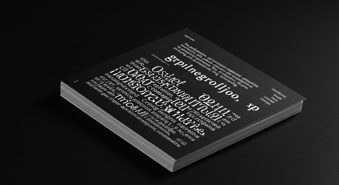
The proliferation of contextualized micro-typographic applications is about to fundamentally redefine brand identity, shifting emphasis from singular wordmarks to ephemeral, system-driven legibility.
The pattern that emerges from these disparate observations—from political commentary in graphic form, to hyper-local promotional packaging, to the enduring appeal of focused design monographs, to heritage-driven wine branding, and the continuous discourse on design legacy—is the increasing demand for typographic systems that can flex and adapt to hyper-specific contexts while retaining a core, discernible identity. This isn’t merely about responsive design; it’s about responsive meaning, where the precise glyph, its spatial relationship, and its embedded grid become the active agents of communication, not just passive carriers of information. The underlying force is a pervasive need for distilled authenticity and immediate relevance in an increasingly fragmented and saturated information landscape. This manifests as a drive towards what might be termed “contextual kineticism” in typography.

Beneath the surface, the most significant shift is away from the monolithic, aspirational brand identity as dictated by a singular, immovable logotype or a rigidly applied typeface. Instead, the future belongs to brands that can deploy typography as an intelligent, adaptive skin. Consider the work of SSStudio for Adonna Wines. While the initial branding likely includes a carefully crafted wordmark and primary typeface, the true innovation lies in how that typographic system is designed to be activated within specific contexts. This isn’t just about selecting different weights for headlines and body copy; it’s about a deeper consideration of micro-typography—the precise leading, kerning, tracking, and even the subtle adjustments to glyph shapes within a controlled system—that allows the brand to speak intimately to different audiences and different applications. The prevailing industry wisdom, often focused on grand stylistic gestures and broad aesthetic pronouncements, misses the granular impact of these micro-decisions. A brand identity is becoming less about what it looks like, and more about how it performs its legibility and conveys its conceptual essence through a thousand tiny, deliberate choices. My prediction is that by late 2026, the most lauded brand identities will not be those with the most distinctive wordmarks, but those whose typographic systems demonstrate the most sophisticated and nuanced contextual adaptation, measurable by audience engagement and message clarity in specific, often fleeting, touchpoints.
The friction against this evolution stems from an entrenched inertia within large-scale branding operations and an overemphasis on static, templated executions. Many established agencies and brand managers are still tethered to a 20th-century model of brand identity, prioritizing visual consistency through rigid application of a limited palette of typographic styles rather than embracing the complexity of dynamic, context-aware systems. This resistance is amplified by the economic pressures that favor easily replicable design assets over the more labor-intensive, intellectually demanding process of building truly adaptive typographic frameworks. The tension reveals a fundamental disconnect between the evolving needs of communication and the established business models of design production.
A working Typography professional can act differently this week by consciously prioritizing the interrogation of grid systems not as mere organizational tools, but as conceptual frameworks for legibility and conceptual expression. Before selecting a typeface for a project, spend an hour prototyping its behavior within multiple, rigorously defined micro-grid systems, focusing on how optical centers shift, how letterforms interact with their allocated space, and how those spatial relationships communicate subtle conceptual nuances. This will lead to a more informed and deliberate approach to the essential craft of typography.
The mastery of contextual micro-typography will soon be the primary differentiator in brand identity design.
Curated References
About this editorial — This piece was developed using AI-assisted research and curation across multiple industry sources. All analysis, opinions, and predictions represent the editorial perspective of JHDD. Sources are linked in the references section above.