JHDD Packaging Report — 2026.06.14
The scarcity of true material innovation in packaging design is the industry’s most profound existential threat.
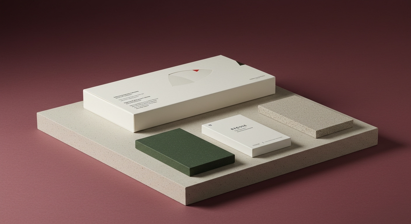
These disparate news items coalesce around a subtle yet powerful convergence: the strategic elevation of tactile and intrinsic material qualities as primary drivers of brand communication, moving beyond mere aesthetic refreshment. While the articles highlight rebranding efforts, logo updates, and color shifts, the deeper current is the industry’s accelerating reliance on physical sensation to forge deeper consumer connections. This isn’t simply about making a pack look good on the shelf; it’s about leveraging the quiet language of touch and texture to imbue a brand with personality and perceived value, especially as digital saturation continues to flatten sensory experiences. The underlying force is the Maturation of the Shelf, where digital clutter has driven a desperate need for analog tangibility to capture attention and build emotional resonance, transforming packaging from a purely visual medium into a performative object.
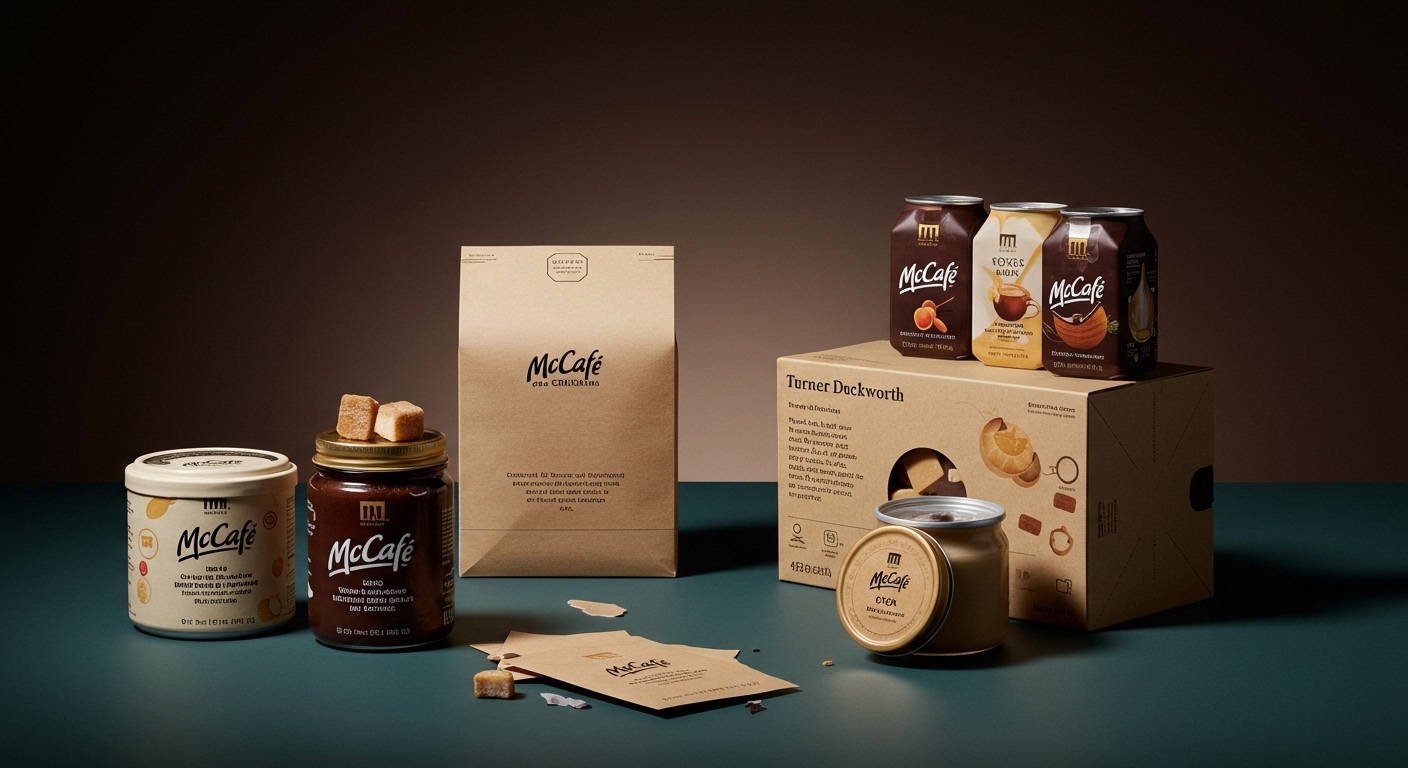
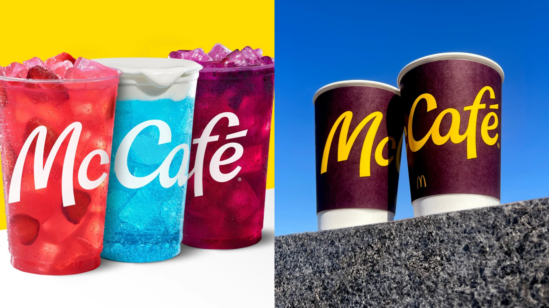
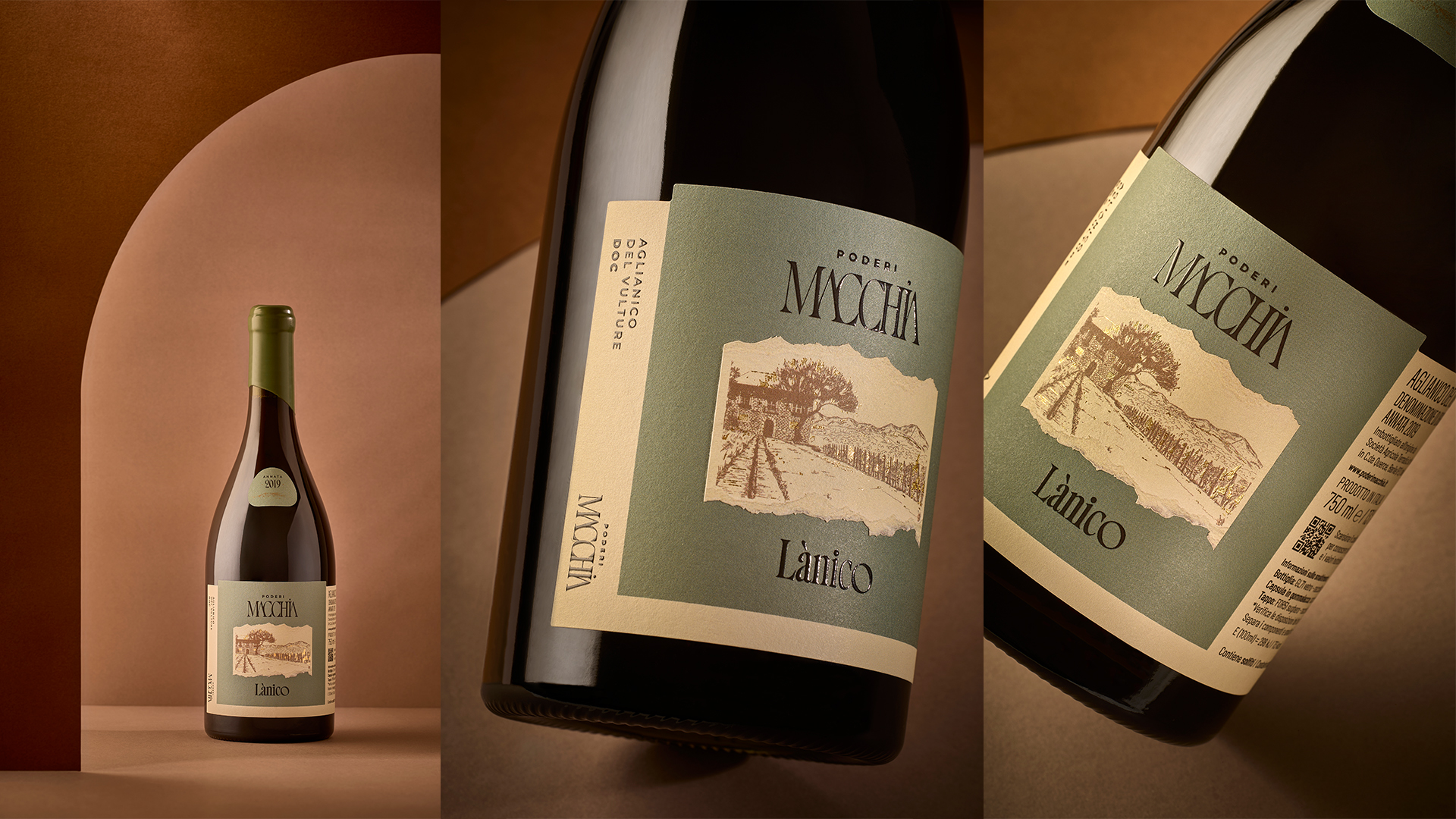
Beneath the surface of these brand refreshes, a more profound strategic realignment is underway. Brands are increasingly recognizing that in an era of fleeting digital attention spans, the physical act of engaging with packaging is becoming the most potent form of brand immersion. The McCafe redesign, for instance, with its deliberate nod to iconic McDonald’s heritage through typography, hints at a future where the physical form language of a brand is as critical as its digital presence. Similarly, the Poderi Macchia wine labels, with their architectural motifs and tactile finishes, are not just decorating a bottle; they are constructing a narrative of place and quality through touch. This approach directly challenges the prevailing industry wisdom that prioritizes large-scale graphic interventions and celebrity endorsements. Instead, it champions a more intimate, craft-driven approach where material science and subtle haptic cues become the heroes of the unboxing experience. This focus on tactile storytelling is not a trend; it is a fundamental shift in how brands will build equity. Therefore, by late 2025, expect to see a significant increase in packaging briefs that explicitly mandate the exploration and integration of novel surface treatments and substrate properties as a primary design objective, not an afterthought.
This emergent emphasis on tactile branding faces significant friction from entrenched logistical and cost-optimization frameworks. Large-scale CPG manufacturers, in particular, are inherently resistant to incorporating high-cost, low-run tactile finishes into mass-produced packaging. The complex machinery, stringent quality control requirements, and potential for production bottlenecks associated with intricate embossing, debossing, or specialized coatings represent a substantial hurdle. This tension between the desire for bespoke, sensory-rich packaging and the industrial realities of cost-efficient, high-volume production reveals a fundamental challenge for brands attempting to translate the tactile premium into accessible consumer products. The ongoing debate between sustainability goals (often leaning towards simpler, less processed materials) and the desire for sophisticated tactile experiences highlights this friction point.
The working packaging professional should, this week, begin actively exploring the tactile possibilities of common substrates. This means moving beyond the visual design phase and engaging directly with material suppliers and printers to understand the nuanced differences achievable with existing technologies. Instead of simply specifying a matte laminate, investigate the subtle variations in weight, grain, and finish. Push for small-scale mock-ups that allow for direct sensory comparison of different paper stocks, inks, and varnishes. The actionable direction is to prioritize the development of a personal tactile vocabulary, becoming an advocate for the physical qualities of packaging as much as its visual appeal.
TL;DR
The future of packaging design lies in the deliberate cultivation of tactile experiences, transcending mere visual appeal to build deeper brand resonance and shelf impact.
Curated References

About this editorial — This piece was developed using AI-assisted research and curation across multiple industry sources. All analysis, opinions, and predictions represent the editorial perspective of JHDD. Sources are linked in the references section above.