Julian’s Typography Insight — 2026.06.06
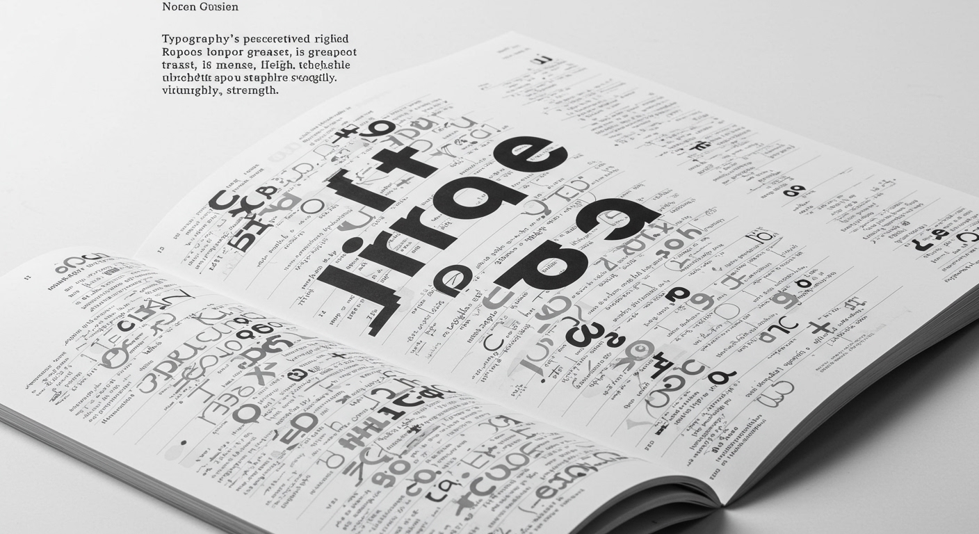
Typography’s perceived rigidity is its greatest, and perhaps most vulnerable, strength.
In an era saturated with fleeting digital experiences and an ever-accelerating visual culture, the foundational elements of typography—legibility, conceptual integrity, and the disciplined application of grid systems—are undergoing a profound re-evaluation. The current discourse highlights a compelling tension between the enduring principles of clear communication and the explosive potential of experimental letterforms. As designers grapple with optimizing micro-typography for diverse interfaces and screen sizes, the very definition of a “well-crafted” typeface is expanding, embracing both the meticulously engineered and the defiantly unconventional. This moment is not merely about aesthetics; it’s about the fundamental role of the letter in shaping understanding and meaning in an increasingly complex information landscape. The rigorous pursuit of legibility, long considered a non-negotiable, now shares the stage with conceptual boldness, forcing a reconsideration of how type can both serve and subvert expectation.

The news from the design trenches reveals a fascinating duality. On one hand, there’s a palpable, almost nostalgic, re-examination of established canons and historical lineages, as Steven Heller famously undertakes. This act of curation, of sifting through decades of typographic practice, suggests a desire to anchor contemporary work within a lineage of proven effectiveness and conceptual weight. Simultaneously, there’s an undeniable surge of designers pushing the boundaries of what letters can be, eschewing traditional forms for deeply personal or politically charged expressions. Collins’ redesign of Olipop exemplifies a pragmatic application of thoughtful typography to a commercial product, aiming for a harmonious blend of desirability and perceived healthfulness. This is less about radical form and more about the nuanced alchemy of visual cues and subtle typographic choices that reinforce a brand’s message. Conversely, the Iranian designer’s aspiration to create a “visual warning” underscores typography’s power as a potent tool for social commentary and dissent, where form and function are inextricably linked to message. The underlying sentiment across these diverse practices is a move away from a pursuit of unattainable, sterile perfection towards a more honest, iterative, and conceptually driven creative process. The messy middle, as championed, becomes the fertile ground for authentic typographic innovation, where accidental discoveries and deliberate imperfections birth genuine meaning.
The central tension lies in the perceived conflict between the guardians of typographic tradition and the provocateurs of its future. One camp champions the enduring legacy and the quiet elegance of established forms, prioritizing clarity and historical context. The other, driven by a desire for urgent expression and cultural relevance, seeks to imbue letterforms with new meanings and confront established norms. This isn’t a simple dichotomy of old versus new, but rather a dynamic push and pull between the responsibility of clear communication and the imperative for individual and collective voice. The question arises: can the rigorous discipline of legibility coexist with the provocative charge of conceptual art? The emerging narrative suggests that the answer lies not in choosing one over the other, but in finding sophisticated integrations where clarity amplifies conceptual impact, and experimental forms remain grounded in a deep understanding of their communicative function. The very act of questioning established canons, whether personal or societal, necessitates a typographic language that is both robust enough to carry weight and agile enough to express dissent.
This editorial predicts a significant rise in adaptive, context-aware typography systems that dynamically adjust their form and weight based on user interaction, environmental conditions, and even emotional sentiment. Imagine headlines that subtly shift their serifs or weights as a reader scrolls through a melancholic article, or navigation elements that subtly reconfigure their spacing to aid readability in low light.
TL;DR
Typography is navigating a crucial moment, balancing enduring principles with radical innovation, and its future lies in intelligent adaptability.