Julian’s Packaging Insight — 2026.06.08
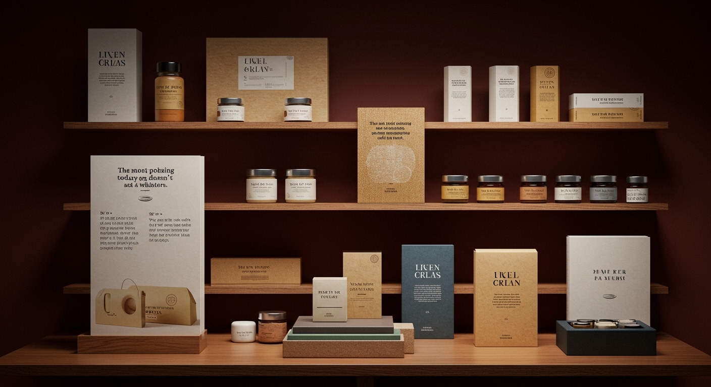
The most potent packaging today doesn’t scream; it whispers, and its whisper is a revolutionary call to touch.
We are currently navigating a pivotal moment in packaging design, a confluence of environmental urgency and evolving consumer expectations. The ritual of unboxing, once a fleeting digital trend, has solidified into a cornerstone of brand engagement, demanding more than just visual appeal. Consumers are increasingly scrutinizing the environmental footprint of their purchases, pushing brands towards sustainable materials that align with their values without compromising aesthetic integrity. Shelf impact, in this context, is no longer solely about standing out visually but about communicating responsibility and evoking a desirable tactile experience. Tactile branding, the intentional design of physical touchpoints, is emerging as a powerful differentiator, transforming a simple container into a memorable ambassador for the product and its ethos.
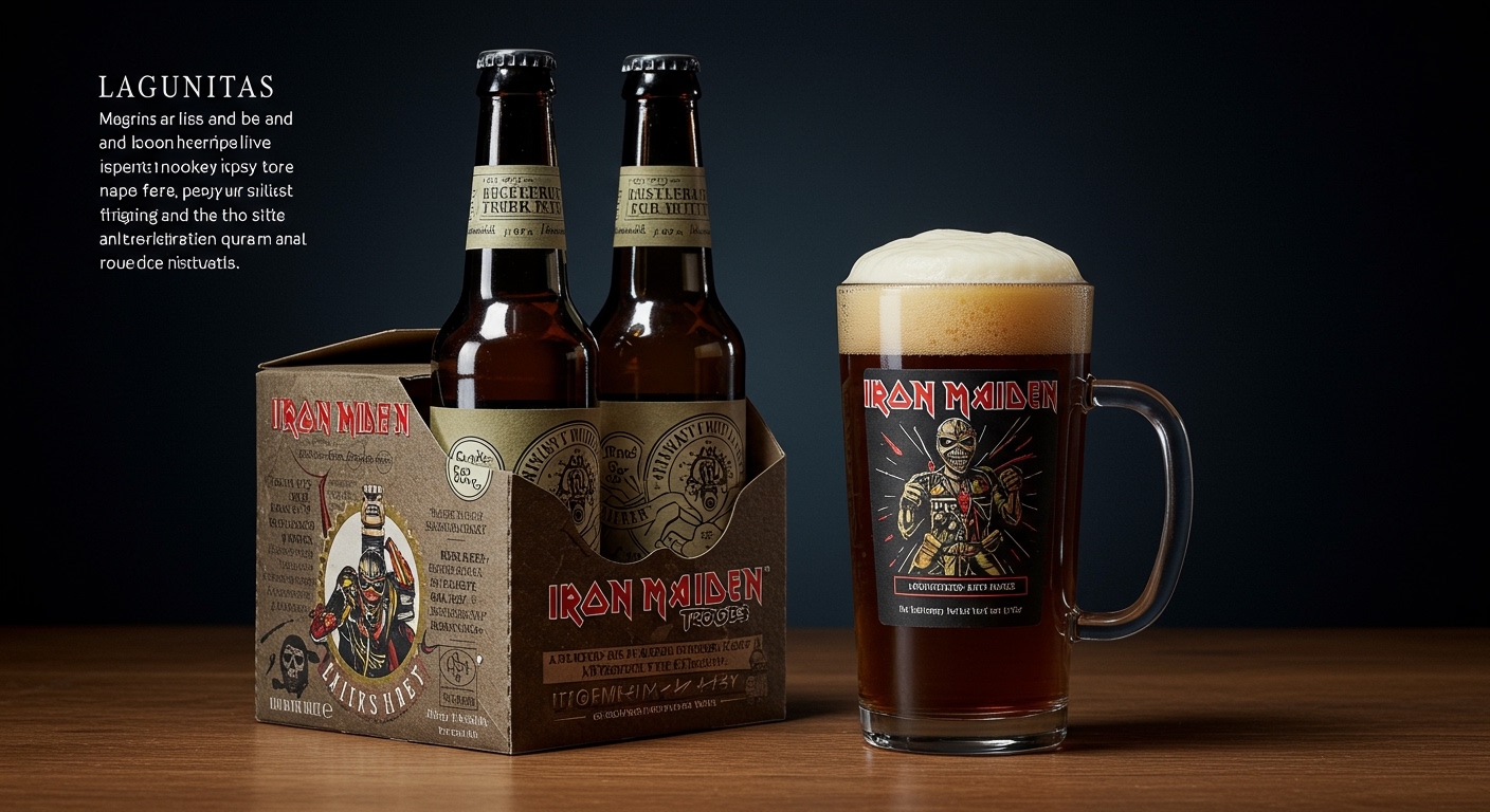
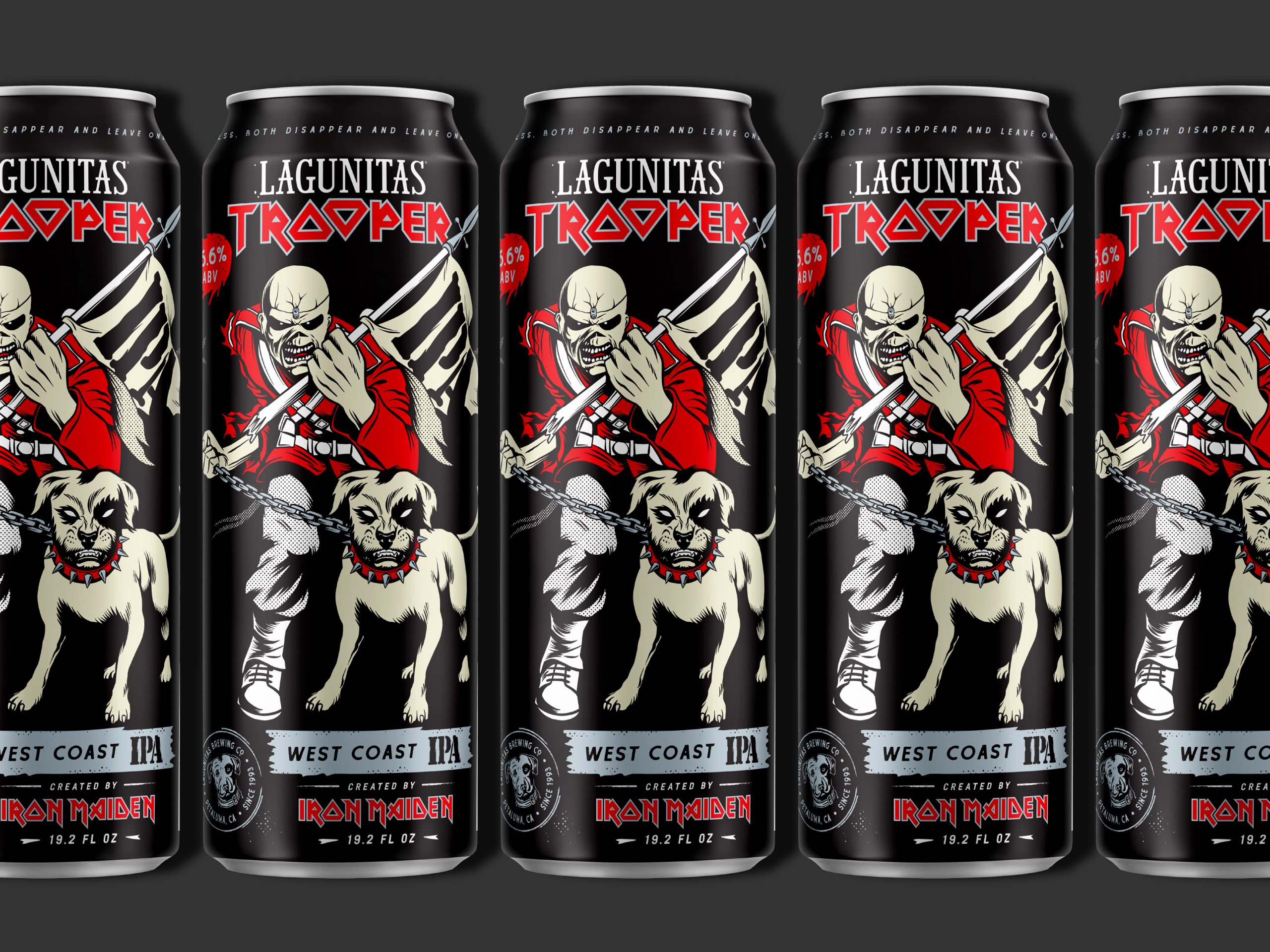
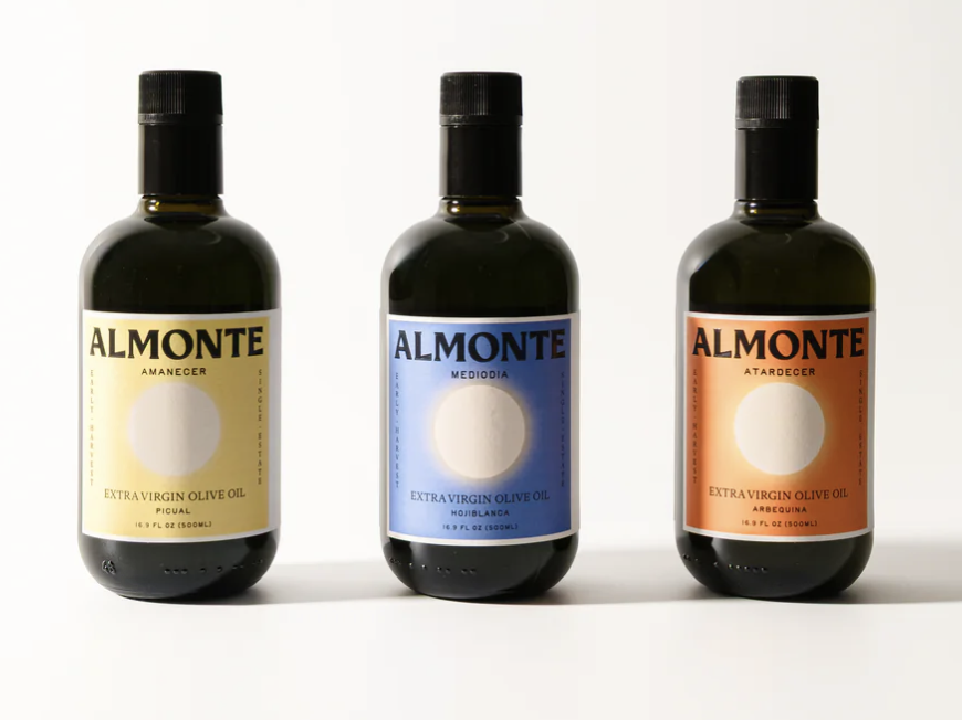
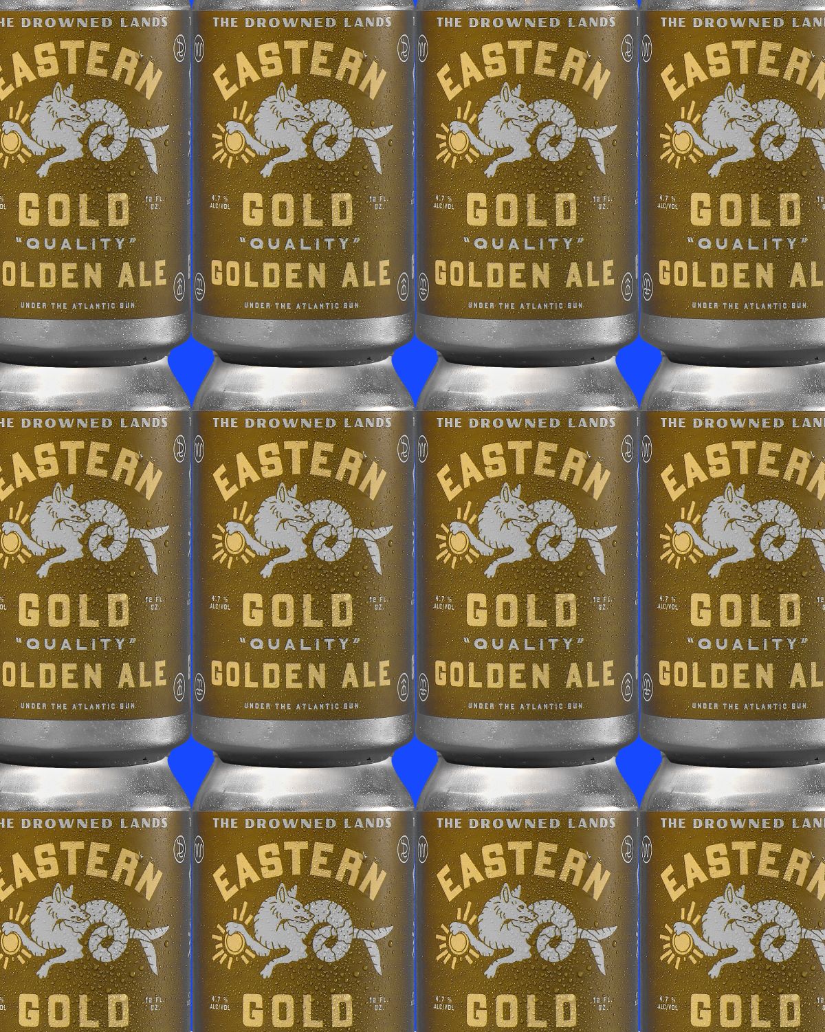
The news offers a compelling snapshot of this seismic shift. Lagunitas’ partnership with Iron Maiden for a limited-edition ‘Trooper’ beer taps into the power of nostalgia and cultural resonance, leveraging a recognizable motif to create anticipation, though the packaging specifics remain elusive. Almonte’s premium olive oil, however, provides a tangible example of elevated tactile and visual branding. By eschewing tired clichés for a sun-coded color system and thoughtful typography, Prime Studio crafts an identity that speaks of heritage and quality through its very material presence, inviting consumers to engage beyond the transactional. Young Jerks’ design for Eastern Gold beer is a masterclass in earned authenticity. Its distressed typography and folk-art inspired graphics on the can create an immediate sense of history and locality, a palpable texture that makes the product feel ‘real’ and desirable in an era of mass production. This deliberate embrace of an aged aesthetic, rather than superficial gloss, highlights a growing desire for packaging that feels considered and crafted, not merely manufactured.
The most resonant shift, however, is the nascent recognition of the ‘Reuse’ imperative. Plastic Change’s visceral campaign, while provocative, underscores the undeniable problem of plastic pollution. Simultaneously, Epigrama’s introduction of a new ‘Reuse’ symbol offers a proactive solution, a visual language to encourage a circular economy. This transition from a singular focus on recyclability to a broader emphasis on longevity and reusability is a profound, albeit slow-moving, evolution. The aspiration for sustainable materials is no longer just about biodegradable plastics or recycled paper; it’s about designing for a life beyond the first use, a concept that demands a fundamental rethinking of packaging’s very purpose.
The inherent tension lies between the allure of the new and the necessity of the old. We are captivated by novel material innovations and the sophisticated branding that elevates premium products, as seen with Almonte and Young Jerks. Yet, the pervasive problem of waste, starkly illustrated by Plastic Change, necessitates a move towards simplicity, durability, and crucially, reusability. The very materials that enable stunning tactile experiences can often be the source of environmental burden if not designed with a closed-loop system in mind. This creates a paradox: how can packaging be both luxuriously inviting and inherently responsible, a sensory delight that doesn’t contribute to planetary distress?
By 2028, expect to see a significant backlash against single-use packaging, even for premium goods, with widespread adoption of modular, refillable systems designed with integrated tactile cues that authenticate authenticity and signal longevity.
TL;DR
Packaging’s future is tactile, sustainable, and built for a life beyond disposal, not just consumption.