
Julian’s Branding Insight — 2026.06.14
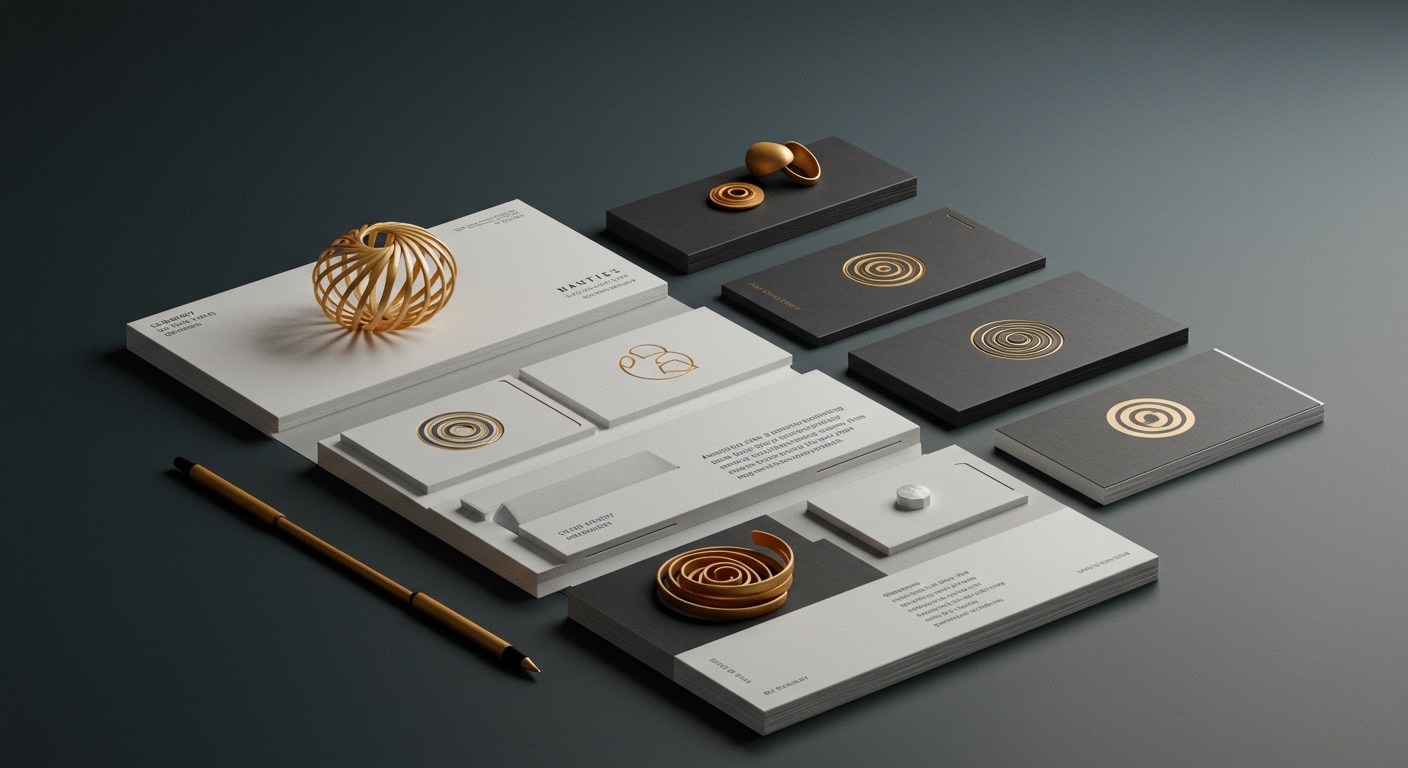
A singular spiral can redefine an entire narrative, proving that profound meaning often resides in the elegantly simple.
This moment in brand strategy is charged with an urgent need for clarity amidst a world saturated with fleeting trends and amplified cultural noise. For brands, the stakes are higher than ever. Brand equity is no longer built solely on consistent messaging, but on deeply resonant visual identity systems that act as cultural anchors. In an era where consumers navigate a constant influx of information, market positioning demands a distinct point of view, one that can cut through the cacophony and establish genuine connection. Visual identity systems, therefore, are not mere cosmetic enhancements; they are the scaffolding upon which brand perception is constructed, the silent architects of trust and recognition. The news items emerging from the design sphere offer compelling glimpses into how this is being achieved, showcasing a deliberate move towards visual languages that are both evocative and precisely calibrated to their cultural contexts.
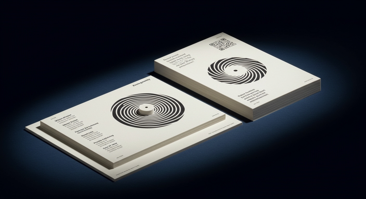
Pentagram’s work for Tokyo’s Museum of Narratives exemplifies this, leveraging a simple spiral to encapsulate a complex, cross-disciplinary mission. This isn’t just a logo; it’s a generative system that visually articulates the museum’s fusion of traditional Japanese culture with hyper-modernity, mirroring the very essence of its programming. Similarly, Creative Spark’s bold, no-nonsense identity for Leo, a hair rejuvenation brand, tackles a sensitive subject with an approach that is both direct and empathetic. The agency eschews the typical obfuscation often associated with such products, instead opting for a visual identity that signals confidence and straightforwardness, aiming to destigmatize the experience of hair loss. Meanwhile, Another Collective’s reinvention of classic burger joint tropes for Brusco demonstrates a keen understanding of how to tap into established cultural signifiers while injecting contemporary relevance. This isn’t merely about aesthetics; it’s about understanding the deeply ingrained visual language of a category and artfully subverting or refining it to create something both familiar and fresh. These examples underscore a significant trend: brands are increasingly seeking visual identities that possess a strong conceptual backbone, capable of communicating nuanced ideas with impactful simplicity.
The underlying tension in contemporary branding lies in the simultaneous demand for radical originality and profound authenticity. We are witnessing a push towards hyper-individualized, culturally specific visual languages, yet these must also speak to universal human experiences and aspirations. The danger is that in the pursuit of uniqueness, brands risk becoming so esoteric they alienate their audience, or so derivative they fail to carve out a distinct identity. The challenge is to forge a visual path that is both utterly distinctive and universally understood, a delicate balancing act between the avant-garde and the accessible. This is where the power of well-considered systems, like the spiral for MoN Takanawa or the directness of Leo’s branding, truly shines, demonstrating that innovation doesn’t always necessitate reinvention from scratch, but rather insightful reinterpretation.
Moving forward, expect to see a significant surge in brands adopting modular visual identity systems that allow for dynamic adaptation across diverse platforms and cultural contexts. This won’t just be about responsive design; it will be about brands proactively building in flexibility from inception, enabling them to speak with a consistent voice while resonating with the specific nuances of a global audience, much like Pentagram’s spiral can be endlessly interpreted and applied.
TL;DR
Brands must now master the art of visually communicating complex ideas with singular impact, balancing bold originality with genuine cultural resonance.