JHDD Web Design Report — 2026.08.02
FLOT NOIR’s digital presence for MERSI embodies a deliberate design philosophy, aiming for a “quiet, immersive space between architectural print and interactive web.” This specific approach highlights a growing trend within front-end craft.
The collective intelligence emerging from recent developments points towards an increasing demand for highly individualized, performant digital experiences. This shift is enabled by granular control over layout and motion, moving beyond conventional responsive frameworks to embrace the expressive potential found at the intersection of print aesthetics and browser capabilities. Developers and designers are gaining access to tools that permit precise orchestration of every visual and interactive element.
This trend directly challenges the mainstream industry’s prevailing belief that “more interactivity equals better user experience.” While immediate user feedback and high interactivity can be engaging, they often prioritize breadth over depth. FLOT NOIR’s work for MERSI, characterized by its “tailored Webflow build with precise motion and editorial storytelling,” demonstrates that true immersion can stem from deliberate restraint and refined presentation. A slower pace, a more considered visual hierarchy, and motion that serves a narrative rather than just providing kinetic distraction can yield a more profound engagement. This strategy pushes against the constant demand for instant gratification and overwhelming UI feedback, opting instead for a carefully curated journey.
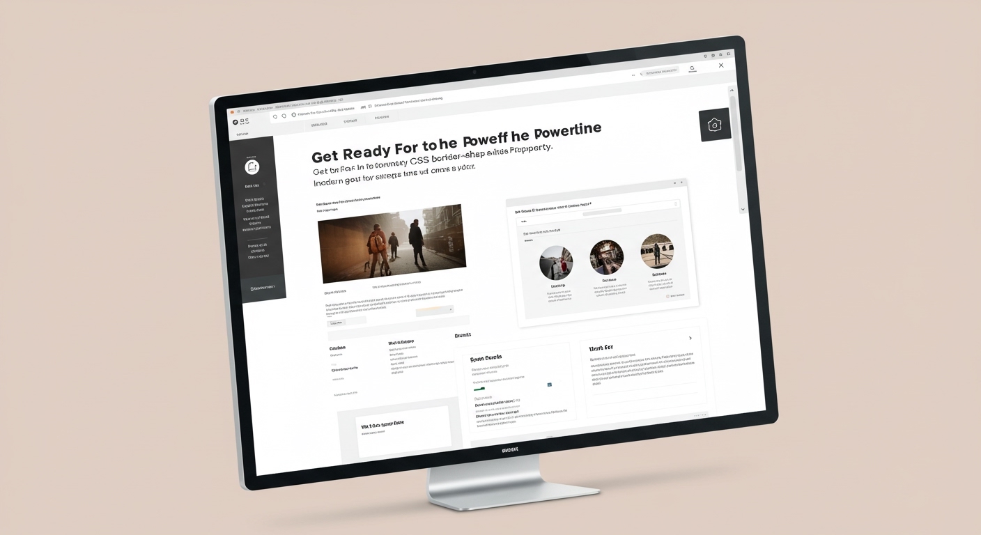
The new CSS capabilities discussed on CSS-Tricks, such as the `border-shape` property and the `sibling-index()` function for animations, alongside container “stuck” queries, are critical enablers for this shift. These features offer pathways to achieve complex visual dynamics and responsive adaptability with less JavaScript overhead, directly impacting performance and accessibility. They allow designers to encode intricate layout and motion rules directly into the stylesheet, reducing reliance on heavy client-side frameworks for basic visual effects. By early 2028, the industry will observe a noticeable reduction in JavaScript bundles primarily dedicated to styling and motion effects that are increasingly achievable natively.
The primary opposing force to this craft-driven evolution remains the dominant “component library” mentality and the pursuit of perceived development velocity over unique digital experiences. Frameworks prioritizing rapid assembly of pre-defined components often inherently limit the unique layout expressions and subtle motion nuances now possible with native CSS and judiciously applied animation libraries like GSAP. This approach, while efficient for certain applications, frequently yields visually homogeneous and functionally predictable websites, lacking the specific character Studio Freight brings to its “mission-driven approach.”
Web design professionals should dedicate time this week to experiment deeply with advanced CSS layout modules and custom properties, moving beyond generic grid and flexbox defaults. Specifically, explore how to layer native CSS animations and transitions with targeted JavaScript solutions for truly complex, interactive sequences, aiming to minimize JS where CSS can perform adequately. Understand when and where new CSS features like `border-shape` or `sibling-index()` offer superior performance and maintainability compared to older JavaScript-heavy solutions.
TL;DR
The modern web demands a blend of print’s thoughtful design and the web’s dynamic capabilities, driven by advanced CSS and purposeful motion.
Curated References
About this editorial — This piece was developed using AI-assisted research and curation across multiple industry sources. All analysis, opinions, and predictions represent the editorial perspective of JHDD. Sources are linked in the references section above.