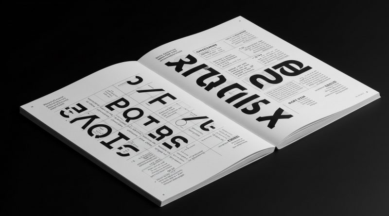
JHDD Typography Report — 2026.08.18
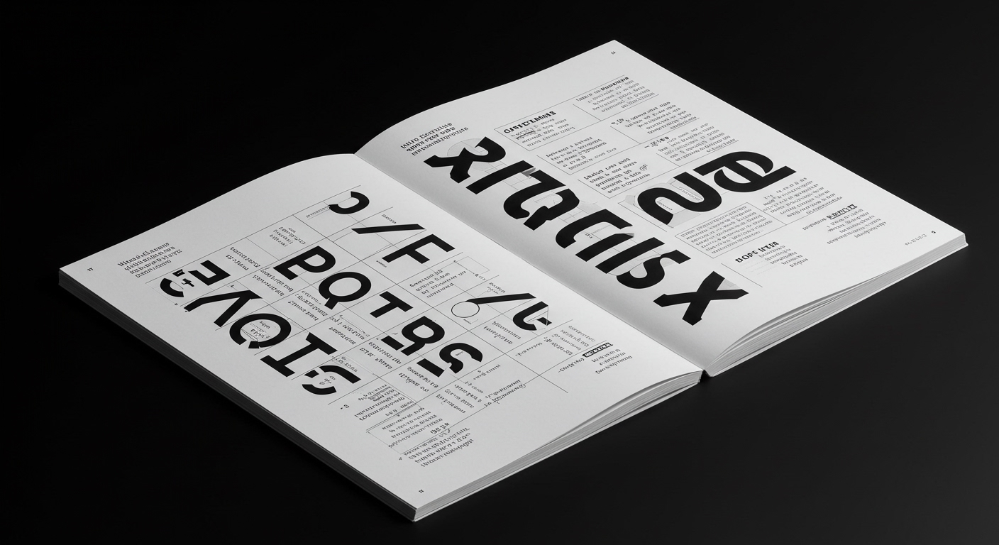
Instagram’s recent visual refresh subtly highlights a design tension often overlooked in grander brand narratives.
This tension, connecting the established “Crown Jewels of the Auto Industry” with the “editorial dissonance of ‘MALE.'”, arises from the perpetual conflict between distinct brand identity and functional typographic clarity. Designers like Walter Allner, Alexander Liberman, and Fred Troller historically navigated separate realms of fine and applied art; today, that distinction blurs within single commercial projects. The outcome is often a push for “conceptual letterforms” that prioritize novelty or artistic expression over the fundamental principles of legibility and a robust grid system, often under the guise of modernization or uniqueness.

The work of designers like Walter Allner, who balanced commercial output with fine art, illuminates the current debate around conceptual letterforms. Allner’s capacity to operate in both commercial and artistic spheres meant he understood the constraints and opportunities of each. Contemporary industry opinion often valorizes “disruptive” typographic solutions that prioritize brand distinction through highly stylized, often bespoke, letterforms. However, this mainstream embrace of radical forms frequently overlooks the practical implications for legibility, especially within complex grid systems and in the critical realm of micro-typography. Many conceptual typefaces, while visually striking in isolation, crumble under the demands of dense editorial content or rapid digital consumption, failing to serve the very users they intend to attract.
The pervasive assumption that unique visual identity necessitates a departure from traditional legibility principles is fundamentally flawed. A brand’s strength, even in a “new era” like Instagram’s refresh, relies on clear communication first. The “editorial dissonance of ‘MALE.'” underscores this failure: when letterforms or their arrangement create unintended meanings or readability hurdles, the design has failed its primary purpose. JHDD posits that the true innovation lies not in abandoning legibility for distinctiveness, but in mastering the subtle nuances of micro-typography and adaptable grid systems to achieve both. It is predicted that by mid-2027, major digital platforms will begin to retract or significantly modify their most conceptually adventurous proprietary typefaces, shifting towards more neutral, highly legible sans-serifs, optimized specifically for diverse screen resolutions and accessibility requirements.
The primary force resisting this re-evaluation is the marketing imperative for differentiation, often driven by a superficial understanding of visual uniqueness. Creative directors, under pressure to deliver “freshness” and distinctiveness, frequently greenlight conceptual typographic solutions without rigorous testing for extended reading, multi-device rendering, or user-centric accessibility. This commercial drive, exemplified in the aggressive branding of the “Crown Jewels of the Auto Industry,” prioritizes perceived originality over practical utility, viewing legibility as a baseline rather than a nuanced and critical design achievement.
A working typography professional should this week audit an existing project’s primary display typeface for legibility at small sizes, specifically focusing on micro-typography elements like character spacing, kerning pairs, and line height within a defined grid system. They should then experiment with a neutral, highly legible system font to see how much of the original “brand character” truly relies on the conceptual letterforms versus other visual cues, such as color, image, or overall layout structure. This exercise reveals the actual contribution of conceptual type versus its potential hindrance.
TL;DR
The push for unique brand typography often compromises legibility and function, demanding a return to micro-typographic rigor within adaptable grid systems.
Curated References
About this editorial — This piece was developed using AI-assisted research and curation across multiple industry sources. All analysis, opinions, and predictions represent the editorial perspective of JHDD. Sources are linked in the references section above.