JHDD Typography Report — 2026.07.23
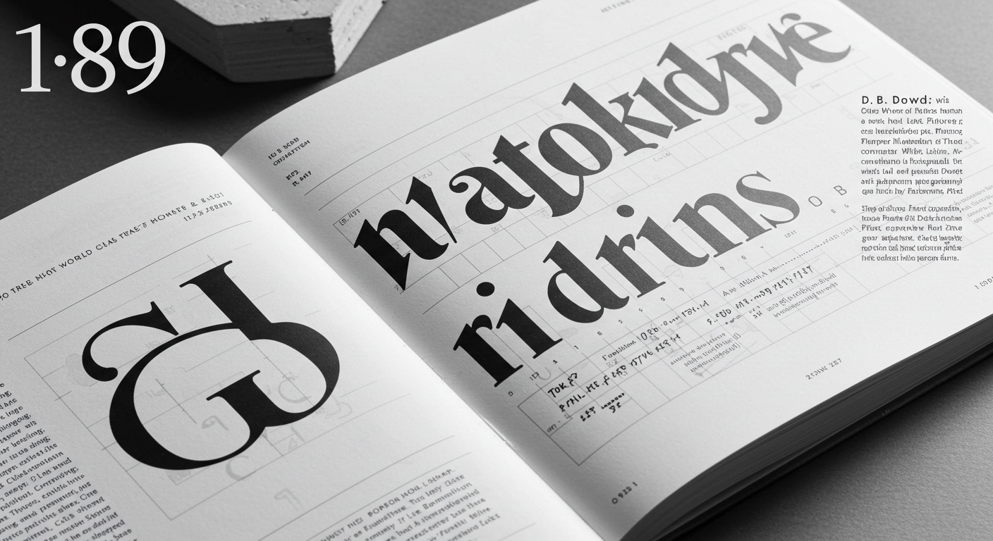
D. B. Dowd’s book “Reading Pictures” explores how illustration has shaped the way humans read, communicate, and understand the world from the printing press to the digital age.
The disparate articles reveal a consistent historical thread: the intentional deployment of visual information, including text treated as image, to shape collective perception and drive specific actions. This extends beyond mere content delivery to active narrative construction and the influencing of belief systems. The subtle visual cues within Walt Kelly’s Pogo, the dynamic shifts in Stephen Savage’s “Wide Load on the Road: A Big Red Truck’s Journey,” and the stark messaging of Soviet propaganda posters all demonstrate how visual context molds interpretation.

Walt Kelly’s comic strip Pogo, known for its political positions, offers a potent example of how letterforms move beyond simple legibility to become integral to meaning. The hand-lettering, the varied bubble shapes, and the way text integrates with character expressions provide layers of interpretive data that a standard, perfectly legible typeface would flatten. Mainstream typographic practice often elevates universal legibility as the paramount goal for effective communication, believing that clarity equates to understanding. This view, however, overlooks the power of deliberately contextualized or even visually challenging letterforms to convey nuance, irony, or a specific emotional tone that pure transparency cannot. Such conceptual letterforms, when expertly deployed, invite deeper engagement rather than just passive consumption. By early 2028, commercial branding strategies will increasingly re-embrace bespoke, highly individualized letterforms, specifically engineered to inject narrative voice and distinct personality, directly challenging the prevailing trend of standardized sans-serif ubiquity.
The “Posters That Sold Collective Action” from the Soviet era further illustrate typography’s manipulative potential. These massive collages, while not explicitly detailing micro-typographic choices, inherently relied on rigorous grid systems and compositional hierarchies to command attention and direct interpretation of their textual elements. The grid, in this context, served not as a neutral framework for aesthetic order but as a forceful tool for persuasion, guiding the eye and reinforcing ideological messages with inescapable visual weight. This application directly contradicts the common industry perception of grid systems as objective structures designed purely for content organization and readability. Their historical deployment demonstrates their capacity to amplify specific narratives, sometimes at the expense of nuanced interpretation or the subtle legibility nuances typically addressed by micro-typography. The very scale and visual density of these posters, and how text integrated within them, were instrumental in shaping collective understanding.
The most significant resistance to this re-evaluation of typography’s persuasive function originates from the technological and algorithmic demands of digital platforms and data-driven user experience design. These forces often prioritize quantifiable efficiency metrics, machine readability, and swift content consumption, leading to a default preference for typographic neutrality. This emphasis, while ostensibly promoting user-friendliness and broad accessibility, frequently overlooks the profound capacity of distinctive type to foster emotional connection, convey specific narratives, or enable deeper engagement through visual texture and context.
When initiating a project involving grid systems, a typography professional should dedicate time to exploring how textual blocks can subtly interplay with imagery—through slight disruptions, unexpected alignments, or variations in visual weight—to guide emotional responses and add layers of meaning beyond straightforward content delivery.
TL;DR
The historical use of visual communication confirms that letterforms and grid systems possess inherent persuasive power extending beyond simple legibility.
Curated References
About this editorial — This piece was developed using AI-assisted research and curation across multiple industry sources. All analysis, opinions, and predictions represent the editorial perspective of JHDD. Sources are linked in the references section above.