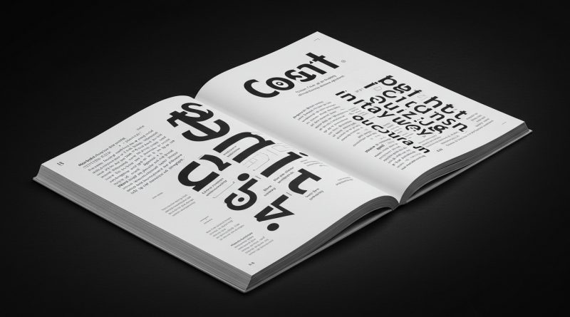
JHDD Typography Report — 2026.07.22
Coca-Cola recently unveiled a new global brand identity focused on greater consistency.
The disparate reports, from the historical analysis of Soviet “massive collages of the Soviet masses” to Simone Post’s explorations of “unconventional materiality,” reveal a persistent friction between the drive for universal legibility and the impulse toward conceptually expressive letterforms. This tension defines much of contemporary visual communication, influencing how static grid systems attempt to accommodate dynamic content and how micro-typographic choices either reinforce or disrupt expected interpretations of legibility across different media.
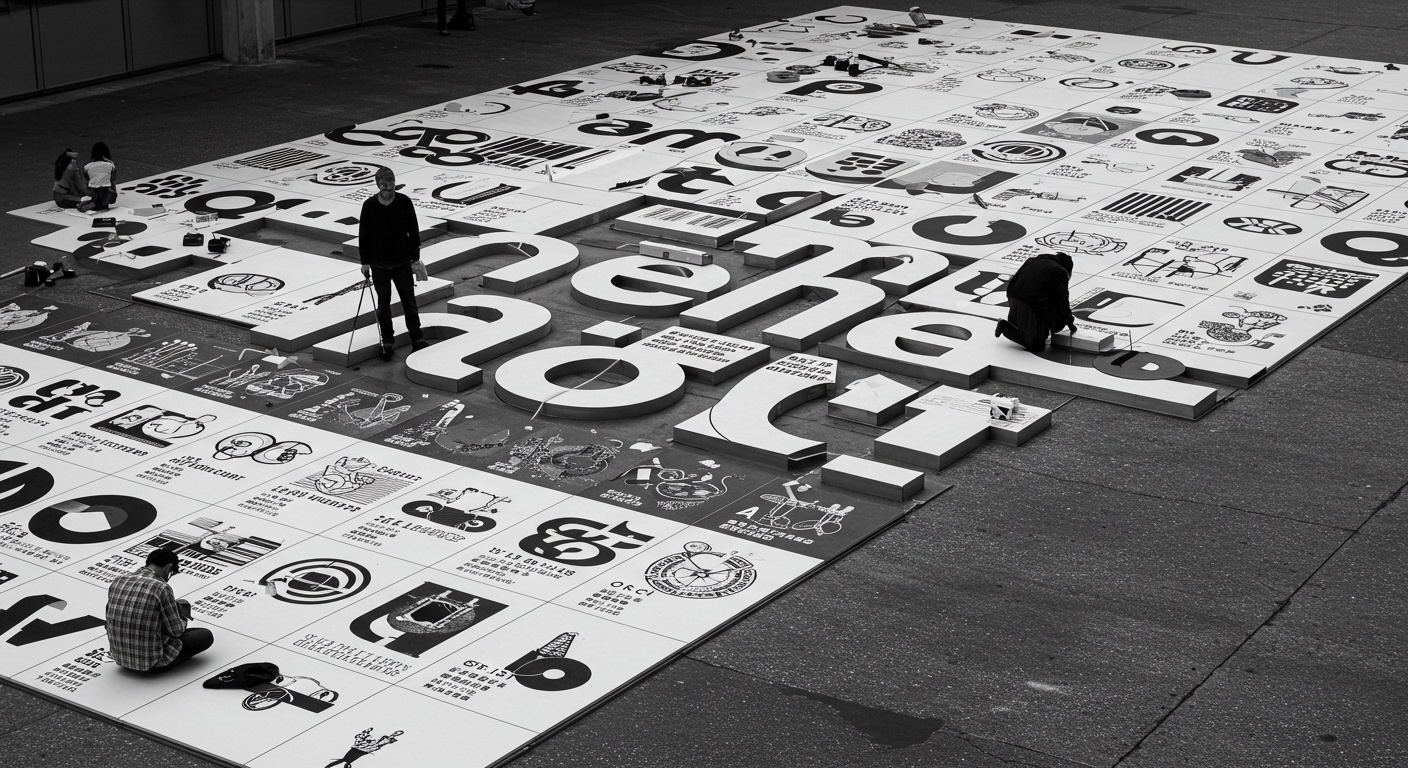
The recent Coca-Cola brand refresh exemplifies the industry’s default position: prioritize consistent recognition across diverse global markets. The goal for “greater consistency” suggests a belief that a stable, unchanging visual language, particularly in its letterforms and their arrangement, ensures universal legibility and brand power. However, this approach often overlooks how a rigorous pursuit of micro-typographic uniformity across all touchpoints can lead to visual blandness, sacrificing local resonance for global predictability. The exactitude of letter spacing, kerning, and baseline grid adherence, while technically precise across innumerable digital and print applications, can flatten the unique cultural inflections of language. This contradicts the mainstream industry opinion that absolute consistency is the ultimate guarantor of robust brand identity; instead, such rigidity risks making the identity brittle when faced with genuine cultural variance, where subtle adjustments might enhance rather than diminish legibility.
This reliance on static grid systems to enforce such consistency may become a liability. Current grid logic, often designed for optimal screen legibility and ease of templating, struggles when encountering material constraints, the expressive potential of conceptual letterforms, or the fluid demands of augmented reality interfaces. The uniform grid, while efficient, can stifle opportunities for micro-typographic adaptations that cater to specific reading environments or cultural contexts. By mid-2027, companies aiming for truly global impact will begin to experiment with adaptive grid systems that allow for nuanced, culturally specific micro-typographic adjustments while maintaining core brand elements. This will necessitate a shift from prescriptive, pixel-perfect type specifications to more fluid, rule-based systems that permit contextual variation in letterforms, leading to a richer, rather than merely consistently applied, visual experience.
The primary opposing force to this nuanced approach is the entrenched infrastructure of digital advertising platforms and their client-side brand guidelines departments. These entities, driven by metrics of instantaneous recognition, ease of global asset distribution, and quantifiable consistency, reinforce a conservative typographic ecosystem. Their systems are built for predictable asset delivery and universal legibility as defined by lowest common denominator interpretations across a multitude of devices. This actively discourages the very contextual variability in grid application and micro-typographic choice that allows for richer conceptual letterforms and more effective cross-cultural communication.
Typography professionals should, this week, identify a live project and experiment with breaking one established grid rule for a non-primary textual element. For example, test a subtle, contextually driven baseline shift or an adjusted tracking value not dictated by the overall style guide. Document the perceived legibility impact versus the conceptual or experiential gain. This is not about advocating for anarchy in design, but about actively identifying the actual functional and communicative bounds of effective visual communication beyond inherited typographic best practices.
TL;DR
The drive for global typographic consistency often prioritizes predictable recognition over culturally resonant legibility, which necessitates new approaches to grid systems and micro-typography.
Curated References
About this editorial — This piece was developed using AI-assisted research and curation across multiple industry sources. All analysis, opinions, and predictions represent the editorial perspective of JHDD. Sources are linked in the references section above.