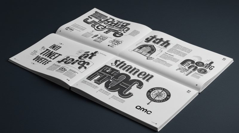
JHDD Typography Report — 2026.07.18
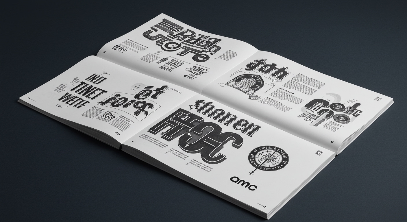
The rebranding effort for AMC, spearheaded by Sheps, aims to create a cinematic brand experience rooted in wonder, drawing inspiration from the theater chain’s beloved 1979 identity.
These varied reports, from Kate Schroeder’s sculptural pottery to the visual identities of AMC, Patriot Front, and KKK Mart, reveal a common thread often overlooked in mainstream design discourse. Brand identity, whether for a product, a service, or an ideology, operates as a deeply embedded system of meaning-making. It is not solely about overt communication or commercial appeal. Instead, the inherent visual structures – the implied grid, the specific conceptual letterforms, and the micro-typographic details – are central to how a message is received and internalized, frequently below conscious awareness.

The work by Sheps for AMC exemplifies a nuanced approach to historical reference, moving beyond mere nostalgic replication. Instead of simply copying the 1979 identity, the project aims to recreate the feeling of wonder. This requires a profound understanding of how conceptual letterforms and their micro-typographic treatment contribute to an overall experiential quality. A prevailing industry opinion often isolates legibility as the primary metric for typographic success. This view is insufficient. Legibility, in this context, must be understood as a means to an end, not the end itself. The clarity of text serves the larger goal of evoking an emotional state, where the choice of a specific ‘A’ or the subtle spacing between characters functions as a part of a larger, systemic grid that paces the viewer’s experience, shaping their perception of “magic.”
The subtle formal cues within a typeface and its surrounding grid directly inform how deeply an identity resonates. Consider the branding efforts for groups like the Patriot Front or the historical KKK Mart; these demonstrate how seemingly conventional legibility can be weaponized. Clean, easily readable typefaces, combined with rigid grid systems, provide an authoritative facade to insidious ideologies. The conceptual letterforms themselves may not be inherently malicious, but their deployment within a carefully constructed visual system — often leveraging micro-typography for emphasis or hierarchy — grants them significant ideological power. It is a prediction that by early 2028, forensic typographic analysis will become a standard tool in identifying the subtle and often subconscious semiotic encoding in political and social messaging, moving beyond content to evaluate the formal mechanisms of persuasion.
The primary resistance to this deeper critical engagement comes from marketing departments and corporate structures driven by immediate, measurable metrics. These entities often prioritize speed, cost-effectiveness, and adherence to simplified brand guidelines, which often overlook the nuanced semiotic impact of micro-typographic decisions and the ideological underpinnings of grid systems.
A working typography professional should, this week, select a seemingly neutral, well-established corporate brand and meticulously deconstruct its visual identity, specifically analyzing how its chosen typefaces, their micro-typographic adjustments (like kerning, tracking, and leading), and the underlying grid system implicitly communicate values beyond the literal text. Document any subtle discrepancies or reinforcements of the stated brand values.
TL;DR
Typographic choices and grid systems carry inherent ideological weight that shapes perception beyond mere legibility.
Curated References
About this editorial — This piece was developed using AI-assisted research and curation across multiple industry sources. All analysis, opinions, and predictions represent the editorial perspective of JHDD. Sources are linked in the references section above.