JHDD Typography Report — 2026.07.08
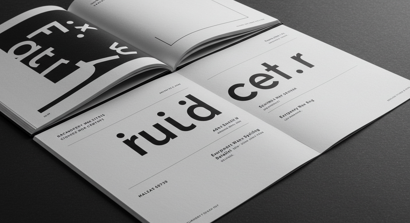
The new identity for European Wax Center, designed by Yard NYC, employs contrasting typography to convey a balanced brand personality.
These recent examples from design publications reveal a consistent, yet often unarticulated, pattern: the sophisticated re-evaluation of legibility through the strategic deployment of micro-typography and conceptual letterforms within grid systems. These are not merely superficial aesthetic changes. Whether it is the visual balance of “expertise, confidence, and personality” for European Wax Center, the historical reinterpretation of Lord & Taylor into Shaver Hall, or R. Sikoryak’s illustrative blend of foundational American documents, each project demonstrates a conscious manipulation of typographic conventions to enhance specific contextual meaning. This approach moves beyond selecting typefaces for their standalone beauty; it prioritizes how type functions as a system of nuanced communication.
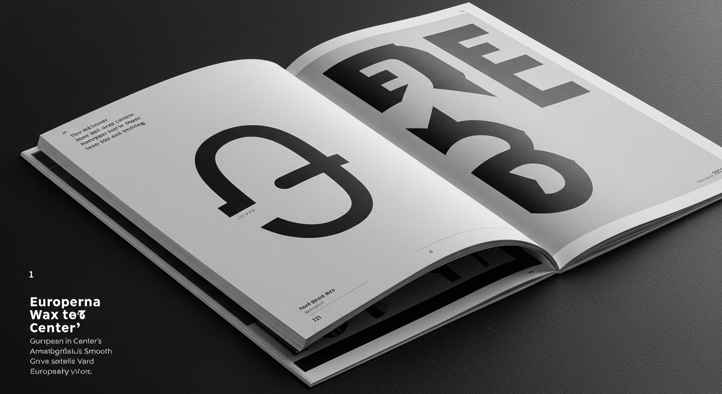
Many within the industry maintain that ultimate clarity and legibility stem from typographic homogeneity, often favoring singular, neutral sans-serif systems for branding. This perspective, however, overlooks the nuanced power of controlled opposition. Yard NYC’s work for European Wax Center illustrates that a deliberate clash of type styles, when precisely managed, can amplify a brand’s unique voice without sacrificing comprehension. The “smoother, more expressive identity” for the brand is achieved not through bland consistency, but through a thoughtful interplay where contrasting elements support the overall message, proving that visual friction, when calibrated, can clarify as much as it distinguishes.
The industry will increasingly recognize that distinctiveness often arises from managed complexity, not reductive simplicity. Within two years, typographic specifications in brand guidelines will extend beyond primary font families and weights to include precise directives on optical sizing for different contexts, character tracking variations for specific usage, and even micro-alignments within grid systems. This shift will demand a deeper understanding of type mechanics from designers and a greater investment in variable font technology that offers granular control over letterform attributes. By mid-2027, the baseline for professional typography will be a mastery of these micro-adjustments, not simply font selection.
The most significant opposing force to this sophisticated approach remains the pervasive reliance on automated layout defaults within content management systems and general design software. These systems, while efficient for rapid deployment, often flatten the subtle hierarchical and expressive qualities that careful micro-typography provides. The pressure for quick turnaround times further discourages the meticulous adjustments required to achieve the kind of nuanced legibility evident in projects like Shaver Hall’s branding by Love & War. This system-driven homogenization often prioritizes speed of production over the precision of communication.
A working Typography professional should, in the coming week, take a long-form text document – perhaps a company report or a detailed article – and conduct an intensive micro-typographic audit. This means adjusting not just point size and leading, but also systematically exploring character tracking (especially for headlines and subheads), word spacing, and the optical alignment of various textual elements within its grid system. The goal is to identify how these small adjustments subtly enhance the document’s inherent hierarchy and readability, demonstrating that legibility is a constructed experience, not a given.
TL;DR
Calculated micro-typographic adjustments and strategic contrast are essential for both clear communication and brand distinctiveness.
Curated References
About this editorial — This piece was developed using AI-assisted research and curation across multiple industry sources. All analysis, opinions, and predictions represent the editorial perspective of JHDD. Sources are linked in the references section above.