JHDD Typography Report — 2026.06.20
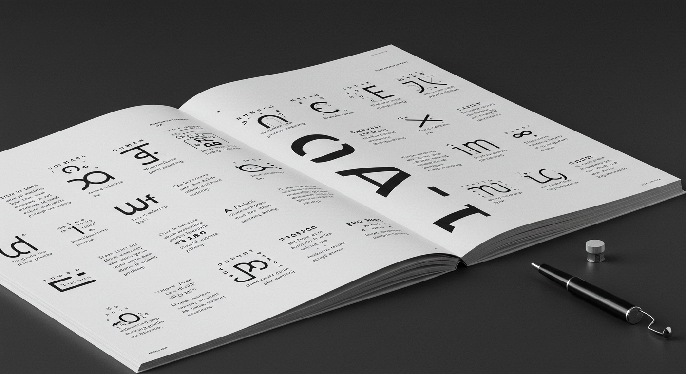
PSTL’s new rounded typeface, Detail, demonstrates how subtle curves and clever deviations define a font’s personality, opting for quiet mischief over loud design gestures.
This approach is not isolated. Across varied design conversations—from the historical deep dive into the American newspaper by Alex Wright to the celebration of graphic ephemera like postage stamps—a common thread emerges: the enduring power of micro-typography and historical context. Designers are increasingly finding significant expressive potential in meticulous, understated refinement rather than sweeping formal innovations. This represents a collective pivot towards precision, where the most compelling design statements manifest through nuanced control over letterforms and their spatial relationships, and where even a nostalgic event like the Brooklyn Botanical Garden’s Summer of Love revival finds its depth in period-accurate typographic detailing.
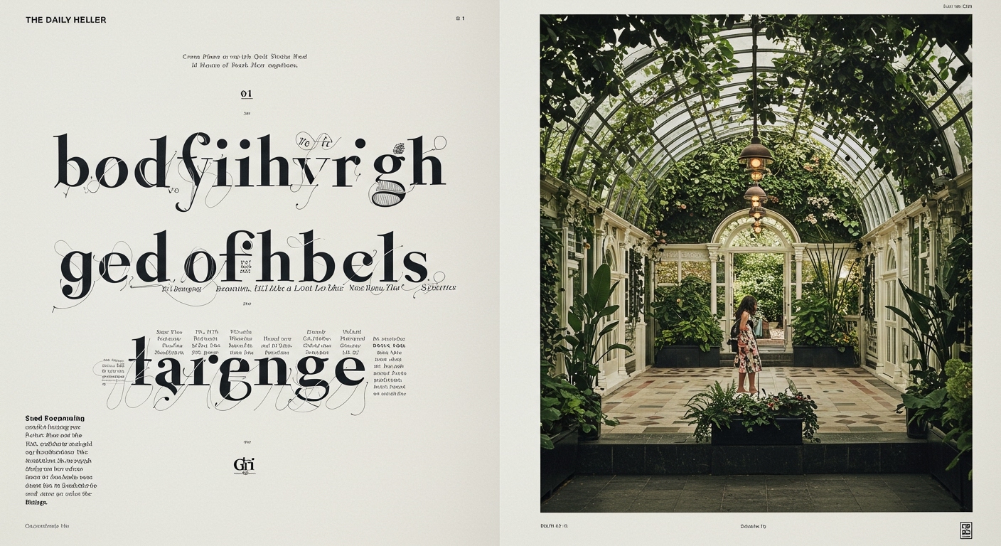
The development of PSTL’s Detail typeface exemplifies this shift. Its success hinges on tiny adjustments in its rounded contours, proving that legibility and distinct character are not mutually exclusive but deeply interdependent, especially at the sub-pixel level in digital rendering. A mainstream industry view often pushes for readily digestible, high-contrast, or dramatically altered letterforms to stand out quickly in a noisy environment. However, the true innovation lies elsewhere. The market’s embrace of a typeface like Detail suggests that contemporary designers and clients are recognizing the long-term value of type that speaks with authority through its inherent refinement and conceptual letterform integrity, rather than shouting for fleeting attention. This contradicts the conventional wisdom that maximum impact requires maximum visual volume or immediate novelty, proposing instead that subtle sophistication yields more lasting engagement.
This focus on the ‘devil in the details’ will extend beyond individual letterforms and into the very construction of typographic environments. Within two years, sophisticated grid systems designed for adaptive digital environments will integrate principles derived from historical newspaper layouts, as explored in Alex Wright’s comprehensive work on the American newspaper. These new grids will move beyond static columns, prioritizing micro-typographic consistency and legibility across diverse screen sizes and content densities. They will ensure that the subtle character of typefaces like Detail is preserved regardless of rendering context. Designers will move towards intelligent systems that can dynamically adjust kerning, tracking, and leading based on content density, user viewing conditions, and even reading speed, making traditional fixed grids seem rudimentary by mid-2027. This will necessitate deeper engagement with the historical constraints and ingenious solutions found in material such as postage stamps, where maximum information was conveyed in minimal space with utmost clarity and aesthetic precision, blending legibility with conceptual integrity.
The primary resistance to this meticulous approach comes from the commercial demand for rapid-fire, visually disruptive communication. The pervasive reliance on pre-packaged design templates and algorithms that prioritize visual impact over typographic nuance often overlooks the very details that contribute to enduring legibility and brand character. This superficial application of aesthetics, frequently seen in quick-turnaround digital marketing, sacrifices the subtle, conceptual letterform integrity for immediate, but ultimately forgettable, visual noise.
Working typography professionals should, this week, select a seemingly mundane piece of historical graphic design—perhaps a vintage map legend or a government-issued form—and conduct a micro-typographic analysis. Examine the spacing, character proportions, and grid implementation not for stylistic emulation, but to understand how legibility and information hierarchy were achieved under severe technical and spatial constraints. Apply these insights to a current digital project, specifically focusing on how adjustments to kerning, leading, and baseline shifts can enhance conceptual clarity and reading comfort without resorting to overt stylistic changes.
TL;DR
Typographic mastery in 2026 relies on micro-detail and historical understanding, not broad gestures.
Curated References
About this editorial — This piece was developed using AI-assisted research and curation across multiple industry sources. All analysis, opinions, and predictions represent the editorial perspective of JHDD. Sources are linked in the references section above.