JHDD Typography Report — 2026.06.07
The current typographic lexicon is being rebuilt from the ground up, not by adding new forms, but by reclaiming and reinterpreting the structural logic of the past.
Across recent design discourse, a subtle yet powerful confluence emerges: a widespread, albeit often unarticulated, pivot from the ephemeral pursuit of novel visual trends towards a profound re-engagement with foundational typographic principles, driven by an imperative for enduring relevance and amplified communicative efficacy. This isn’t merely a stylistic preference for historical forms, but a strategic recalibration, a recognition that the most robust solutions to contemporary design challenges lie not in invention ex nihilo, but in the rigorous application of established frameworks to new contexts. The perceived need for radical originality is yielding to a deeper understanding of how existing typographic structures—grids, established letterform anatomies, and proven legibility strategies—can be re-activated to serve amplified meaning and sophisticated brand identities.
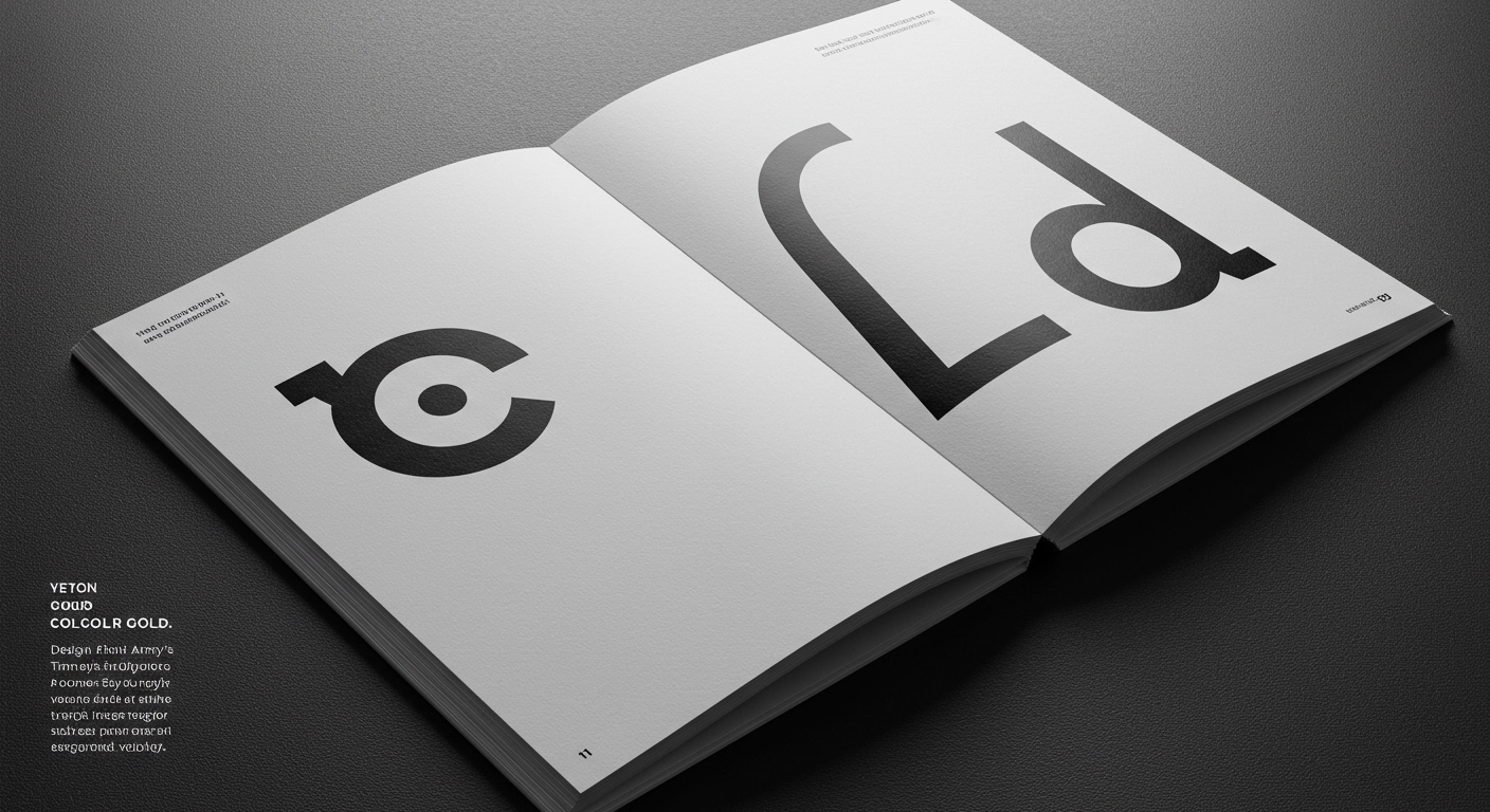
This recalibration is best exemplified by the work of studios like Design Army. Their recent rebrand for Gold House, moving beyond the literal and predictable application of “gold,” demonstrates a sophisticated understanding of conceptual letterforms as anchors for complex identities. Instead of merely decorating, they are employing typography’s inherent structural qualities to build meaning. This approach fundamentally challenges the mainstream industry’s often superficial engagement with “innovation,” which frequently prioritizes fleeting aesthetic novelty over deep conceptual grounding. The prevailing wisdom often suggests that groundbreaking design necessitates entirely new visual languages. However, a seasoned typographic eye sees that the most potent advancements come from the disciplined interrogation and re-application of existing systems. This focus on structure and conceptual clarity, rather than mere surface decoration, suggests that by late 2025, brands will increasingly demand visual systems that are not just aesthetically pleasing but are architecturally sound, capable of withstanding the relentless churn of visual fads and serving as a stable bedrock for long-term brand equity.
The friction against this reintegration of foundational principles stems from the pervasive cult of the “new” within certain sectors of the creative economy, particularly in fast-paced agency environments driven by client demand for immediate, trend-driven differentiation. This resistance manifests as a fear of appearing dated or uninspired, pushing designers towards stylistic experimentation that can often sacrifice legibility and conceptual depth for the sake of perceived cutting-edge relevance. The tension lies between the desire for enduring impact, rooted in typographic integrity, and the pressure for rapid, attention-grabbing visual solutions. This dynamic reveals a fundamental misunderstanding of how true innovation in design is achieved: not by chasing the latest aesthetic whim, but by mastering and then purposefully subverting or extending established systems with conceptual rigor.
A working typography professional can and should begin dissecting existing grid systems with an aim to understand their inherent conceptual limitations and opportunities. This week, focus on a project’s underlying grid not as a restrictive framework, but as a latent conceptual structure. Identify where its assumptions might be actively hindering clarity or conceptual expression, and explore how subtle deviations—a deliberate shift in grid density, an intentional disruption of baseline rhythm, or a redefinition of optical spacing within established letterforms—can introduce new layers of meaning without compromising legibility. This isn’t about breaking rules, but about understanding them so intimately that their purposeful manipulation becomes a powerful design tool, akin to how a musician understands harmony before improvising.
The current typographic pivot is a strategic excavation of foundational structural logic, recontextualized for amplified conceptual impact.
Curated References
About this editorial — This piece was developed using AI-assisted research and curation across multiple industry sources. All analysis, opinions, and predictions represent the editorial perspective of JHDD. Sources are linked in the references section above.