JHDD Packaging Report — 2026.07.17
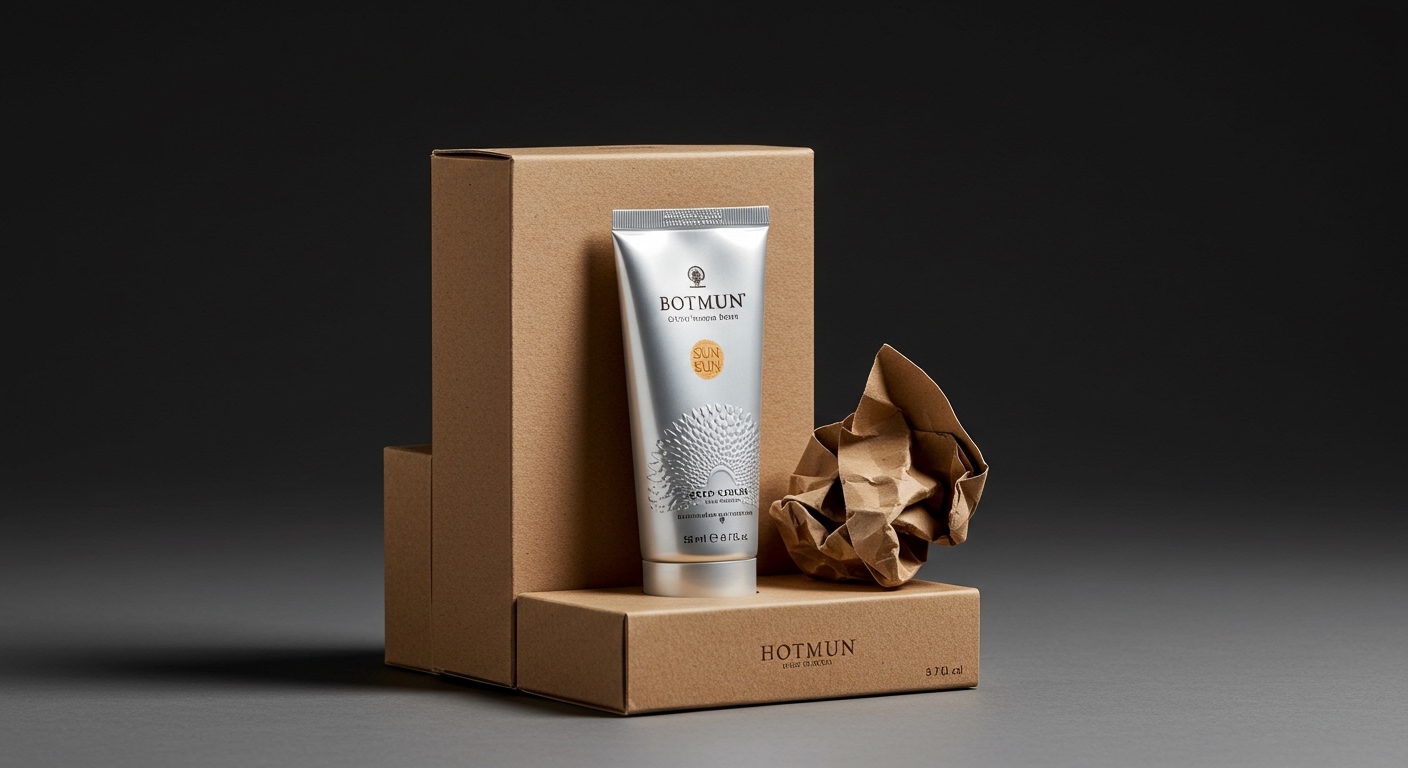
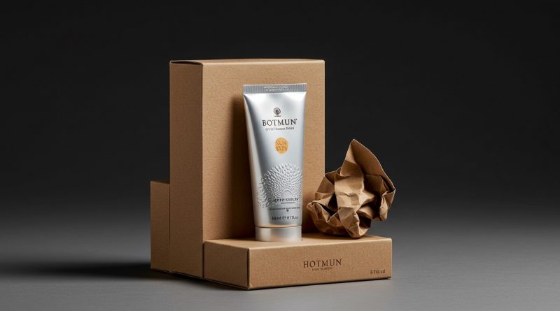
HUGMUN showcases Botnia’s aluminum sun cream tube via gorgeous embossing, utilizing a raw cardboard box with a crumpled metal graphic. This design choice, along with several recent projects, indicates a distinct movement in packaging.
These stories collectively demonstrate a pivot towards packaging as a primary artistic and cultural canvas, moving beyond basic product information to embody a deeper brand identity. Designers are prioritizing specific, often tactile, executions and narrative-driven visuals over generic aesthetic trends or solely functional considerations. The packaging itself becomes an extension of the product’s story and purpose.
Mainstream industry opinion often prioritizes minimalist, often bland, designs for perceived sustainability, equating simplicity with environmental responsibility. HUGMUN’s design for Botnia SPF 30 contradicts this by embracing a raw cardboard box, enhanced with a deeply embossed crumpled metal graphic. This approach shows that the sustainable choice does not require aesthetic sacrifice; instead, it can be a pathway to premium, artful, and highly tactile consumer engagement. Consumers connect with materials and designs that tell a story, even if they are less “clean” in appearance than bleached alternatives. This elevation of packaging from a mere container to an object of desire fosters a stronger, more enduring brand relationship. By mid-2028, highly tactile, narrative-rich packaging for sustainable products will command significant market share in the beauty and personal care sectors.
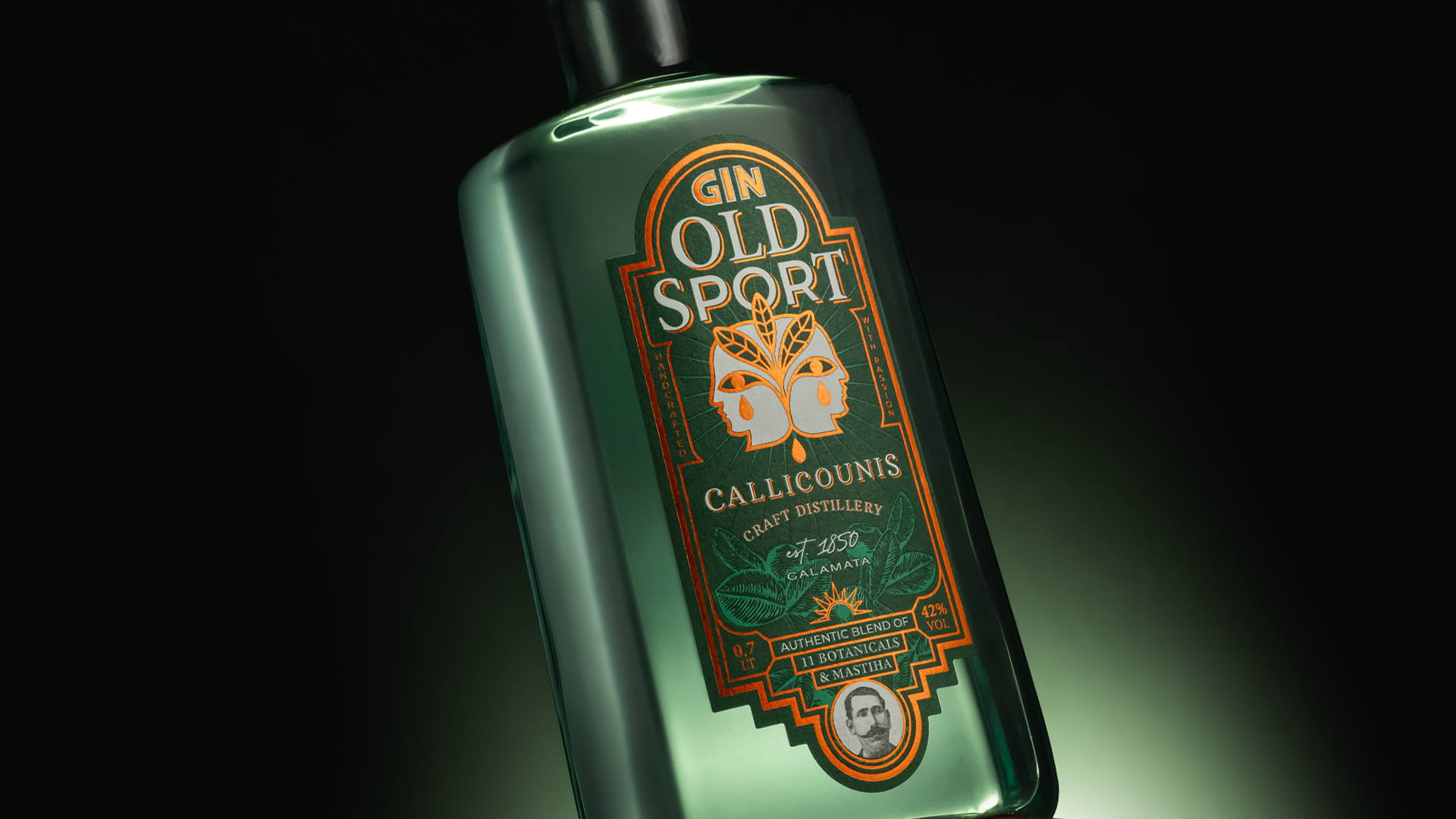
Another common industry assumption suggests that complex, artistically driven packaging is too costly or risky for broader market adoption, especially for everyday products. Method’s collaboration with seven Latine artists for its limited-edition body wash bottles directly challenges this. Each artist transformed the signature bottle into a distinct canvas, reflecting their respective cities and communities. This deepens shelf impact and offers a unique unboxing experience, turning a routine purchase into a cultural interaction. Similarly, Susami Creative Agency’s design for Old Sport Gin, with its Art Deco symmetry and copper on green colors honoring the Tears of Chios, exemplifies how intricate design rich in cultural detail elevates a brand’s perceived value and authenticity. The investment in unique art and storytelling, even for high-volume items, builds stronger emotional connections than simplified branding. This methodology will see increased adoption across personal care, beverage, and food sectors, driving collectibility and brand loyalty within the next two years.
The primary resistance to this shift comes from the inertia of established manufacturing processes and the cost-efficiency models favored by large-scale consumer packaged goods corporations. Legacy supply chains are optimized for volume and standardization, which often clashes with the bespoke material treatments or limited-edition artistic collaborations seen with brands like Brewt’s, whose fantastical airbrushed world, created by Day Job, demands specific printing capabilities and attention to detail that standard production lines may struggle to accommodate.
Packaging professionals should initiate cross-functional workshops early in product development, bringing together artists, material scientists, and production specialists. This ensures that tactile and aesthetic innovations, such as the specific embossing for Botnia or the custom illustration work for Soberanos Chili Oil by Studio Gitanos, are integrated from conception rather than adapted as an afterthought.
TL;DR
Packaging design is evolving into a canvas for deep cultural and artistic expression, using tactile materials to build brand value.
Curated References


About this editorial — This piece was developed using AI-assisted research and curation across multiple industry sources. All analysis, opinions, and predictions represent the editorial perspective of JHDD. Sources are linked in the references section above.