JHDD Typography Report — 2026.07.17
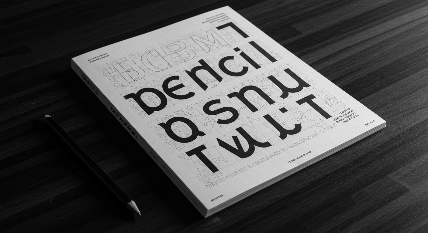
Pencil Magazine’s continued existence highlights an industry’s persistent fascination with the tactile origins of design.
The recent dispatches from The Daily Heller and Print Magazine, covering subjects from ceramic art to historical hate groups, collectively illustrate a deep, often unexamined, undercurrent in contemporary design practice: the persistence of ideologically charged visual systems and their material expression. These stories, disparate in subject, consistently point to how deeply rooted visual identities, whether benign or malign, rely on tangible forms and traditional graphic principles rather than merely fleeting digital presentations. The articles reveal design’s entanglement with enduring human motivations for belonging and differentiation, expressed through concrete visual language.
Consider the branding of the Patriot Front, characterized by an “America First” adherence. Mainstream typography discourse often prioritizes universal legibility and contemporary aesthetic trends. However, this perspective overlooks how groups like the Patriot Front deliberately employ specific, often historically resonant, type choices and visual motifs to cultivate an exclusive, almost encoded, visual identity. Their approach to conceptual letterforms might appear crude or unsophisticated by modern design standards, yet it is profoundly effective within their target demographic. The choice of specific geometric forms or simplified serifs, combined with a rigid grid system in their propaganda, does not aim for broad appeal but for internal coherence and immediate recognition among adherents. This challenges the conventional wisdom that good design must always be universally accessible; for some purposes, deliberate inaccessibility or aggressive clarity to an in-group is the objective.
The efficacy of such visually distinct, almost vernacular, branding suggests a future trend where hyper-specific subcultures or ideological movements will increasingly develop their their own distinct visual grammars. These grammars will often prioritize symbolic resonance and in-group legibility over broad appeal. Within two years, more commercial entities will subtly adopt this strategy of coded visual communication, creating micro-typographies that speak exclusively to defined user segments, allowing for brand differentiation not through universal clarity but through tailored recognition. These applications will extend beyond overt political messaging to consumer products and services seeking to foster intense loyalty among niche audiences.
The primary opposing force to this trend is the prevailing industry emphasis on user experience (UX) metrics that favor immediate, effortless comprehension for the widest possible audience. This broad legibility mandate, often driven by data and accessibility guidelines, inadvertently homogenizes visual language, pushing against the deliberate differentiation and conceptual encoding observed in more ideologically driven branding. Large technology platforms, with their emphasis on universal interface design, exemplify this homogenization, subtly discouraging deviation from established legibility norms across their vast ecosystems.
Typography professionals should conduct detailed semiotic analyses of historical type usage within specific subcultures and political movements. This involves examining the micro-typography of propaganda, manifestos, and community ephemera from the mid-20th century to the present. Identify how specific letterform characteristics, grid variations, and spatial relationships contributed to or reinforced particular ideologies, regardless of mainstream aesthetic judgment. This week, dedicate three hours to studying the visual rhetoric of at least two historically significant, non-mainstream publications.
TL;DR
Ideologically driven branding prioritizes in-group recognition and conceptual encoding over universal legibility.
Curated References
About this editorial — This piece was developed using AI-assisted research and curation across multiple industry sources. All analysis, opinions, and predictions represent the editorial perspective of JHDD. Sources are linked in the references section above.