
JHDD Branding Report — 2026.07.17

Pentagram New York’s design for Rugiet, featuring unabashedly phallic visual cues, directly confronts conventional discretion in men’s health branding.
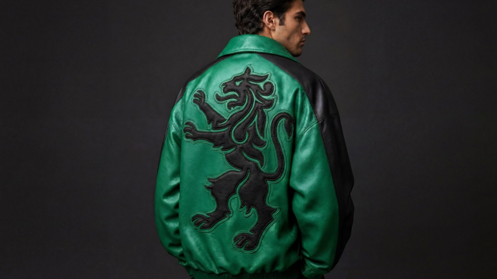
This directness, often perceived as niche or even risky, is a common thread. Fjord’s positioning of a sauna experience between architecture and outdoor recreation, instead of pure wellness, similarly expands its category definition. JKR’s approach to Sporting CP, drawing deeply from heritage but rendering it robustly contemporary, also avoids generic modernization. These examples demonstrate a calculated move away from generalized appeal towards a highly specific, often provocative, market stance.

Consider Fjord, the San Francisco Bay cold plunge and sauna. DutchScot’s branding for Fjord is industrial, conceptual, and starkly beautiful, deliberately avoiding the soft, ethereal tropes common to the wellness industry. The mainstream industry opinion often dictates that a new wellness offering should maximize its addressable market by emphasizing broad concepts of relaxation, self-care, and escape. However, this approach frequently leads to visual and tonal indistinguishability. Fjord’s choice to lean into architecture and recreation carves out a distinct cultural signal, targeting a segment that values rigor and experiential authenticity over passive pampering. It cultivates brand equity through curated exclusivity, not widespread relatability.
This deliberate specificity allows brands to build deeper resonance with a core audience, fostering a sense of belonging that generic branding struggles to achieve. Rather than losing customers, the brand gains advocates who recognize and appreciate the clarity of its positioning. By mid-2027, brands that have traditionally relied on broad, anodyne identities will find their market share eroded by challengers who have embraced a more focused, culturally sharp visual and verbal identity. These challengers will have translated their specific worldview into their brand’s aesthetic language, drawing clear lines in the market.
The primary resistance to this specificity comes from corporate risk aversion, particularly within large organizations with established market positions. Legal departments and legacy brand guidelines often prioritize avoiding any potential controversy or niche appeal, fearing alienation of existing customers. This preference for safety and consensus frequently translates into bland visual identities and diluted messaging, which aim for universal acceptance but achieve minimal impact.
A branding professional should immediately audit client brand portfolios for instances where visual identity systems and market positioning attempt to be everything to everyone. Specifically, identify a brand’s most passionate, even if smaller, audience segment. Then, identify one concrete visual or verbal element that could be amplified or sharpened to speak directly to that segment, even if it might slightly narrow broader appeal. This involves moving beyond surface-level aesthetics to interrogate the underlying cultural signals a brand is sending.
TL;DR
Effective brand equity today comes from specific, often challenging, cultural signaling that attracts a distinct audience rather than broadly appealing to everyone.
Curated References




About this editorial — This piece was developed using AI-assisted research and curation across multiple industry sources. All analysis, opinions, and predictions represent the editorial perspective of JHDD. Sources are linked in the references section above.