JHDD Packaging Report — 2026.06.11
The consumer demand for tangible authenticity will soon render digital-only unboxing experiences obsolete.
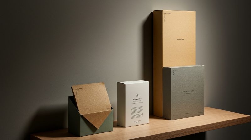
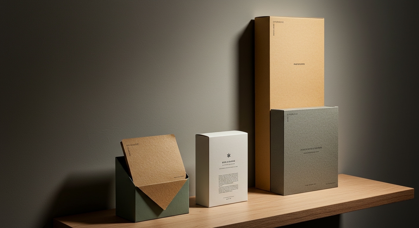
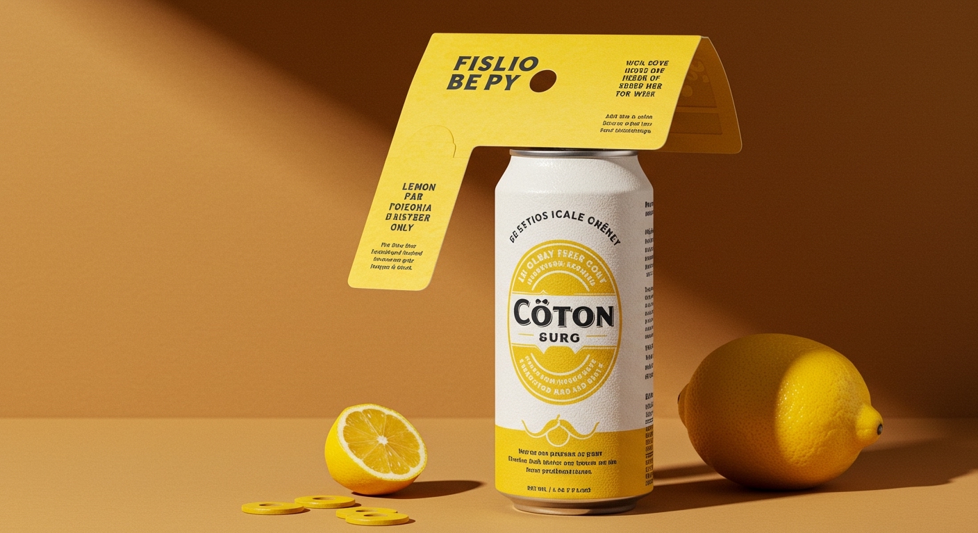
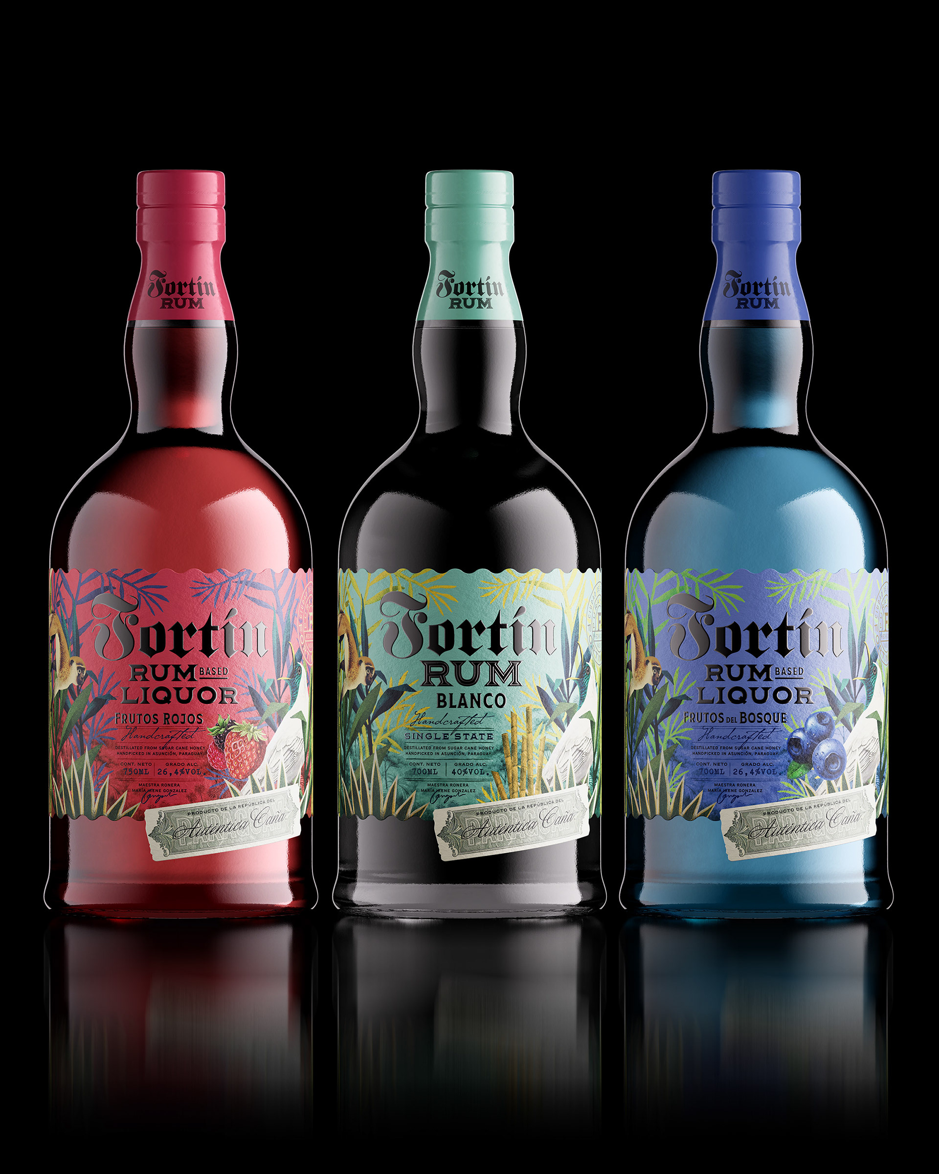
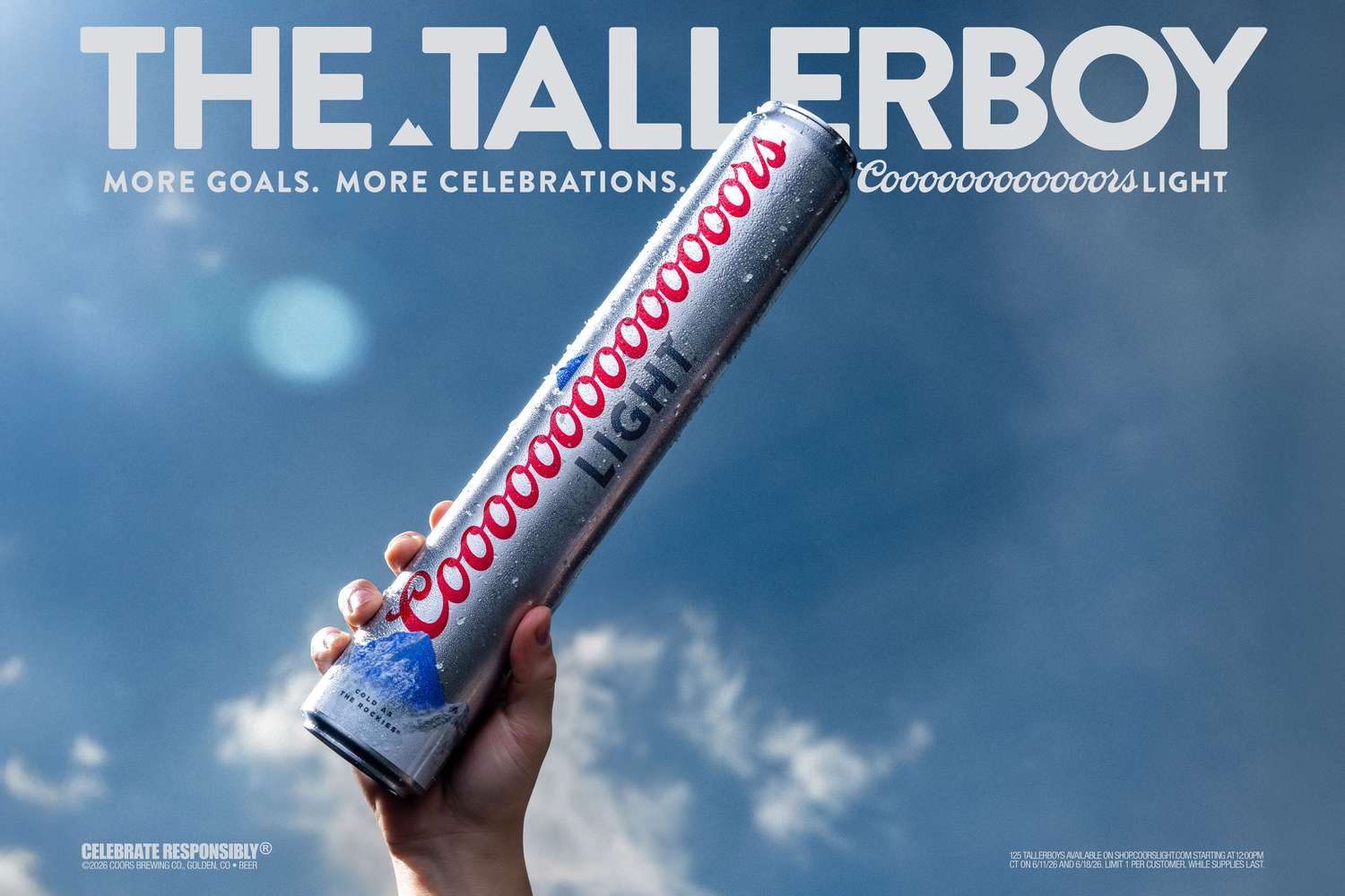
A palpable shift is occurring, driven by a convergence of factors that can be collectively termed the “Tactile Renaissance.” This isn’t merely about aesthetics; it’s a fundamental re-evaluation of how brands connect with consumers at the point of interaction. The research context points to a growing desire for packaging that offers more than just visual appeal. Côte Citron’s “members only” approach, Fortín Rum’s richly detailed botanical illustrations, and even the peculiar functional indulgence of the Coors Light Tallerboy, all speak to an instinct to create an experience beyond the purely transactional. This renaissance is fueled by a deep-seated yearning for sensory engagement in an increasingly digitized world, where provenance, craftsmanship, and the sheer physical presence of a product are becoming paramount differentiators. Consumers are developing a more sophisticated palate for tactile cues, demanding that packaging not only look good but feel substantial, unique, and indicative of a considered creation process. This moves beyond simple eco-friendliness to a broader appreciation for material integrity and the story it tells.
This demand for tangible authenticity is fundamentally challenging the prevailing industry wisdom that prioritizes digital-first marketing and visually driven, often fleeting, trends. For instance, the Pirate’s Booty rebrand, by trading its hand-drawn scrappiness for CGI polish, risked alienating a core audience that likely connected with the brand on a visceral, imperfect level. Similarly, the Oro Saiwa re-imagining by Dragon Rouge, while aiming for modernity, highlights the tightrope walk between updating a legacy and losing its soul. The over-reliance on smooth finishes and hyper-realistic digital rendering, while efficient for mass production and broad appeal, can often create a sterile experience. A counter-narrative is emerging, championed by brands that understand the power of a deliberate texture, a carefully chosen weight, or a surprise tactile element within an unboxing. Oveja & Remi Studio’s work for Fortín Rum exemplifies this, where the intricate detail of the illustrations is amplified by the paper choice and printing techniques, creating a bottle that feels like an artifact. The true innovation lies not just in beautiful graphics, but in how those graphics integrate with the physical substance of the package. By late 2025, brands that have not incorporated deliberate, memorable tactile elements into their primary packaging will experience a measurable decline in repeat purchase rates among their most engaged customer segments.
The opposing force to this Tactile Renaissance is the relentless pressure for cost optimization and scalability in a hyper-competitive global market. Large-scale manufacturers and many established brands are deeply invested in efficient, high-speed production lines that favor uniform, smooth surfaces and readily available, mass-produced materials. Introducing unique textures, variable embossing, or specialized inks can significantly increase per-unit costs and slow down production cycles, creating a friction point with procurement departments and operations managers who are incentivized by volume and efficiency. This tension reveals a fundamental disconnect between the evolving desires of discerning consumers and the legacy infrastructure of mass packaging production. The established systems are optimized for a predictable, visually driven experience, making the integration of nuanced tactile elements a significant logistical and financial hurdle. This inertia perpetuates a cycle where the more accessible and widely adopted solutions are often the least sensorially engaging.
A working Packaging professional should immediately prioritize a deep dive into material science that goes beyond sustainability certifications. Specifically, investigate the tactile properties of underutilized materials like uncoated recycled papers with inherent fibrous textures, molded pulp with varying densities, or even bio-based composites that offer unique surface qualities. Understand how different printing techniques – such as debossing, letterpress, or textured varnishes – can interact with these materials to create distinct sensory experiences. Don’t just ask “Is it recyclable?”; ask “How does it feel when you hold it? What story does its texture tell?” This week, dedicate time to physically interacting with packaging that excites you, dissecting what makes its touch memorable and explore how similar effects can be achieved within your own project constraints, even if it means challenging the initial material brief.
TL;DR
The future of packaging interaction lies in intentional, cost-effective tactile design that creates a physical brand experience, moving beyond purely visual appeal to drive deeper consumer connection.
Curated References



About this editorial — This piece was developed using AI-assisted research and curation across multiple industry sources. All analysis, opinions, and predictions represent the editorial perspective of JHDD. Sources are linked in the references section above.