JHDD Interior Report — 2026.08.23
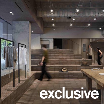
AIM Architecture’s amphitheatre-like brick podium at Zara Huaihai Road reasserts the physical form’s role in guiding human interaction.
This emphasis on a grounded, tactile material experience recurs across disparate commercial projects, indicating a subtle pivot away from purely visual spectacle towards spaces that actively engage the body. It suggests designers are calibrating spatial arrangements and material interfaces to create inherent friction or invitation, impacting pedestrian pace and presence within a space.
Tatjana von Stein’s design for The Dean Munich, particularly her bespoke lights and furnishings blending Jugendstil with 1980s glamour, exemplifies this push for layered, sensory environments. Mainstream commentary often dissects such eclectic styles for their thematic coherence or trend relevance, framing “dopamine decor” as either a frivolous indulgence or a marketing ploy. However, this interpretation misses the deeper function of these material juxtapositions. The interplay between the sinuous lines of Art Nouveau and the bold, often reflective surfaces of 1980s aesthetics creates a specific kind of spatial tension. This tension, rather than being merely aesthetic, forces a different kind of human engagement. It makes patrons pause, run hands over varied textures, and experience light differently, resisting the superficial scan common in digitally informed design.
The true value lies not in the “dopamine” label, which Julie Lasky rightly critiques for its glibness, but in the deliberate crafting of spaces that demand a slower, more embodied perception. The choice of specific materials and forms by von Stein, from polished metals to plush velvets, is about curating a series of tactile and visual thresholds that impact flow and duration of stay, not just signaling a trend. This approach moves beyond the flat, Instagram-optimized surface to build complex micro-climates of touch and sight. By mid-2027, designs that explicitly foreground haptic experience through contrasting material palettes will see a significant increase in client briefs, moving beyond generic luxury finishes to those that evoke specific, non-visual memories or sensations.
The primary opposing force is the persistent client demand for “instagrammable moments” and rapid turnover of superficial trends, often fueled by aggregated social media feeds that flatten complex sensory experiences into two-dimensional visuals.
Interior professionals should, this week, select a small, unconventional material pairing – perhaps rough-hewn stone with polished brass, or raw concrete with draped silk – and build a physical model or mock-up. Explore how different lighting conditions alter the tactile perception and perceived spatial tension between these elements, rather than relying solely on digital renderings.
TL;DR
Design must prioritize tangible spatial tension and tactile quality over superficial visual trends to genuinely engage occupants.
Curated References


About this editorial — This piece was developed using AI-assisted research and curation across multiple industry sources. All analysis, opinions, and predictions represent the editorial perspective of JHDD. Sources are linked in the references section above.