JHDD Branding Report — 2026.10.12
All Purpose’s identity for Two Tribes Brewing explicitly defines itself as ‘craft’ while consciously departing from established craft beer visual codes.
These recent identity projects reveal a pattern: brands are strategically engaging in a calculated subversion of established visual category systems. They are not merely adopting new trends; they are performing a balancing act, maintaining enough category belonging for recognition while injecting specific, often playful, forms of rebellion. This shift moves beyond simple differentiation and into a sophisticated form of cultural signal management, where brand equity is built on recognized difference rather than outright departure from the sector.
Conventional wisdom often dictates that brands, especially in crowded categories, should adhere closely to established visual cues for immediate recognition and perceived authenticity. A craft beer brand, by this logic, might be expected to visually signal its artisanal nature through familiar elements such as rustic typography or earthy color palettes. However, All Purpose’s work for Two Tribes Brewing, founded by veterans of London’s 1990s club scene, defies this expectation. It embraces the ‘craft’ label while deliberately turning its back on the visual language commonly associated with it, opting for a distinct aesthetic. This strategic departure creates a more robust and memorable market positioning.
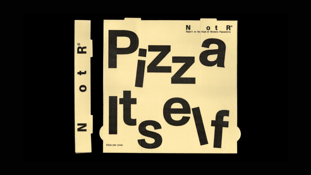
Mainstream industry opinion frequently prioritizes broad legibility and instant category recognition, arguing that consumers need immediate visual cues to place a brand. This view risks genericism. Two Tribes demonstrates that a brand can build stronger equity by leaning into specific cultural signals that resonate deeply with a target audience, even if it initially requires a moment longer for a new consumer to decode its category. This subtle rejection of visual cliché creates a more intriguing brand narrative and strengthens recognition through distinctiveness, not just familiarity. Similarly, Koto’s “lively, thoroughly human, and just the right amount of cute” branding for Franki, or Vrints-Kolsteren’s “mischief to minimalism” for Napoli on the Road, showcase this nuanced approach. By mid-2027, more established players in crowded categories will begin to adopt these nuanced, counter-intuitive visual strategies, moving beyond safe, iterative refreshes.
The most significant opposing force to this intelligent subversion is short-term sales metrics and the pervasive risk aversion inherent in many marketing departments. The pressure to achieve immediate, measurable returns often leads to safe, derivative branding choices that mimic successful competitors or adhere strictly to established visual norms. Internal stakeholders, particularly those without deep design or cultural strategy experience, often resist identity systems that challenge immediate recognition or require a slight cognitive leap from the consumer, favoring broad appeal over resonant distinctiveness.
This week, a branding professional should select a current client’s category and identify three visual or narrative clichés that are ubiquitous across its competitive landscape. They should then propose one specific way the client’s brand could subtly subvert or play with one of those clichés without abandoning category recognition entirely, focusing on how this subversion could create a more memorable cultural signal. For example, if all competitors utilize bold, aggressive typography to signal strength, explore a uniquely elegant yet assertive serif font to achieve the same perceived attribute.
TL;DR
Brands are building equity by subtly subverting category visual clichés, creating distinct cultural signals.
Curated References


About this editorial — This piece was developed using AI-assisted research and curation across multiple industry sources. All analysis, opinions, and predictions represent the editorial perspective of JHDD. Sources are linked in the references section above.