JHDD Branding Report — 2026.09.21
Wedge’s Bastét toothpaste features a brand identity described as making “absolutely no sense for its category.”
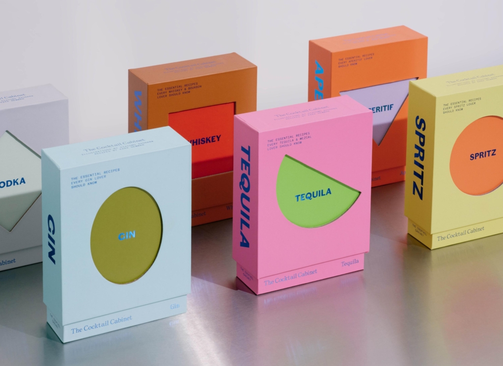
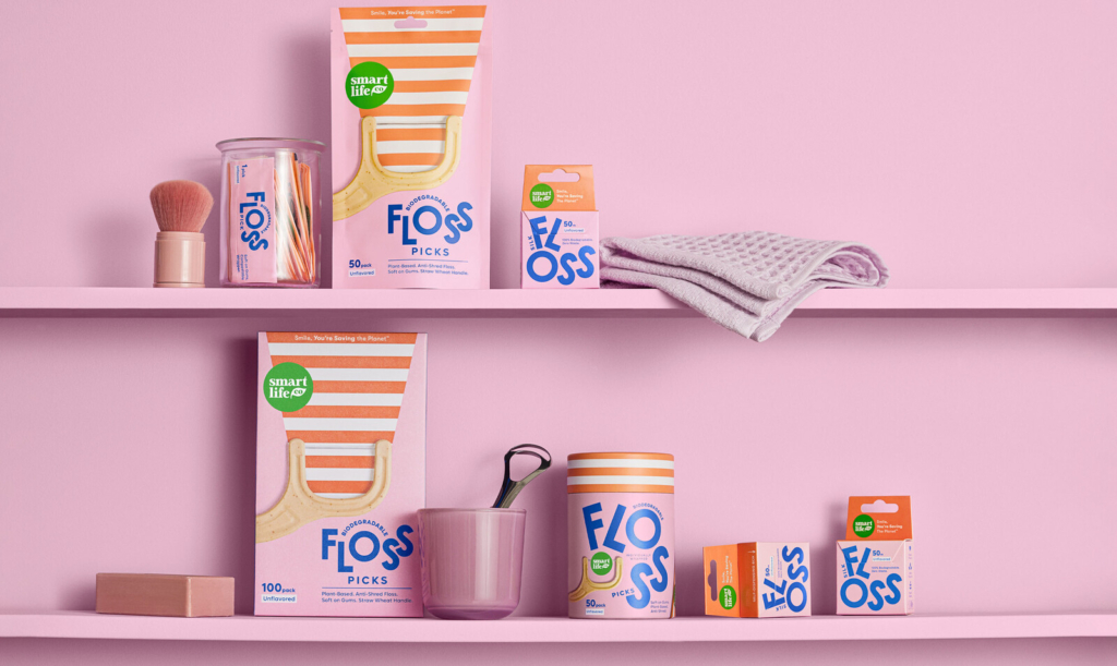
This perceived incongruity connects several recent brand launches. From Bastét’s oral care packaging to Studio South’s work for Oodles, which gives a noodle joint the aesthetic of a hip skate brand, there is a deliberate move towards brand identities that actively subvert established category visual cues. Mother Design’s strategy for Keen, embracing a 90s New Age sensibility for a psychic platform, similarly leverages cultural signals previously considered niche or ‘unserious’ to establish a distinct market position. These examples demonstrate a sophisticated approach to brand equity, where differentiation comes from a strategic departure from the expected.
Mainstream industry opinion often prioritizes immediate category legibility and adherence to established visual systems. Conventional wisdom states that consumers need to instantly recognize what a product is and where it belongs on the shelf. However, the success of brands like Bastét contradicts this. The identity for Bastét, operating in a sector Lisa Cain observes as where “good design usually goes to die,” achieves memorability precisely by eschewing the clinical white and blue tropes. Its “utterly gorgeous” aesthetic creates a powerful cultural signal, signaling premium quality and a distinct lifestyle affiliation that transcends functional benefits. This positioning allows it to stand out on crowded oral care shelves without needing to verbally explain its “Nano-hydroxyapatite” differentiator.
This strategic incongruity builds brand equity by fostering curiosity and signaling an elevated perspective, rather than just functional clarity. It assumes a consumer willing to engage beyond surface-level category cues. For a brand like Keen, this meant tapping into a ‘post-woo-woo’ acceptance, aligning psychic services with a sophisticated, digitally native audience through nostalgic visual language. By late 2027, this trend will likely see an increase in established, traditionally conservative categories adopting “off-category” visual identities as a primary means to capture new demographics and signal relevance, moving beyond mere minimalist refreshes.
The primary resistance to this approach comes from internal stakeholders within large organizations, particularly those in risk management, traditional market research departments, and sales teams fixated on immediate conversion metrics. They often prioritize designs that offer instant recognition and reassurance over those that challenge perceptions, fearing consumer confusion or alienating the existing customer base. Legacy brands, anchored by decades of category-conforming visual equity, also represent a significant force against such radical shifts, seeing them as a threat to established market positioning rather than an opportunity for revitalization.
Branding professionals should actively conduct visual audits that extend beyond direct category competitors, analyzing cultural signals and visual identities from entirely unrelated sectors that resonate with the target audience’s broader aspirations. Presenting mood boards that deliberately include “unfitting” aesthetics early in the creative process, and framing them as opportunities for unexpected equity, can help shift client perspectives away from default category conventions.
TL;DR
Brands build equity by strategically deploying visual identities that defy category norms and leverage unexpected cultural signals.
Curated References


About this editorial — This piece was developed using AI-assisted research and curation across multiple industry sources. All analysis, opinions, and predictions represent the editorial perspective of JHDD. Sources are linked in the references section above.