JHDD Branding Report — 2026.09.08
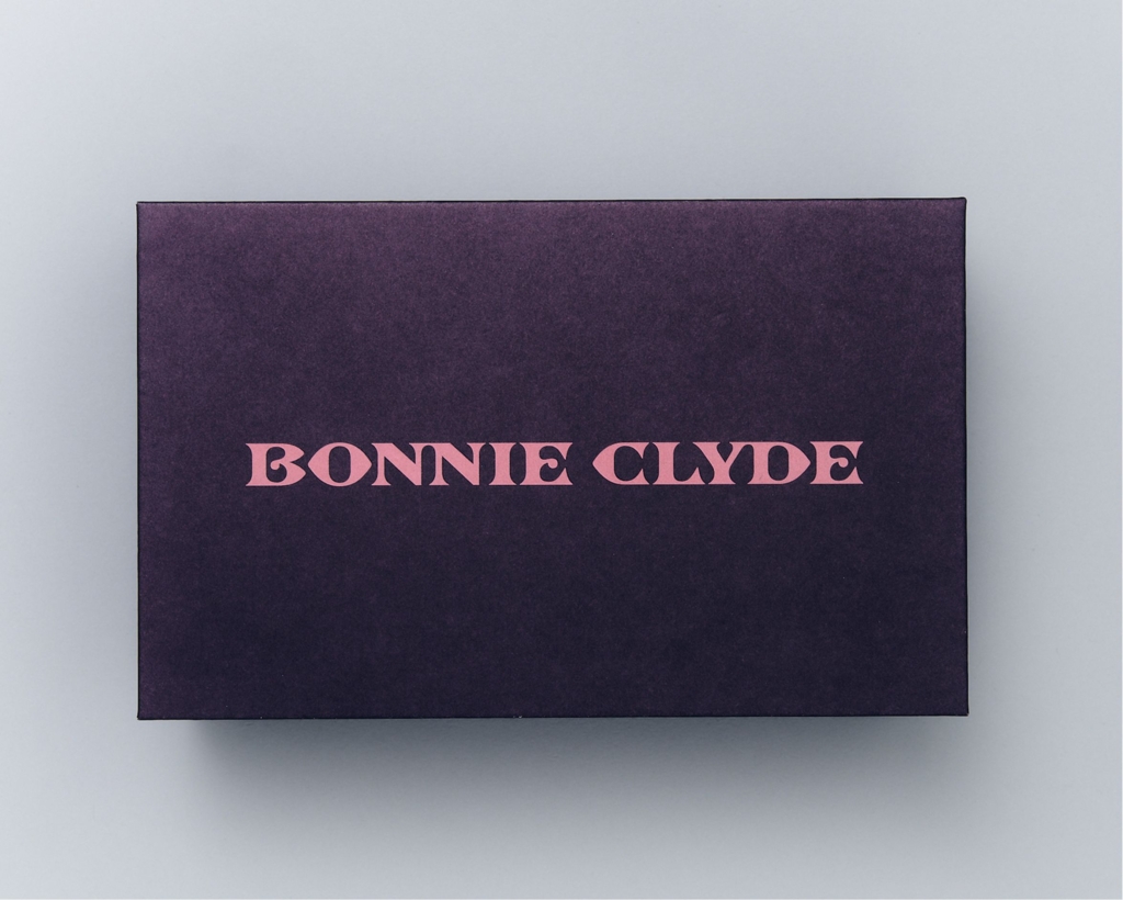
Mouthwash Studio’s identity for eyewear brand Bonnie Clyde actively courts confusion and historical inaccuracy.
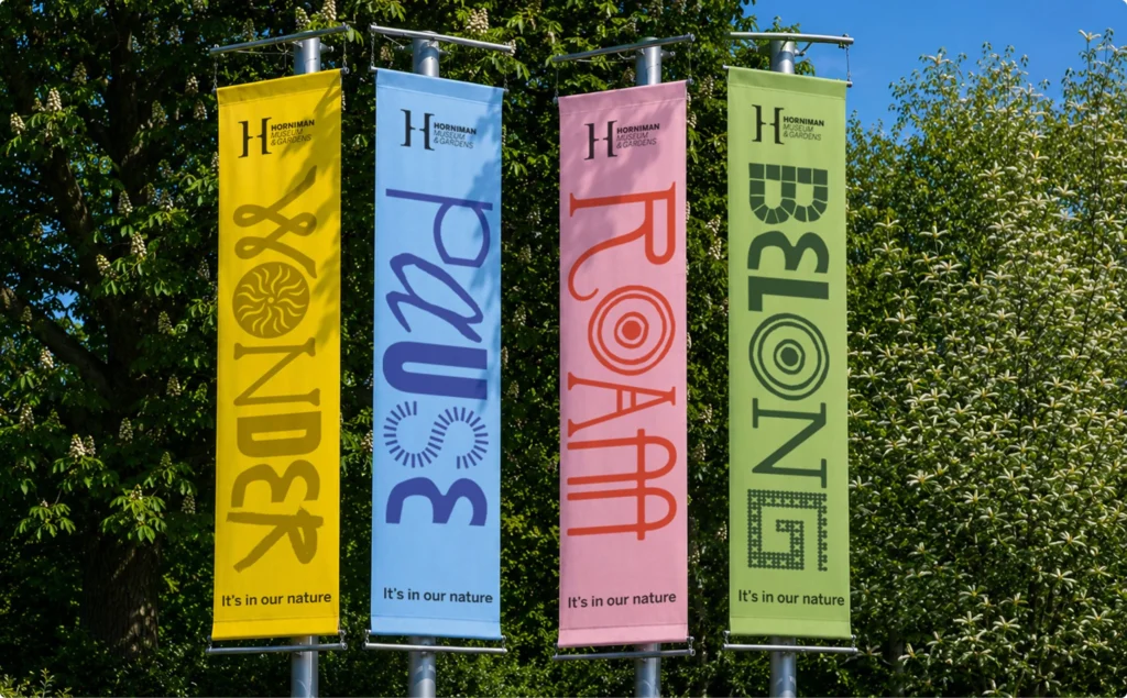
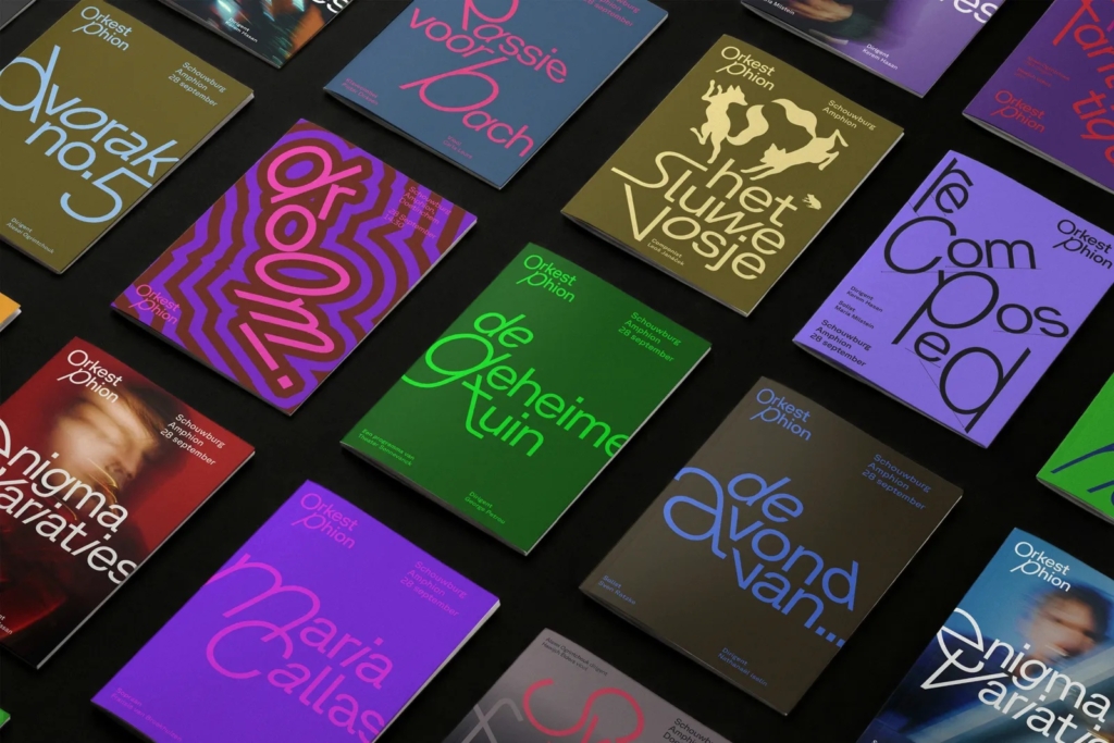
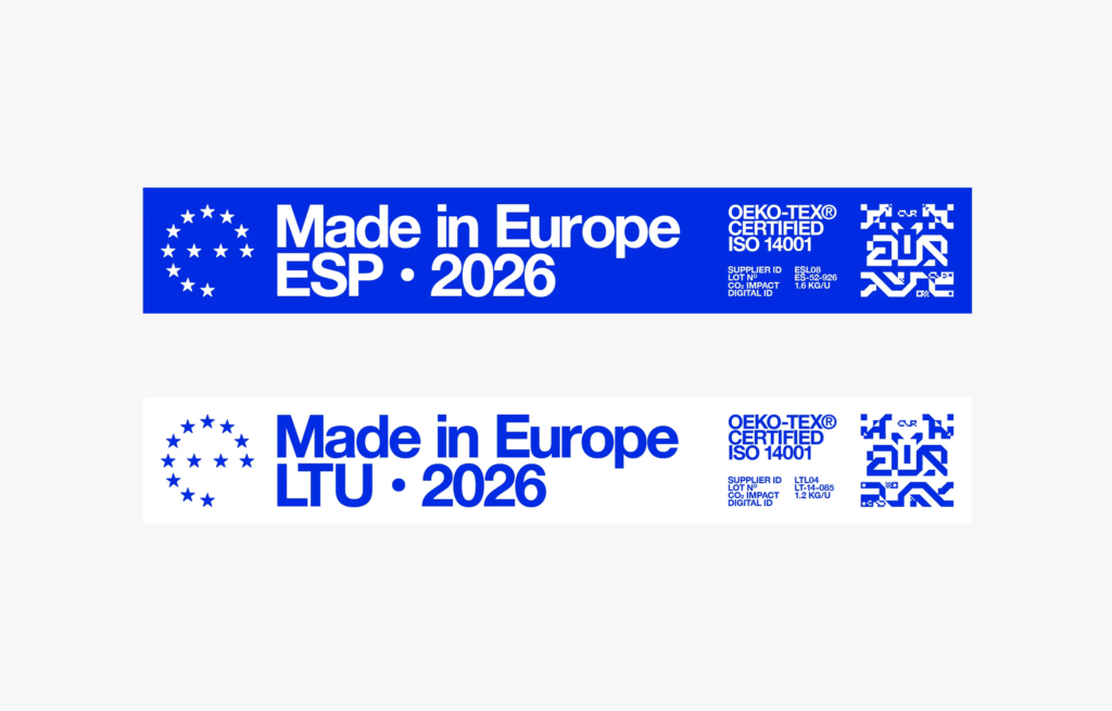
This approach reflects a growing trend where brand identity systems deliberately move away from singular, immutable expressions. Instead, they embrace fluidity, internal contradictions, or even a degree of deliberate “messiness.” Thonik’s work for Orkest Phion, a travelling symphony orchestra, exemplifies this with a visual system designed to be “ever-changing and itinerant.” Similarly, Anatomy’s identity for the Horniman Museum playfully integrates elements that might challenge conventional museum branding, moving beyond a predictable aesthetic. Even discussions around concepts like “Europe as a Brand” suggest a recognition that complex entities cannot be distilled into simple, static symbols. The value now lies in the system’s capacity for dynamic interpretation and adaptation, rather than its fixed form.
Mainstream branding wisdom dictates that clarity and consistency are paramount for building strong brand equity. The industry often promotes streamlined visual identities, easily digestible narratives, and a rigid adherence to guidelines to prevent consumer confusion and dilute brand recognition. However, the success of Mouthwash Studio’s identity for Bonnie Clyde suggests a contrary perspective: that intentional complexity and even historical inaccuracy can, in specific contexts, strengthen a brand’s cultural signal. For a discerning audience, this perceived “confusion” or “inaccuracy” is not a flaw, but an invitation to deeper engagement, signaling an independence from mass-market expectations. It allows the brand to operate outside expected visual tropes, fostering a unique, almost insider, connection with its audience.
This requires audiences to invest more cognitive effort, which can paradoxically lead to a stronger, more memorable bond. Within two years, more luxury and niche brands will prioritize these nuanced, multi-layered visual identities over easily digestible, universal symbols, creating equity through distinctiveness rather than immediate legibility.
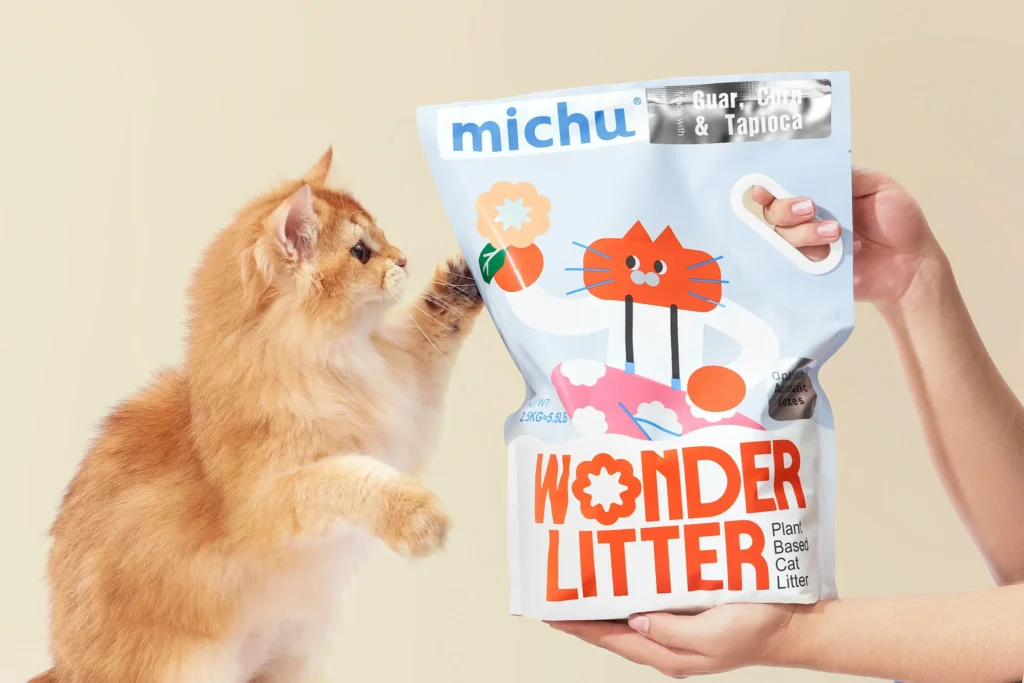
This trend faces resistance from risk-averse corporate structures and traditional marketing departments. Brands reliant on broad, immediate consumer recognition, such as large fast-moving consumer goods companies like those in the Michu cat litter market, still prioritize straightforward communication and visual consistency to drive transactional volume. Their existing brand equity often rests on familiarity and predictability, making a shift towards intentional ambiguity commercially unviable.
Branding professionals should challenge briefs that demand absolute visual uniformity across all touchpoints. Instead, they should explore developing “adaptive identity systems” where core brand tenets are expressed through a range of variables, permutations, or even deliberately discordant elements. This involves designing visual languages that anticipate and embrace change, context, and nuance, rather than resisting them with rigid guidelines. The goal shifts from creating a static logo to engineering a dynamic system of recognition.
TL;DR
Successful brands are increasingly embracing dynamic, even contradictory, identity systems that foster deeper engagement.
Curated References
About this editorial — This piece was developed using AI-assisted research and curation across multiple industry sources. All analysis, opinions, and predictions represent the editorial perspective of JHDD. Sources are linked in the references section above.