JHDD Branding Report — 2026.08.26
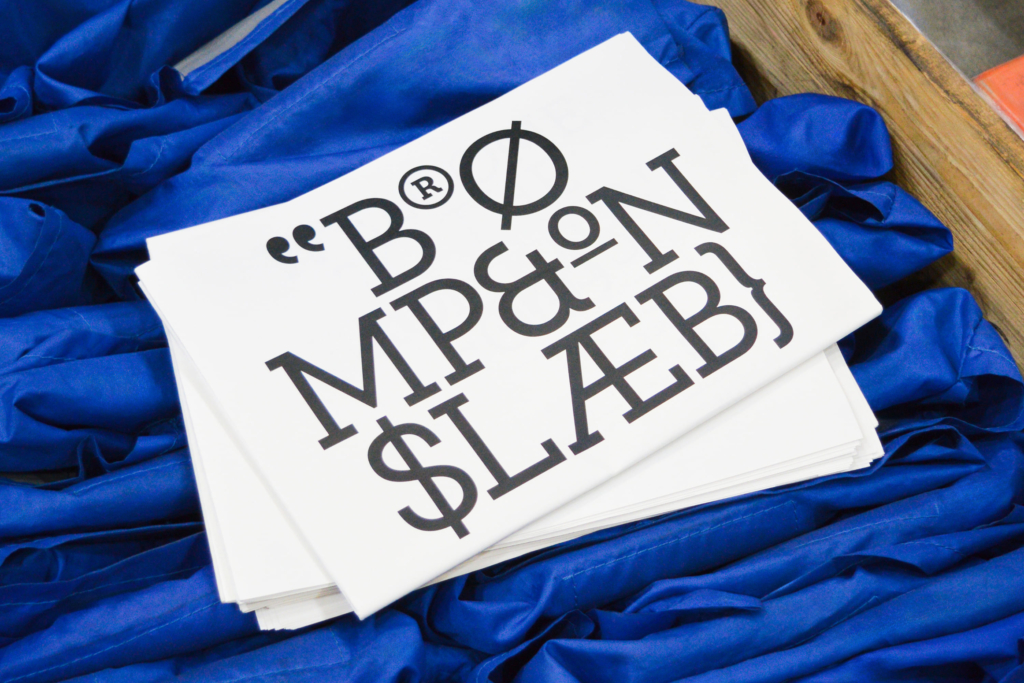
Brompton, the folding bike icon, maintains its British engineering heritage through Studio Blackburn’s new identity work. This focus on deep-seated origins and inherent characteristics appears across multiple recent design engagements. The pattern connecting these projects is a precise articulation of a brand’s core essence, often rooted in history, geography, or a distinctive ethos, rather than a pursuit of transient trends or generic ‘boldness’.
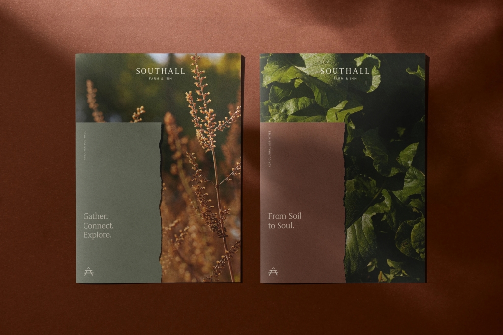
Perky Bros’ identity for Southall, a Tennessee resort, exemplifies this by prioritizing “restrained Southern hospitality” over what the industry often lauds as “shouty branding” or “disruption”. This approach recognizes that true brand equity for Southall comes from an authentic expression of its unique locale and service philosophy, not from attempting to stand out through visual aggression. A prevailing industry opinion suggests that brands must be loud and constantly innovative to capture attention. However, this view overlooks the power of subtle, yet deeply resonant, brand identities that build long-term affinity. By mid-2027, many brands that adopted generic ‘disruptive’ aesthetics will find their positioning increasingly undifferentiated, leading to a scramble for more authentic visual narratives.
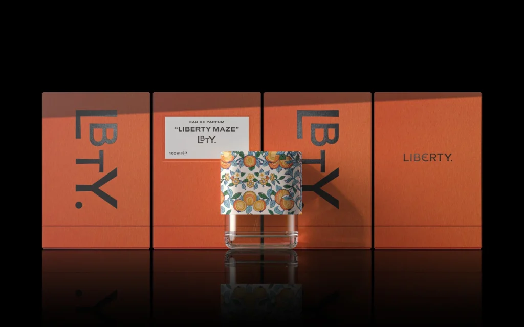
Similarly, Porto Rocha crafted a “bold yet sensitive” identity for the Brazilian art gallery Almeida & Dale, recognizing the nuance required when representing artists like Lygia Clark. This is not about quietness, but about an intelligent expressiveness that respects the subject matter and the brand’s specific cultural role. Pentagram’s packaging for Liberty fragrance brand LBTY also leans into the “essence of heritage,” indicating a deliberate choice to ground visual identity in an enduring narrative rather than fleeting fads. These projects demonstrate a growing understanding that sustained market positioning often results from an identity system that faithfully reflects a brand’s specific cultural signals and intrinsic value, fostering a profound connection with its audience.
The primary opposing force to this trend comes from venture capital-backed consumer brands and their marketing departments. These entities often prioritize rapid, scalable awareness and immediate market share gains, frequently through aggressive, trend-driven visual languages that lack genuine depth or unique cultural anchors. They mistakenly equate market visibility with brand equity, often overlooking the long-term dilution of distinctiveness that results from such an approach.
A branding professional should shift their primary line of inquiry from “How can we be disruptive?” to “What is the immutable essence of this brand, and how can we articulate it with precision and appropriate sensitivity or restraint?” This week, conduct deeper ethnographic research into the foundational principles or cultural context of a client’s brand. Advise clients to invest in identity systems that are designed for enduring relevance by clearly referencing a specific cultural origin or unique value proposition, rather than chasing short-term aesthetic trends.
TL;DR
Brand equity thrives when identities precisely articulate inherent value and cultural context, rather than chasing generic disruption.
Curated References


About this editorial — This piece was developed using AI-assisted research and curation across multiple industry sources. All analysis, opinions, and predictions represent the editorial perspective of JHDD. Sources are linked in the references section above.