JHDD Branding Report — 2026.08.22
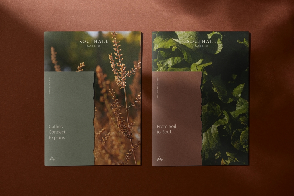
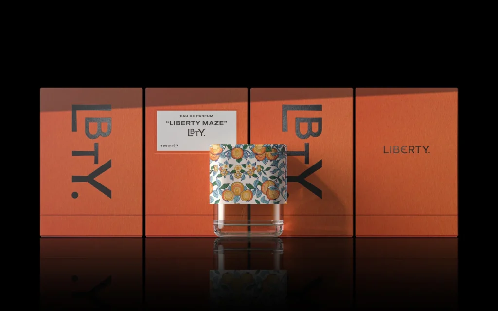
Perky Bros’ identity for Southall prioritized restrained Southern hospitality over typical ‘shouty’ branding. This decision, alongside recent initiatives for Brompton, LBTY, and Almeida & Dale, collectively signals a recalibration in how cultural resonance builds brand equity. These endeavors highlight a strategic shift from generic aspirational promises to specific, deeply rooted narratives. Designers are increasingly tasked with articulating an authentic sense of place or legacy through their visual systems and packaging.
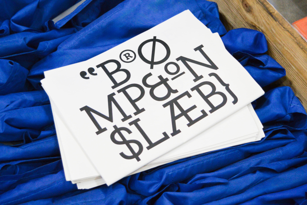
Studio Blackburn’s new identity for Brompton emphasizes its British engineering heritage, specifically its founding in 1975 by Andrew Ritchie in his West London flat. This approach counters the mainstream industry’s persistent belief that every brand must relentlessly innovate visually to stay relevant, often at the expense of its foundational story. Conventional wisdom often dictates that heritage brands require significant visual disruption to attract new demographics or avoid appearing stagnant. However, Brompton’s strategy demonstrates that a confident reaffirmation of intrinsic origin and specific design principles can be a more potent long-term equity builder than superficial aesthetic overhauls. By leaning into its history, Brompton cultivates a distinct market positioning that differentiates it from newer, often generic, folding bike competitors. This method strengthens its brand equity by appealing to a sense of enduring quality and craft.
This confident embrace of origin, rather than a frantic chase for novelty, indicates a deeper understanding of cultural signals. It is not about resisting modernity, but about integrating new expressions into an established identity. Brands that authentically articulate their provenance and unique contributions, as seen with Almeida & Dale’s Brazilian art heritage or LBTY’s fragrance lineage, will achieve greater market stability. Within two years, more established brands seeking renewed relevance will invest in design systems that celebrate their founding narrative and visual grammar rather than attempting radical aesthetic departures that alienate existing loyalists.
The primary opposing force remains venture-backed disruptor brands and their agency partners who prioritize speed-to-market and an immediate, often loud, visual impact. Their branding strategies frequently default to easily digestible, often homogenous, aesthetics designed for rapid digital scalability and a perceived modernity that lacks substantive cultural anchoring.
Branding professionals should shift their initial discovery phases to include rigorous anthropological and historical research into a client’s specific cultural origins, manufacturing processes, or founding philosophy. This week, begin by mapping out a brand’s specific ‘heritage markers’ before any visual concepting commences.
TL;DR
Brand equity is increasingly built on specific cultural heritage rather than generic modern aesthetics.
Curated References


About this editorial — This piece was developed using AI-assisted research and curation across multiple industry sources. All analysis, opinions, and predictions represent the editorial perspective of JHDD. Sources are linked in the references section above.