JHDD Branding Report — 2026.08.10
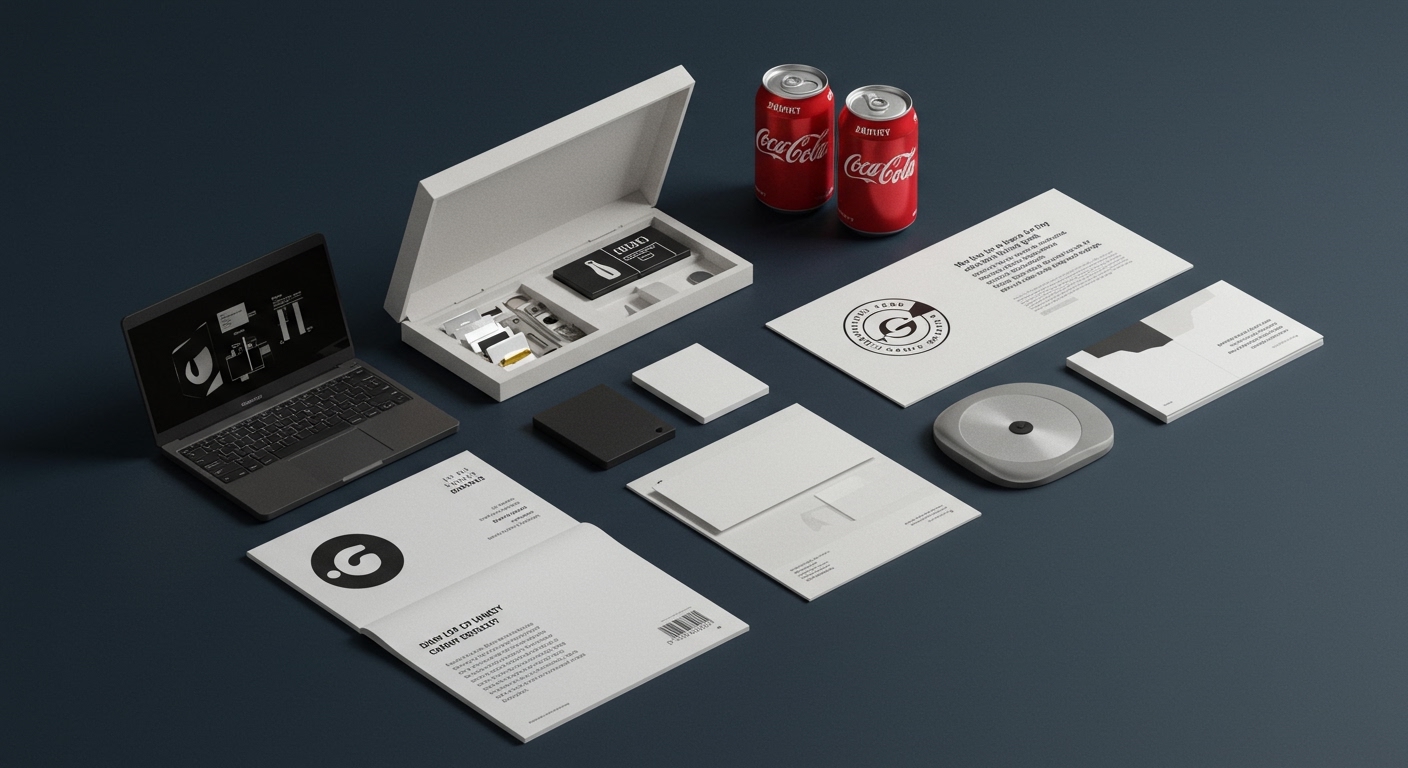
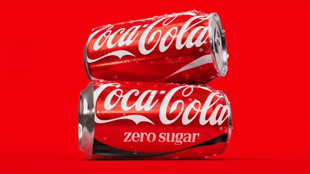
JKR proved that for Coca-Cola, the smartest rebrand was barely a rebrand at all.
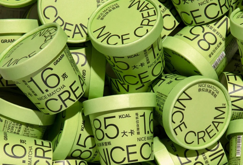
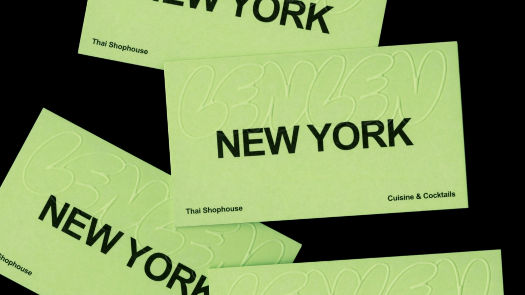
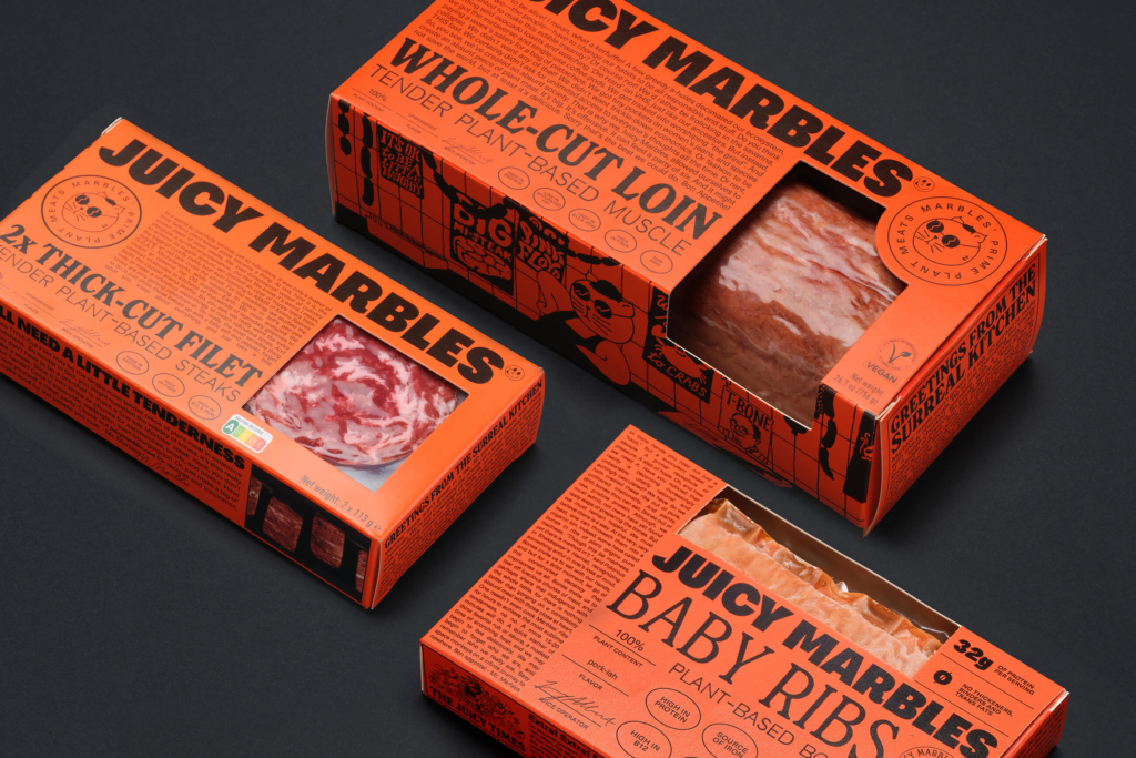
The recent brand identity projects collectively demonstrate a strategic calibration of visual distinctiveness, moving beyond a simple dichotomy of loud or quiet. These initiatives highlight intentional choices about where and how much a brand’s visual system should signal difference or reinforce familiarity, reflecting a deeper understanding of brand equity beyond superficial change.
JKR’s work for Coca-Cola exemplifies a brand strategy that defies the conventional wisdom held by many in the industry. The mainstream often posits that rebrands must visually signify progress or disruption to maintain contemporary relevance. However, JKR’s approach, which largely maintained Coca-Cola’s iconic red, white, and script typography, demonstrates that for deeply entrenched global brands, the most potent brand equity move is often a subtle reaffirmation of core visual assets. This contradicts the assumption that all brands benefit from a visibly new aesthetic overhaul when seeking to adapt or renew.
This deliberate visual restraint is not about stagnation; it is about identifying the bedrock elements of cultural recognition and leveraging them for stability in a fragmented market. For brands like Coca-Cola, whose visual codes are shorthand for categories and cultural eras, incremental refinement prevents dilution while signaling ongoing attention to consistency. This strategy positions the brand as a dependable, consistent presence. By early 2028, more heritage brands will publicly adopt similar “minimal intervention” rebranding strategies, reframing them as guardians of enduring brand equity rather than simply avoiding change.
The resistance to this nuanced approach often comes from clients or internal stakeholders who equate creative investment solely with dramatic visual transformation. This group frequently expects rebrands to deliver immediate, tangible newness that is instantly visible to the casual observer, thereby overlooking the strategic power of strengthening existing, proven brand signals. Branding agencies consequently face pressure to present a visibly different “solution,” even when a more subtle, strategically informed approach would serve the brand better long-term.
A working Branding professional should actively audit client brand assets to identify “sacred cow” visual elements—colors, typefaces, symbols—that hold deep, often unarticulated, cultural meaning. Instead of immediately considering their overhaul for a rebrand, professionals should explore strategies for their refinement and reinforcement as a primary path to strengthening brand equity. This applies even to emergent brands looking to quickly establish visual archetypes that resonate.
TL;DR
Brands are strategically calibrating visual distinctiveness to either disrupt expectations or reinforce core identity without drastic change.
Curated References
About this editorial — This piece was developed using AI-assisted research and curation across multiple industry sources. All analysis, opinions, and predictions represent the editorial perspective of JHDD. Sources are linked in the references section above.