
JHDD Branding Report — 2026.08.09
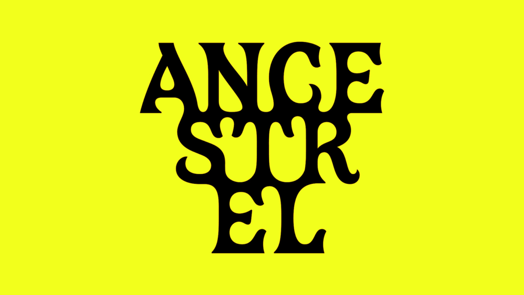
All Purpose delivered a lurid new identity for natural wine importer Ancestrel, deliberately ditching traditional wine clichés.
A clear pattern emerges from recent brand identity shifts: successful branding increasingly navigates a precise tension between deeply embedded, culturally owned visual language and an intentional, specific rejection of category norms. This is not simply about “disruption” for its own sake, but about precision in aesthetic choice, strategically deployed to either reinforce or redefine cultural signals with acute specificity.
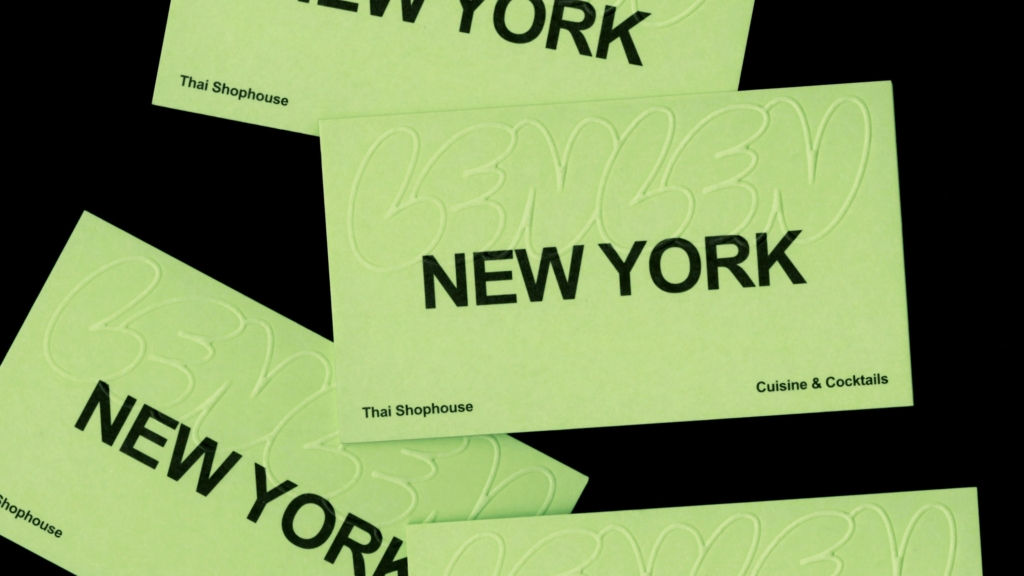
All Purpose’s work for Ancestrel exemplifies this strategic boldness. By embracing a “lurid” aesthetic and explicitly shedding the typical visual tropes of the wine industry, Ancestrel establishes a distinct counter-cultural signal. Mainstream industry opinion often dictates that broad appeal, especially in a premium market like natural wine, requires an elegant, sophisticated, or at least conventionally attractive aesthetic. This view misses a fundamental shift: generic “clean” or “minimalist” identities, while safe, increasingly fail to build durable brand equity. Such approaches merely add to visual noise. Instead, brands like Ancestrel, and Pentagram’s “controlled chaos” for LenLen, demonstrate that a highly specific, even polarizing, visual identity can forge a far stronger connection with a defined audience. This specificity allows a brand to own a unique cultural space, making it impervious to imitation. By mid-2027, more brands will realize that attempting to please everyone with an aesthetically neutral approach ultimately pleases no one meaningfully.
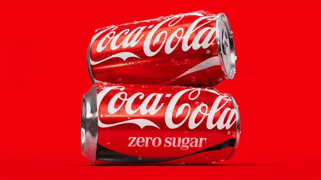
Conversely, JKR’s “barely a rebrand” for Coca-Cola highlights the other side of this precise aesthetic strategy: a deep, almost invisible commitment to reinforcing existing cultural ownership. Where Ancestrel seeks to redefine, Coca-Cola chooses to double down on the iconic combination of red and white and its specific script serif type. Both strategies, despite appearing opposite, succeed by embracing a highly specific aesthetic position, rather than succumbing to the pressure for superficial “newness.”
The primary resistance to these specific aesthetic strategies comes from internal marketing teams and design committees within larger organizations. These groups often prioritize consensus-driven aesthetics and risk aversion, fearing any visual choice that might alienate a broad consumer base. This fear, often fueled by data analytics optimized for the largest possible demographic, can lead to homogenized visual outcomes that lack distinction or cultural resonance. Such pressure frequently stifles bold, specific aesthetic choices, favoring bland compromise.
Branding professionals should conduct “aesthetic friction audits” for their clients this week. This involves identifying not only category clichés to avoid but also uncovering specific visual and tonal elements within a brand’s heritage or proposed direction that, while potentially polarizing, could be amplified to create unique, defensible cultural signals and distinct brand equity.
TL;DR
Strong brand identities are built through precise aesthetic choices that either boldly reject or deeply reinforce specific cultural signals.
Curated References
About this editorial — This piece was developed using AI-assisted research and curation across multiple industry sources. All analysis, opinions, and predictions represent the editorial perspective of JHDD. Sources are linked in the references section above.