JHDD Branding Report — 2026.07.23
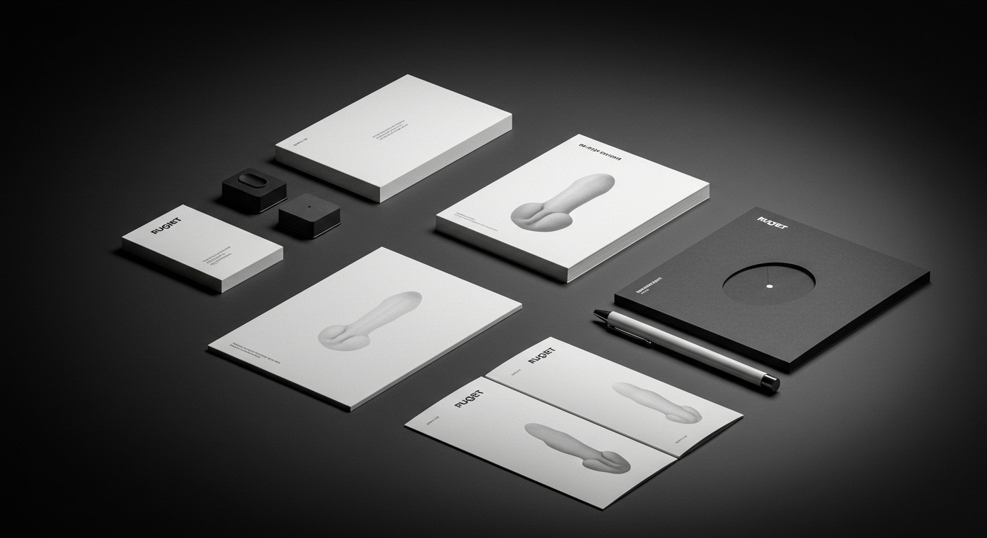
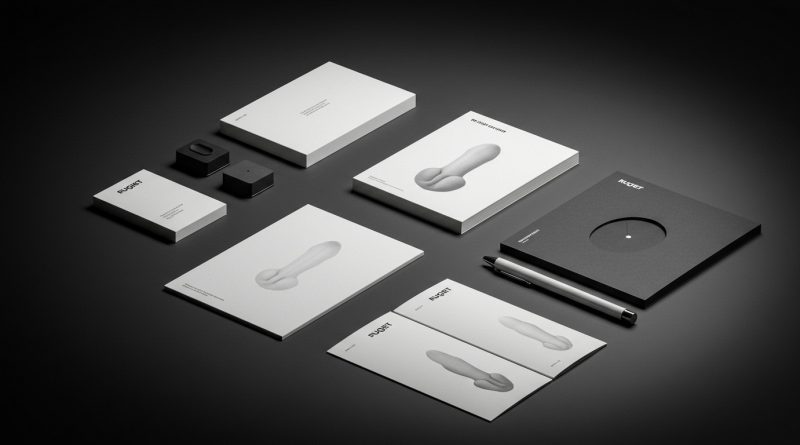
Pentagram’s designs for Rugiet employ unabashedly phallic imagery to market personalized male health treatments.
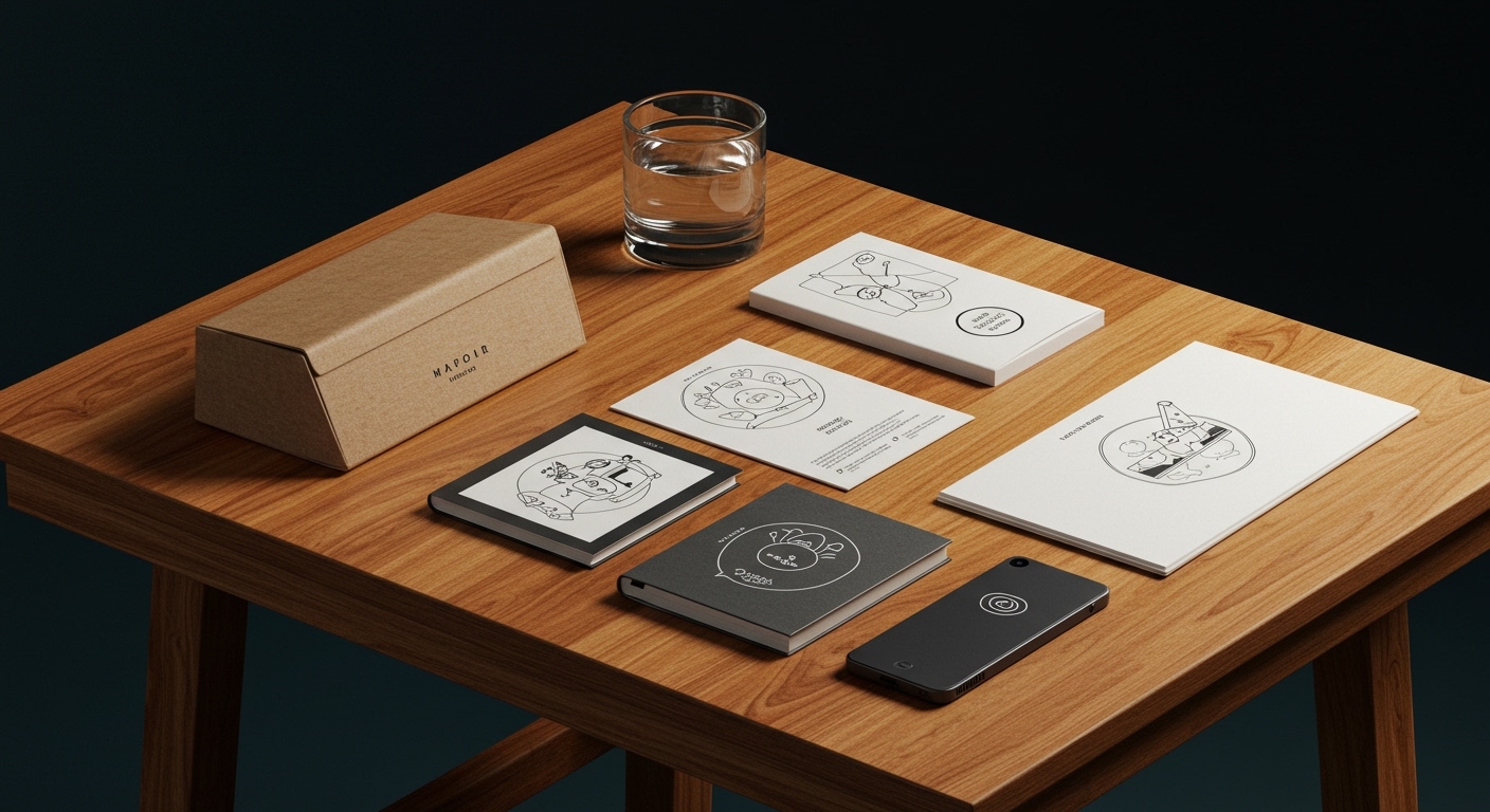
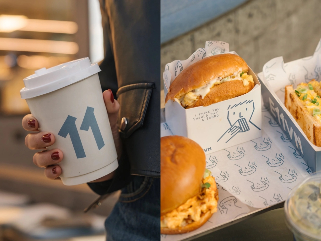
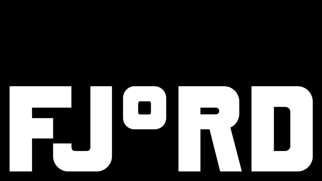
This directness, alongside DutchScot’s branding for Fjord which consciously floats between architecture and outdoor recreation, and Makebardo’s charming illustrations for the unfortunately named E11VN, reveals a recurring industry pattern. Brands are increasingly finding their distinct market positioning and brand equity not through broad appeal, but by leaning into highly specific, sometimes confrontational, or even deliberately imperfect visual identity systems and messaging. The objective is to carve out a precise niche rather than dilute for mass acceptance.
Consider Pentagram’s work for Rugiet, a male health brand offering personalized, clinically-backed treatments sold exclusively online. The brand’s visual identity system features forms that are, as noted, unabashedly phallic, a concrete detail that sets it apart immediately. Mainstream industry opinion, particularly within sensitive health categories, typically advocates for subtlety, universality, and broad appeal, fearing that overtly suggestive or provocative imagery will alienate segments of the audience, invite ridicule, or trivialize the product’s clinical efficacy. This conventional wisdom often pushes brands towards generic, sanitized aesthetics that prioritize perceived safety and mass market acceptance over genuine distinctiveness. However, Rugiet’s bold visual identity demonstrates a crucial counterpoint: a highly specific, even confrontational, approach can be a significant asset in building brand equity. It signals confidence, directness, and an unfiltered understanding of its precise target demographic’s needs and context, transforming what might be seen as a liability into a cultural signal of authenticity and daring.
This explicit, singular approach profoundly challenges the long-held notion that sophisticated branding must always be discreet or universally palatable. It suggests that in a fragmented marketplace, standing out requires more than just polish or adherence to category norms; it demands a clear, sometimes audacious, stance that resonates deeply with a specific segment. By embracing such a hyper-specific visual language, Rugiet defines its market positioning with undeniable clarity, building brand equity through overt recognition and a strong cultural signal, rather than through diluted, understated suggestion. This is a powerful counter-narrative to the mainstream idea that robust brand equity is built primarily through universal familiarity or bland corporate aesthetics. Within two years, it is expected that more brands across historically cautious sectors, including health and finance, will adopt visual identity systems that are deliberately confrontational or highly specific to their core product function or target audience, actively moving away from the safe, generic corporate aesthetics that currently dominate their categories.
The primary opposing force to this trend emanates from internal brand management teams and corporate legal departments, whose mandates often prioritize risk aversion, regulatory compliance, and broad stakeholder consensus above disruptive market positioning. These groups frequently rely on traditional market research methodologies that tend to validate conservative choices, reinforcing a preference for broad, inoffensive identities that minimize potential negative reactions. This inherent organizational bias acts as a significant barrier against embracing the distinct, potentially polarizing visual systems that effectively cut through market noise and foster deep connection with specific consumer groups.
A working branding professional should, this week, push clients to articulate not only what their brand offers functionally, but what specific, perhaps uncomfortable, truth it embodies or what conventional expectation it explicitly rejects. The subsequent visual identity brief must then be framed around amplifying this precise distinction, this refusal of the norm, rather than merely communicating product benefits or adhering to established category visual codes. This critical shift requires moving beyond vague “brand personality” exercises to identifying and expressing “brand conviction” through every element of the visual system.
TL;DR
Brands are achieving stronger market positioning by employing distinct, sometimes provocative, visual identities that actively challenge category conventions.
Curated References


About this editorial — This piece was developed using AI-assisted research and curation across multiple industry sources. All analysis, opinions, and predictions represent the editorial perspective of JHDD. Sources are linked in the references section above.