JHDD Branding Report — 2026.06.19
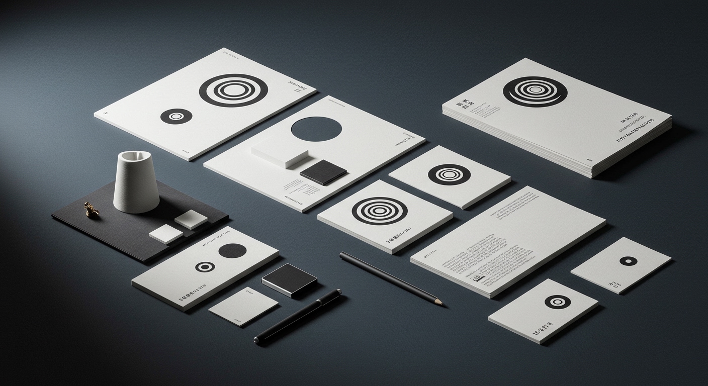
Pentagram’s joyful identity for the Museum of Narratives in Tokyo, featuring a dynamic spiral motif, exemplifies a subtle yet significant shift in contemporary brand strategy.
These stories collectively point to a sophisticated maturation in brand strategy, where visual identity systems are not merely applied, but meticulously engineered to excavate and articulate the core essence of an offering. This involves an intense focus on making the deeply local, the complexly technological, or the culturally experimental profoundly legible and resonant, thereby building distinct brand equity through specificity rather than broad appeal.

Consider Base Design’s approach to Ray’s, the smalltown ’80s seafood spot, celebrated for its “earnestness done well.” Mainstream industry opinion often assumes that international design agencies primarily seek and deliver value for global, scalable brands. This view suggests hyper-local entities are better served by local practitioners who possess innate cultural understanding. This overlooks a crucial strategic insight: a seasoned, external perspective can precisely distill the essential character of a local brand into a visual identity that is both authentic to its roots and universally appreciable, transcending provincial clichés without diluting local flavor. The value lies not in imposing a global aesthetic, but in elevating local essence through a highly refined, objective lens, which significantly strengthens market positioning and cultural signals. Within the next 18 months, leading agencies will increasingly highlight their most impactful work not on global campaigns, but on hyper-local brands that have achieved significant cultural equity through their sophisticated, specific visual design.
This specific application of intelligence extends to highly technical domains. Studio Gruhl’s “Global Hypercolour-esque” brand identity for Rerun, a “unified data layer for physical data,” demonstrates how abstract technological offerings are now demanding distinct cultural signals. While many tech brands default to minimalist, often undifferentiated visual systems for perceived authority, this trend contradicts that instinct. It shows the growing need for even complex B2B solutions to project an identifiable personality, fostering brand equity beyond mere functionality.
The primary opposing force to this intelligent specificity is the corporate drive for “efficiency” and “scalability” which often pushes for homogenized visual guidelines and template-based solutions. This institutional aversion to distinctiveness, often fearing perceived friction or increased costs in global deployment, inadvertently leads to generic visual identities that struggle to build meaningful brand equity or cultural resonance.
A working Branding professional should actively champion opportunities to apply high-level strategic and design thinking to culturally rich, smaller-scale, or highly niche brands. This means reframing the perceived “risk” of such projects as a potent opportunity to build deep, authentic brand equity and develop visual systems that resonate with precision, rather than merely broadcasting broadly. Presenting robust case studies of successful local brand elevation can effectively illustrate the tangible return on investment derived from strategic specificity to clients.
TL;DR
Strategic brand identity work is finding its most potent expression in deeply contextualized, specific applications, even for global agencies and high-tech entities.
Curated References
About this editorial — This piece was developed using AI-assisted research and curation across multiple industry sources. All analysis, opinions, and predictions represent the editorial perspective of JHDD. Sources are linked in the references section above.