JHDD Typography Report — 2026.07.11
Kate Schroeder crafts unique mugs and light fixtures, drawing inspiration from carefully observed scenes in the home and midcentury modern
Read More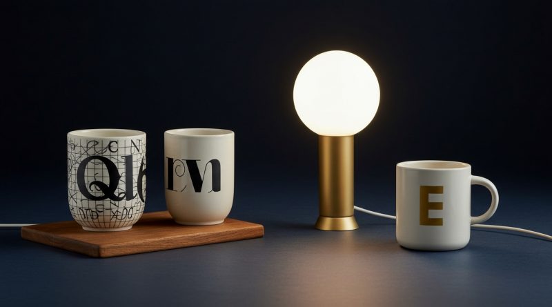
Kate Schroeder crafts unique mugs and light fixtures, drawing inspiration from carefully observed scenes in the home and midcentury modern
Read More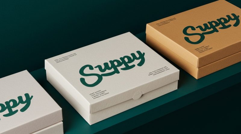
Joy Supply’s packaging, designed by Jake Nicolella, features a squiggly hand drawn wordmark that immediately communicates a playful, approachable sensibility.
Read More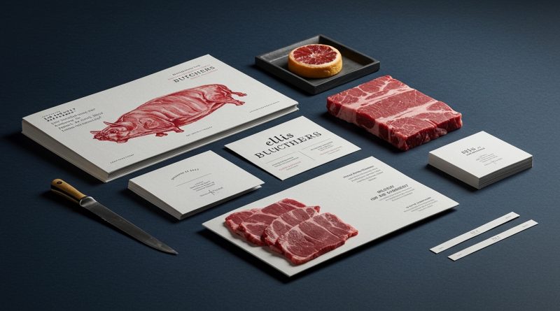
Studio Blackburn’s branding for Ellis Butchers embraces an unflinchingly carcass-centric visual identity, yet manages to evoke warmth. This approach, mirrored
Read More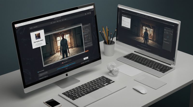
Studio375’s “Ten Years Away” interactive comic demonstrates a commitment to deeply integrated visual storytelling. These disparate articles reveal a collective
Read More
A senior designer at a major tech company recently observed an AI model generate a search box with a blur
Read More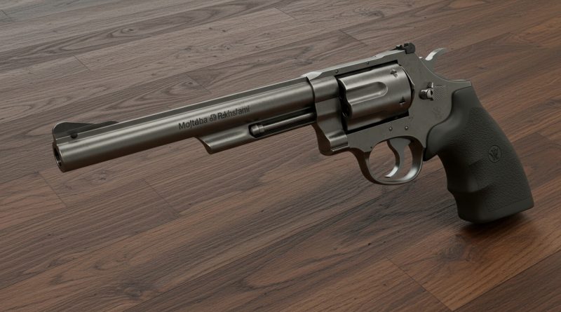
Mojtaba Rakhshani’s comprehensive tutorial on modeling a Dan Wesson 2.5″ Revolver exemplifies a focused pursuit of hyper-realism in digital fabrication,
Read More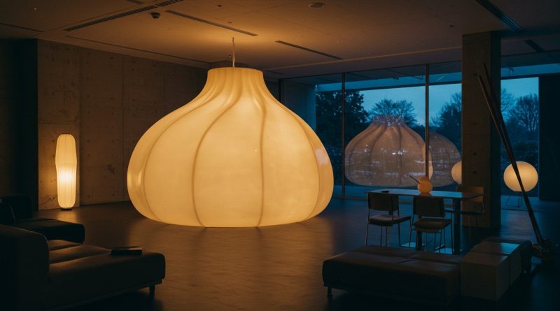
The gigantic fibreglass dumpling lamp designed by Open Studio for Dumpling Darlings represents a spatial shift beyond mere aesthetic novelty.
Read More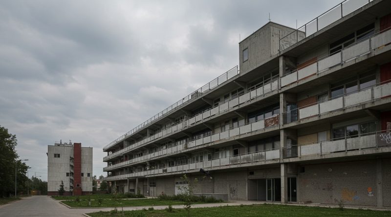
The renovation of KOSMALT, originally the largest workers’ dormitory of the Košice steelworks VSŽ, built in the 1960s, represents a
Read More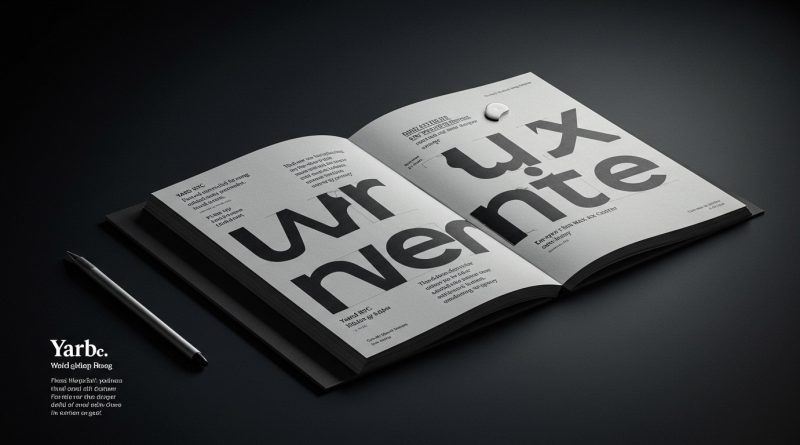
Yard NYC’s identity for European Wax Center employs contrasting typography to express brand personality. A subtle but pervasive pattern emerges
Read More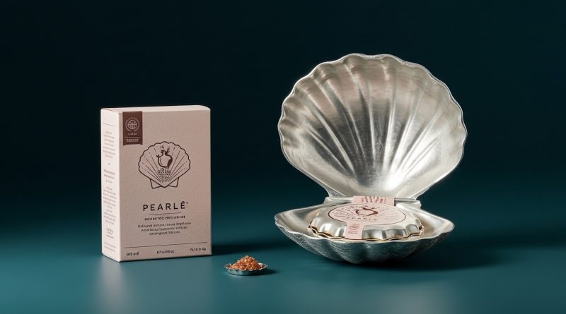
Pearle’s hinged silver scallop shell elevates plant-based caviar, trading category clichés for heirloom charm. Across diverse sectors, packaging design is
Read More