JHDD Typography Report — 2026.06.27
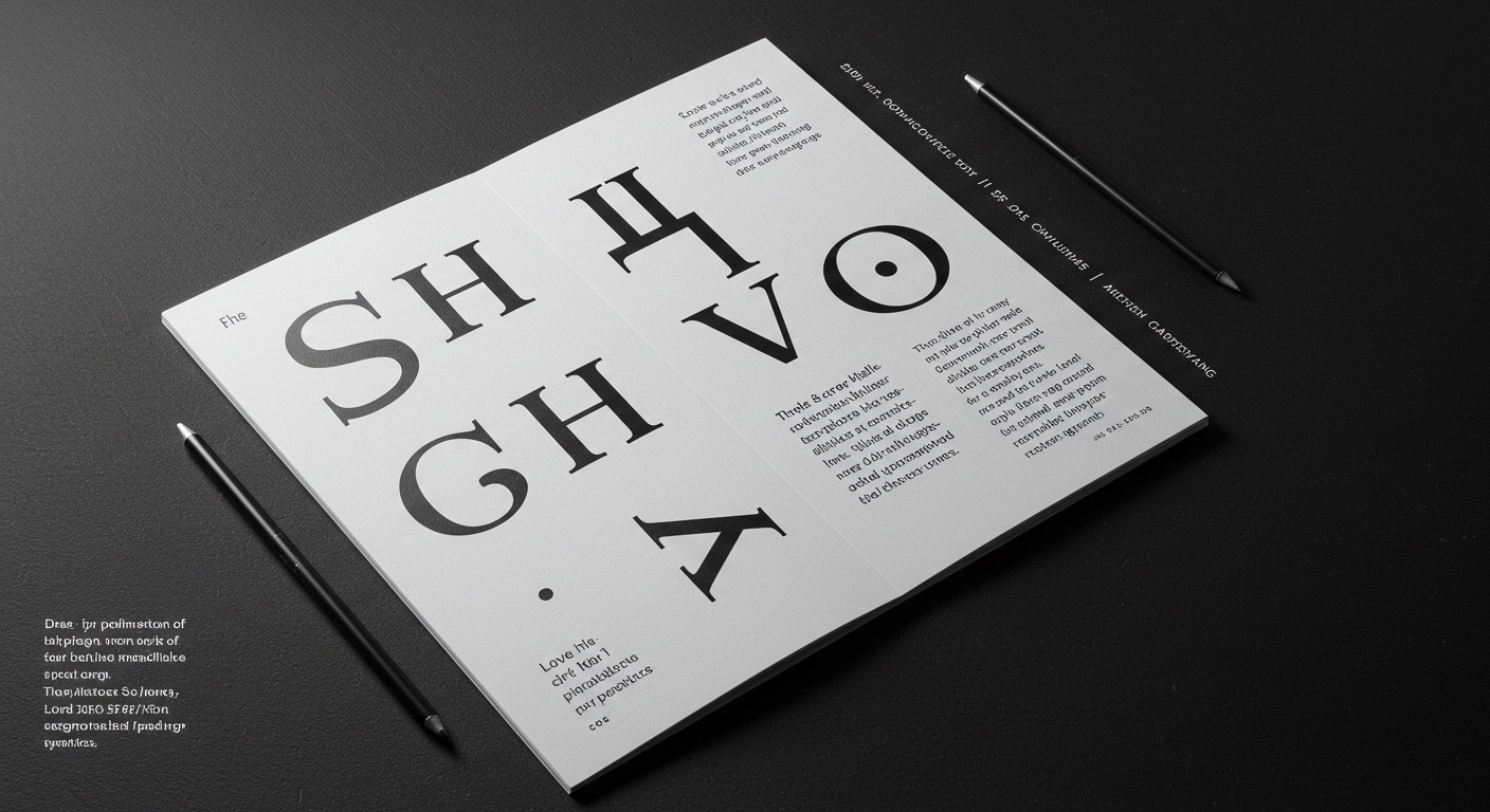
Love & War’s branding for Shaver Hall at the historic Lord & Taylor building demonstrates a contemporary approach to typographic systems within a legacy context.
The recent activity across design, from R. Sikoryak’s illustrative work in ‘Declaration / Emancipation Illustrated’ to the discussions at the Sustainable Brands Conference 2026, points towards a subtle but significant convergence. Design practices are increasingly tasked with embedding deep historical or conceptual narratives into systems demanding immediate legibility and brand resonance. This involves more than surface-level aesthetic choices; it reflects a push to integrate nuanced meaning within structured visual communication, challenging the boundaries between bespoke craftsmanship and scalable design principles.
Love & War’s work for Shaver Hall exemplifies this challenge. By honoring the legacy of retail pioneer Dorothy Shaver, the studio navigates the tension between historical typographic references and the modern legibility requirements of a food and culture destination. The mainstream industry often defaults to either mimicking historical styles directly or abandoning them for purely contemporary forms, believing legibility is a singular, universal state. This perspective is incomplete. True legibility is contextual. For Shaver Hall, legibility signifies the immediate recognition of a brand voice that feels historical yet functions effortlessly in a contemporary multi-use space. This requires a micro-typographic understanding of how letterforms carry historical weight without sacrificing clarity, often through subtle adjustments to weight, contrast, or counter-shapes that evoke an era rather than reproduce it rigidly.
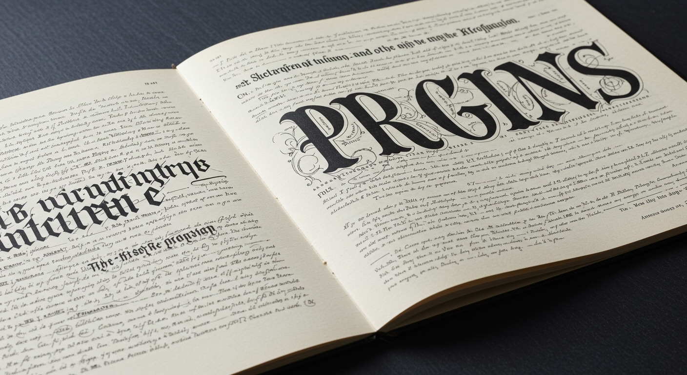
The notion that conceptual letterforms inherently reduce legibility, or that grid systems enforce homogeneity, overlooks their potential for symbiotic enhancement. When a designer like R. Sikoryak integrates illustrative elements with text, the conceptual letterforms often amplify meaning, acting as semantic anchors that guide the reader through complex content. The grid’s role here is not to constrain but to provide a robust framework that allows these conceptual flourishes to perform their function without visual chaos. Predictions that future interfaces will prioritize generic sans-serif efficiency above all else will prove short-sighted. Instead, by mid-2027, the leading design systems will exhibit sophisticated frameworks capable of incorporating highly specific, meaningful typographic details, allowing them to communicate layered information effectively within a single visual field.
This sophisticated integration faces resistance from rapid prototyping tools and automated layout engines that prioritize speed and generic scalability over nuanced semantic expression. These tools often encourage the selection of easily accessible, broadly applied typographic defaults, inadvertently discouraging the deep engagement with letterform history or conceptual adaptation that gives a brand its unique voice and enriches the reading experience. The prevailing pressure for immediate output can sideline the careful micro-typographic adjustments essential for blending historical resonance with contemporary functional demands.
Typography professionals should, this week, experiment with building small, flexible grid systems that can consciously accommodate one or two conceptually modified letterforms within a paragraph of otherwise standard text. Focus on how variations in optical weight, tracking, and leading around these bespoke elements impact the overall rhythm and legibility of the surrounding content. This practice shifts attention from macro-level layout to the critical micro-typographic adjustments required for seamless integration, ensuring that conceptual intent enhances rather than impedes readability.
TL;DR
The future of typography lies in integrating conceptual and historical letterforms within flexible grid systems for enhanced legibility and distinct brand communication.
Curated References
About this editorial — This piece was developed using AI-assisted research and curation across multiple industry sources. All analysis, opinions, and predictions represent the editorial perspective of JHDD. Sources are linked in the references section above.